标签:
Some useful design tips about IOS.
Make it easy for people to interact with content and controls by giving each interactive element ample spacing. Give tappable controls a hit target of about 44 x 44 points.
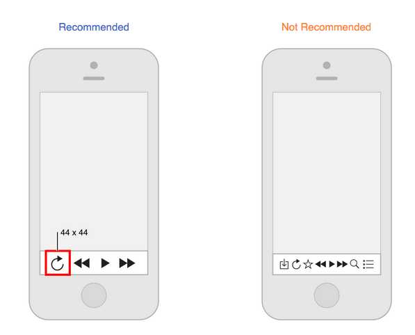
Create controls that measure at least 44 points x 44 points so they can be accurately tapped with a finger.

Create a layout that fits the screen of an iOS device. Users should see primary content without zooming or scrolling horizontally.

Use UI elements that are designed for touch gestures to make interaction with your app feel easy and natural.

Text should be at least 11 points so it‘s legible at a typical viewing distance without zooming.

Make sure there is ample contrast between the font color and the background so text is legible.

Don‘t let text overlap. Improve legibility by increasing line height or letter spacing.

Provide high-resolution versions of all image assets. Images that are not @2x and @3x will appear blurry on the Retina display.

Always display images at their intended aspect ratio to avoid distortion.

Create an easy-to-read layout that puts controls close to the content they modify. 
Align text, images, and buttons to show users how information is related.

Learn more :
标签:
原文地址:http://www.cnblogs.com/shizq/p/5199337.html