标签:
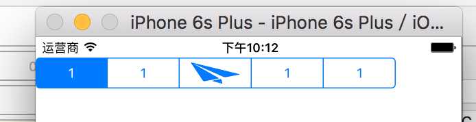
// 创建控件(他同样是透明的)
    UISegmentedControl *seg = [[UISegmentedControl alloc] initWithItems:@[@"1",@"1",@"1",@"1"]];
//typedef NS_ENUM(NSInteger, UISegmentedControlStyle) {
//    UISegmentedControlStylePlain,     // large plain
//    UISegmentedControlStyleBordered,  // large bordered
//    UISegmentedControlStyleBar,       // small button/nav bar style. tintable
//    UISegmentedControlStyleBezeled,   // DEPRECATED. Do not use this style.
//} NS_DEPRECATED_IOS(2_0, 7_0, "The segmentedControlStyle property no longer has any effect") __TVOS_PROHIBITED;
//
//enum {
//    UISegmentedControlNoSegment = -1   // segment index for no selected segment
//};
//
//typedef NS_ENUM(NSInteger, UISegmentedControlSegment) {
//    UISegmentedControlSegmentAny = 0,
//    UISegmentedControlSegmentLeft = 1,   // The capped, leftmost segment. Only applies when numSegments > 1.
//    UISegmentedControlSegmentCenter = 2, // Any segment between the left and rightmost segments. Only applies when numSegments > 2.
//    UISegmentedControlSegmentRight = 3,  // The capped,rightmost segment. Only applies when numSegments > 1.
//    UISegmentedControlSegmentAlone = 4,  // The standalone segment, capped on both ends. Only applies when numSegments = 1.
//};
//
  @class UIImage, UIColor;
//
//NS_CLASS_AVAILABLE_IOS(2_0) @interface UISegmentedControl : UIControl <NSCoding>
//
  - (instancetype)initWithItems:(nullable NSArray *)items; // items can be NSStrings or UIImages. control is automatically sized to fit content
//
  @property(nonatomic) UISegmentedControlStyle segmentedControlStyle NS_DEPRECATED_IOS(2_0, 7_0, "The segmentedControlStyle property no longer has any effect") __TVOS_PROHIBITED;

//设置是否保持选中状态:
//注意:如果设置为YES,点击结束后,将不保持选中状态,默认为NO
  @property(nonatomic,getter=isMomentary) BOOL momentary;             // if set, then we don‘t keep showing selected state after tracking ends. default is NO

//获取标签个数:(只读)
  @property(nonatomic,readonly) NSUInteger numberOfSegments;
//
//// For segments whose width value is 0, setting this property to YES attempts to adjust segment widths based on their content widths. Default is NO.
// 设置标签宽度是否随内容自适应:
// 注意:如果设置为NO,则所有标签宽度一致,为最大宽度。
  @property(nonatomic) BOOL apportionsSegmentWidthsByContent NS_AVAILABLE_IOS(5_0);
//
// 插入文字标签在index位置:
  - (void)insertSegmentWithTitle:(nullable NSString *)title atIndex:(NSUInteger)segment animated:(BOOL)animated; // insert before segment number. 0..#segments. value pinned
// 插入图片标签在index位置:
  - (void)insertSegmentWithImage:(nullable UIImage *)image  atIndex:(NSUInteger)segment animated:(BOOL)animated;
// 移除index位置标签:
  - (void)removeSegmentAtIndex:(NSUInteger)segment animated:(BOOL)animated;
// 移除所有位置标签:
  - (void)removeAllSegments;

// 重新设置标题标签(指定位置)
  - (void)setTitle:(nullable NSString *)title forSegmentAtIndex:(NSUInteger)segment;      // can only have image or title, not both. must be 0..#segments - 1 (or ignored). default is nil
//重新设置标签的图片(指定位置)
  - (void)setImage:(nullable UIImage *)image forSegmentAtIndex:(NSUInteger)segment;       // can only have image or title, not both. must be 0..#segments - 1 (or ignored). default is nil
//获取指定位置标签的文字
  - (nullable NSString *)titleForSegmentAtIndex:(NSUInteger)segment;
//获取指定位置标签的图片
  - (nullable UIImage *)imageForSegmentAtIndex:(NSUInteger)segment;
//
//设置指定位置标签的宽度
  - (void)setWidth:(CGFloat)width forSegmentAtIndex:(NSUInteger)segment;         // set to 0.0 width to autosize. default is 0.0
//获取指定位置标签的宽度
  - (CGFloat)widthForSegmentAtIndex:(NSUInteger)segment;
//
//设置内容(图片,或者文字)的偏移量
  - (void)setContentOffset:(CGSize)offset forSegmentAtIndex:(NSUInteger)segment; // adjust offset of image or text inside the segment. default is (0,0)
//获取内容(图片,或者文字)的偏移量
  - (CGSize)contentOffsetForSegmentAtIndex:(NSUInteger)segment;
//
//设置指定位置标签是否可用
  - (void)setEnabled:(BOOL)enabled forSegmentAtIndex:(NSUInteger)segment;        // default is YES
//获取指定位置标签是否可用
  - (BOOL)isEnabledForSegmentAtIndex:(NSUInteger)segment;
//
//// ignored in momentary mode. returns last segment pressed. default is UISegmentedControlNoSegment until a segment is pressed
//// the UIControlEventValueChanged action is invoked when the segment changes via a user event. set to UISegmentedControlNoSegment to turn off selection
//获取当前选中的标签
  @property(nonatomic) NSInteger selectedSegmentIndex;
//
//// The tintColor is inherited through the superview hierarchy. See UIView for more information.
//影响图片和文字的颜色
  @property(null_resettable,nonatomic,strong) UIColor *tintColor;
//
///* If backgroundImage is an image returned from -[UIImage resizableImageWithCapInsets:] the cap widths will be calculated from that information, otherwise, the cap width will be calculated by subtracting one from the image‘s width then dividing by 2. The cap widths will also be used as the margins for text placement. To adjust the margin use the margin adjustment methods.
//
// In general, you should specify a value for the normal state to be used by other states which don‘t have a custom value set.
//
// Similarly, when a property is dependent on the bar metrics, be sure to specify a value for UIBarMetricsDefault.
// In the case of the segmented control, appearance properties for UIBarMetricsCompact are only respected for segmented controls in the smaller navigation and toolbars.
// */
//设置特定状态下segment的背景图案
  - (void)setBackgroundImage:(nullable UIImage *)backgroundImage forState:(UIControlState)state barMetrics:(UIBarMetrics)barMetrics NS_AVAILABLE_IOS(5_0) UI_APPEARANCE_SELECTOR;
//注意:UIBarMetrics是一个枚举,如下:(defaulf风格会充满背景)
//typedef NS_ENUM(NSInteger, UIBarMetrics) {
//    UIBarMetricsDefault,
//    UIBarMetricsCompact,
//    UIBarMetricsDefaultPrompt = 101, // Applicable only in bars with the prompt property, such as UINavigationBar and UISearchBar
//    UIBarMetricsCompactPrompt,
//
//    UIBarMetricsLandscapePhone NS_ENUM_DEPRECATED_IOS(5_0, 8_0, "Use UIBarMetricsCompact instead") = UIBarMetricsCompact,
//    UIBarMetricsLandscapePhonePrompt NS_ENUM_DEPRECATED_IOS(7_0, 8_0, "Use UIBarMetricsCompactPrompt") = UIBarMetricsCompactPrompt,
//};
//获取背景图案
  - (nullable UIImage *)backgroundImageForState:(UIControlState)state barMetrics:(UIBarMetrics)barMetrics NS_AVAILABLE_IOS(5_0) UI_APPEARANCE_SELECTOR;
//
///* To customize the segmented control appearance you will need to provide divider images to go between two unselected segments (leftSegmentState:UIControlStateNormal rightSegmentState:UIControlStateNormal), selected on the left and unselected on the right (leftSegmentState:UIControlStateSelected rightSegmentState:UIControlStateNormal), and unselected on the left and selected on the right (leftSegmentState:UIControlStateNormal rightSegmentState:UIControlStateSelected).
// */
//设置标签之间分割线的图案
  - (void)setDividerImage:(nullable UIImage *)dividerImage forLeftSegmentState:(UIControlState)leftState rightSegmentState:(UIControlState)rightState barMetrics:(UIBarMetrics)barMetrics NS_AVAILABLE_IOS(5_0) UI_APPEARANCE_SELECTOR;
//获取标签之间分割线的图案
  - (nullable UIImage *)dividerImageForLeftSegmentState:(UIControlState)leftState rightSegmentState:(UIControlState)rightState barMetrics:(UIBarMetrics)barMetrics  NS_AVAILABLE_IOS(5_0) UI_APPEARANCE_SELECTOR;
//
///* You may specify the font, text color, and shadow properties for the title in the text attributes dictionary, using the keys found in NSAttributedString.h.
// */
//通过Attribute字符串属性字典设置标签标题
  - (void)setTitleTextAttributes:(nullable NSDictionary *)attributes forState:(UIControlState)state NS_AVAILABLE_IOS(5_0) UI_APPEARANCE_SELECTOR;
//获取Attribute字符串属性字典
  - (nullable NSDictionary *)titleTextAttributesForState:(UIControlState)state NS_AVAILABLE_IOS(5_0) UI_APPEARANCE_SELECTOR;
//
///* For adjusting the position of a title or image within the given segment of a segmented control.
// */
//自行设置标签内容的偏移量
//注意:UIOffset为偏移量,这个结构体中又两个浮点数,分别表示水平量和竖直量;UISegmentedControlSegment类型参数是一个枚举,如下
//typedef NS_ENUM(NSInteger, UISegmentedControlSegment) {
//    UISegmentedControlSegmentAny = 0,//所有标签都受影响
//    UISegmentedControlSegmentLeft = 1,  //只有左边部分受到影响
//    UISegmentedControlSegmentCenter = 2, // 只有中间部分受到影响
//    UISegmentedControlSegmentRight = 3,  // 只有右边部分受到影响
//    UISegmentedControlSegmentAlone = 4,  // 在只有一个标签的时候生效
//};
  - (void)setContentPositionAdjustment:(UIOffset)adjustment forSegmentType:(UISegmentedControlSegment)leftCenterRightOrAlone barMetrics:(UIBarMetrics)barMetrics NS_AVAILABLE_IOS(5_0) UI_APPEARANCE_SELECTOR;
//获取自定义偏移量
  - (UIOffset)contentPositionAdjustmentForSegmentType:(UISegmentedControlSegment)leftCenterRightOrAlone barMetrics:(UIBarMetrics)barMetrics NS_AVAILABLE_IOS(5_0) UI_APPEARANCE_SELECTOR;
//
//添加点击事件
//[_seg addTarget:self action:@selector(segClick:) forControlEvents:UIControlEventValueChanged];
  - (void)segClick:(UISegmentedControl *)seg{
//
//    NSLog(@" -- %ld",seg.selectedSegmentIndex);
//}
标签:
原文地址:http://www.cnblogs.com/kinghx/p/5285454.html