标签:
课件里介绍了一个很实用又能学到很多知识点的例子。并且Roger老师可是用了40分钟的视频亲力亲为。所以这里我把课件和视频知识整理一下会比较更清晰地解析这个案例。
视频链接: https://www.youtube.com/watch?v=VE-6bQvyfTQ&feature=youtu.be
Data Analysis Case Study: Changes in Fine Particle Air Pollution in the U.S.
Reading in the 1999 data
We first read in the 1999 data from the raw text file included in the zip archive. The data is a delimited file were fields are delimited with the | character adn missing values are coded as blank fields. We skip some commented lines in the beginning of the file and initially we do not read the header data.
> pm0 <- read.table("pm25_data/RD_501_88101_1999-0.txt", comment.char = "#", hea\
der = FALSE, sep = "|", na.strings = "")
After reading in the 1999 we check the first few rows (there are 117,421) rows in this dataset.
> dim(pm0)
[1] 117421 28
> head(pm0[, 1:13])
V1 V2 V3 V4 V5 V6 V7 V8 V9 V10 V11 V12 V13
1 RD I 1 27 1 88101 1 7 105 120 19990103 00:00 NA
2 RD I 1 27 1 88101 1 7 105 120 19990106 00:00 NA
3 RD I 1 27 1 88101 1 7 105 120 19990109 00:00 NA
4 RD I 1 27 1 88101 1 7 105 120 19990112 00:00 8.841
5 RD I 1 27 1 88101 1 7 105 120 19990115 00:00 14.920
6 RD I 1 27 1 88101 1 7 105 120 19990118 00:00 3.878
We then attach the column headers to the dataset and make sure that they are properly formatted for R data frames.
这个文件里面是这个样子的。标题行非常地长,然后内部每个名词是用“|”符号来分隔开来的。
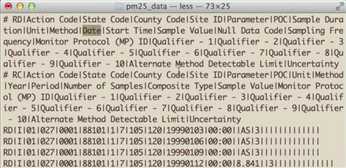
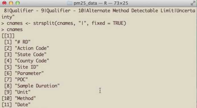
所以第一个任务是要把名字按“|”一一识别出来。
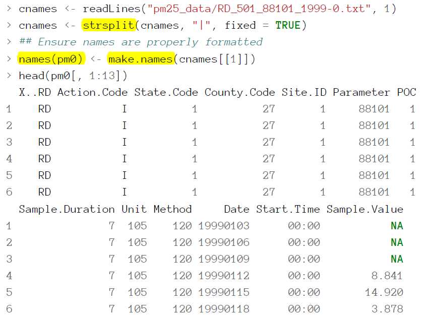
这里如果不用make.names 得到的名字比如County.Code中间将不是“.”而是原来的空格。这样不利于后面用到pm0$XX这样的操作,因为$后面是不能带有空格的。
The column we are interested in is the Sample.Value column which contains the PM_2.5_ measurements. Here we extract that column and print a brief summary.
> x0 <- pm0$Sample.Value
> summary(x0)
Min. 1st Qu. Median Mean 3rd Qu. Max. NA‘s
0.00 7.20 11.50 13.74 17.90 157.10 13217
Missing values are a common problem with environmental data and so we check to se what
proportion of the observations are missing (i.e. coded as NA).
> mean(is.na(x0)) ## Are missing values important here?
[1] 0.1125608
Because the proportion of missing values is relatively low (0.1125608), we choose to ignore missing values for now.
这里我们最关心的是Sample.Value这一列数据,因为它代表着污染物浓度。用Summary命令可以得到它很多的有用信息。
接下来同上面1999年的操作,2012年的数据也同样地读取并转换。
Reading in the 2012 data
We then read in the 2012 data in the same manner in which we read the 1999 data (the data files are
in the same format).
> pm1 <- read.table("pm25_data/RD_501_88101_2012-0.txt", comment.char = "#",
+ header = FALSE, sep = "|", na.strings = "", nrow = 1304290)
We also set the column names (they are the same ast the 1999 dataset) and extract the Sample.Value column from this dataset.
> names(pm1) <- make.names(cnames[[1]])
> x1 <- pm1$Sample.Value
Pm1是2012年全美国的污染物统计的Data.frame,结构如上所示。
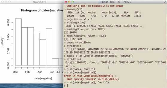
然后我们对pm1中的Data这一列探究一下。这一列都是日期,但是原本的格式是数字格式,并不是日期格式。
as.Date(as.character(dates),”%Y%m%d”)会转化为日期格式。
Data是一个和int, character, logi等平级的数据类型。

接下来可以先看看x1这列数据。里面有很多是负数,这在实际上是错误的,因为污染物浓度不应该是负值。所以我们把na去除,用 negative <- x1 < 0 和 sum (negative, na.rm = TRUE) 就知道里面有多少负值了。再用mean就知道了负值占里面所有数据的百分比。这里是2%,看上去还不错。
同样地,我们也可以用直方图来看看Data列中的数据分布。如果想按月份分布的话就用 hist(dates, “months”)就好了。用hist(dates[negative], “months”) 可以只看里面负值的分布。
这样我们就有了x0和x1这两个分别代表着1999年和2012年的污染物信息的列。
下面做一个有意思的事情,是要做一个boxplot
Results
Entire U.S. analysis
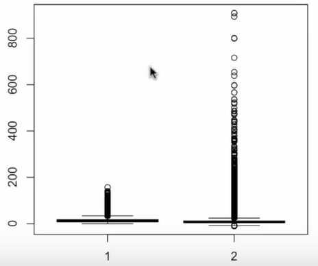
In order to show aggregate changes in PM across the entire monitoring network, we can make boxplots of all monitor values in 1999 and 2012. Here, we take the log of the PM values to adjust for the skew in the data.
> boxplot(log2(x0), log2(x1))
Warning in boxplot.default(log2(x0), log2(x1)): NaNs produced
Warning in bplt(at[i], wid = width[i], stats = z$stats[, i], out =
z$out[z$group == : Outlier (-Inf) in boxplot 1 is not drawn
Warning in bplt(at[i], wid = width[i], stats = z$stats[, i], out =
z$out[z$group == : Outlier (-Inf) in boxplot 2 is not drawn
plot of chunk boxplot log values
> summary(x0)
Min. 1st Qu. Median Mean 3rd Qu. Max. NA‘s
0.00 7.20 11.50 13.74 17.90 157.10 13217
> summary(x1)
Min. 1st
> summary(x0)
Min. 1st Qu. Median Mean 3rd Qu. Max. NA‘s
0.00 7.20 11.50 13.74 17.90 157.10 13217
> summary(x1)
Min. 1st Qu. Median Mean 3rd Qu. Max. NA‘s
-10.00 4.00 7.63 9.14 12.00 909.00 73133
Interestingly, from the summary of x1 it appears there are some negative values of PM, which in
general should not occur. We can investigate that somewhat to see if there is anything we should
worry about.
Changes in PM levels at an individual monitor
So far we have examined the change in PM levels on average across the country. One issue with the previous analysis is that the monitoring network could have changed in the time period between 1999 and 2012. So if for some reason in 2012 there are more monitors concentrated in cleaner parts of the country than there were in 1999, it might appear the PM levels decreased when in fact they didn’t. In this section we will focus on a single monitor in New York State to see if PM levels at that monitor decreased from 1999 to 2012.
> site0 <- unique(subset(pm0, State.Code == 36, c(County.Code, Site.ID)))
> site1 <- unique(subset(pm1, State.Code == 36, c(County.Code, Site.ID)))
Then we create a new variable that combines the county code and the site ID into a single string.
> site0 <- paste(site0[,1], site0[,2], sep = ".")
> site1 <- paste(site1[,1], site1[,2], sep = ".")
> str(site0)
chr [1:33] "1.5" "1.12" "5.73" "5.80" "5.83" "5.110" ...
> str(site1)
chr [1:18] "1.5" "1.12" "5.80" "5.133" "13.11" "29.5" ...
Finaly, we want the intersection between the sites present in 1999 and 2012 so that we might choose
a monitor that has data in both periods.
> both <- intersect(site0, site1)
> print(both)
[1] "1.5" "1.12" "5.80" "13.11" "29.5" "31.3" "63.2008"
[8] "67.1015" "85.55" "101.3"
Here (above) we can see that there are 10 monitors that were operating in both time periods.
However, rather than choose one at random, it might best to choose one that had a reasonable amount of data in each year.
上面命令分别提取了纽约州在1999年和2012年State.Code和Site.ID这两列数据。并用paste命令把两列合成一列,合成标准是中间用“.”隔开。
Both命令则只提取出1999年和2012年重合部分的数据。
> ## Find how many observations available at each monitor
> pm0$county.site <- with(pm0, paste(County.Code, Site.ID, sep = "."))
> pm1$county.site <- with(pm1, paste(County.Code, Site.ID, sep = "."))
这里用with命令,把刚才两列合并的一列加到原来的数据框中,叫 country.site
再用 a %in% A 这种判断元素是否在A中的命令把在both中出现的站点site提取出来。
> cnt0 <- subset(pm0, State.Code == 36 & county.site %in% both)
> cnt1 <- subset(pm1, State.Code == 36 & county.site %in% both)
Now that we have subsetted the original data frames to only include the data from the monitors that overlap between 1999 and 2012, we can split the data frames and count the number of observations at each monitor to see which ones have the most observations.
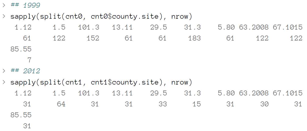
A number of monitors seem suitable from the output, but we will focus here on County 63 and site ID 2008.
> both.county <- 63
> both.id <- 2008
>
> ## Choose county 63 and side ID 2008
> pm1sub <- subset(pm1, State.Code == 36 & County.Code == both.county & Site.ID \
== both.id)
> pm0sub <- subset(pm0, State.Code == 36 & County.Code == both.county & Site.ID \
== both.id)
Now we plot the time series data of PM for the monitor in both years.
> dates1 <- as.Date(as.character(pm1sub$Date), "%Y%m%d")
> x1sub <- pm1sub$Sample.Value
> dates0 <- as.Date(as.character(pm0sub$Date), "%Y%m%d")
> x0sub <- pm0sub$Sample.Value
>
> ## Find global range
> rng <- range(x0sub, x1sub, na.rm = T)
> par(mfrow = c(1, 2), mar = c(4, 5, 2, 1))
> plot(dates0, x0sub, pch = 20, ylim = rng, xlab = "", ylab = expression(PM[2.5]\
* " (" * mu * g/m^3 * ")"))
> abline(h = median(x0sub, na.rm = T))
> plot(dates1, x1sub, pch = 20, ylim = rng, xlab = "", ylab = expression(PM[2.5]\
* " (" * mu * g/m^3 * ")"))
> abline(h = median(x1sub, na.rm = T))
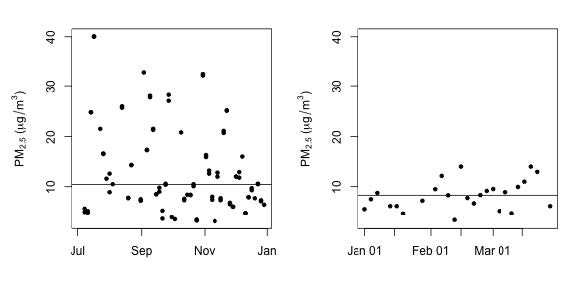
这样就看到了纽约州County 63,2008站点在1999年和2012年检测到的PM2.5的随日期分布图。
Changes in state-wide PM levels
Although ambient air quality standards are set at the federal level in the U.S. and hence affect the
entire country, the actual reduction and management of PM is left to the individual states. States
that are not “in attainment” have to develop a plan to reduce PM so that that the are in attainment
(eventually). Therefore, it might be useful to examine changes in PM at the state level. This analysis
falls somewhere in between looking at the entire country all at once and looking at an individual
monitor.
What we do here is calculate the mean of PM for each state in 1999 and 2012.
> ## 1999
> mn0 <- with(pm0, tapply(Sample.Value, State.Code, mean, na.rm = TRUE))
> ## 2012
> mn1 <- with(pm1, tapply(Sample.Value, State.Code, mean, na.rm = TRUE))
>
> ## Make separate data frames for states / years
> d0 <- data.frame(state = names(mn0), mean = mn0)
> d1 <- data.frame(state = names(mn1), mean = mn1)
> mrg <- merge(d0, d1, by = "state")
> head(mrg)
state mean.x mean.y
1 1 19.956391 10.126190
2 10 14.492895 11.236059
3 11 15.786507 11.991697
4 12 11.137139 8.239690
5 13 19.943240 11.321364
6 15 4.861821 8.749336
Now make a plot that shows the 1999 state-wide means in one “column” and the 2012 state-wide
means in another columns. We then draw a line connecting the means for each year in the same
state to highlight the trend.
> par(mfrow = c(1, 1))
> rng <- range(mrg[,2], mrg[,3])
> with(mrg, plot(rep(1, 52), mrg[, 2], xlim = c(.5, 2.5), ylim = rng, xaxt = "n"\
, xlab = "", ylab = "State-wide Mean PM"))
> with(mrg, points(rep(2, 52), mrg[, 3]))
> segments(rep(1, 52), mrg[, 2], rep(2, 52), mrg[, 3])
> axis(1, c(1, 2), c("1999", "2012")
这种图真是帅。感谢Roger老师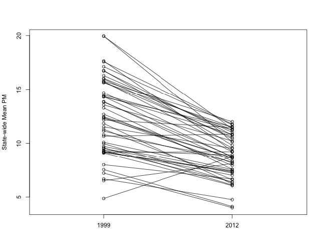
Coursera系列-R Programming (John Hopkins University)-课件案例
标签:
原文地址:http://www.cnblogs.com/yifeili/p/5451790.html