码迷,mamicode.com
首页 > 其他好文 > 详细

实现左边div固定宽度,右边div自适应

时间:2016-05-09 12:29:10      阅读:114      评论:0      收藏:0      [点我收藏+]

标签:


(1)使用float
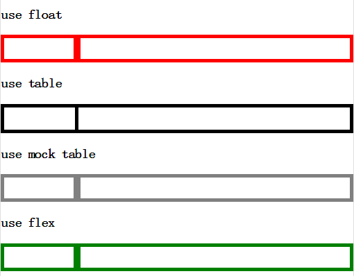
<div class="use-float">
    <div></div>
    <div></div>
</div>
.use-float>div:first-child{
    width:100px;
    float:left;
}
.use-float>div:last-child{
    overflow:hidden;
}

- - - - - - - - - - - - - - - - - - - - - - - - - - - - - - - - - - - - - - - - - - - - - - - - -

(2)使用table
<table class="use-table">
    <tr>
        <td></td>
        <td></td>
    </tr>    
</table>
.use-table{
    border-collapse:collapse;
    width:100%;
}
.use-table>tbody>tr>td:first-child{
    width:100px;
}

- - - - - - - - - - - - - - - - - - - - - - - - - - - - - - - - - - - - - - - - - - - - - - - - -

(3)用div模拟table
<div class="use-mock-table">
    <div></div>
    <div></div>
</div>
.use-mock-table{
    display:table;
    width:100%;
}
.use-mock-table>div{
    display:table-cell;
}
.use-mock-table>div:first-child{
    width:100px;
}

- - - - - - - - - - - - - - - - - - - - - - - - - - - - - - - - - - - - - - - - - - - - - - - - -

(4)使用flex
<div class="use-flex">
    <div></div>
    <div></div>
</div>
.use-flex{
    display:flex;
}
.use-flex>div:first-child{
    flex:none;
    width:100px;
}
.use-flex>div:last-child{
    flex:1;
}

- - - - - - - - - - - - - - - - - - - - - - - - - - - - - - - - - - - - - - - - - - - - - - - - -

效果图:(在以上样式基础上,我又加了高度和边框,才能看到下面的样子。。。)
技术分享

实现左边div固定宽度,右边div自适应

标签:

原文地址:http://www.cnblogs.com/hpx2020/p/5473409.html

(0)
(0)
   
举报
评论 一句话评论(0
登录后才能评论!
© 2014 mamicode.com 版权所有  联系我们:gaon5@hotmail.com
迷上了代码!