标签:
响应式布局
给大家分享下我做的一个简单的响应式的布局:
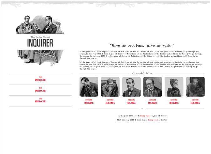
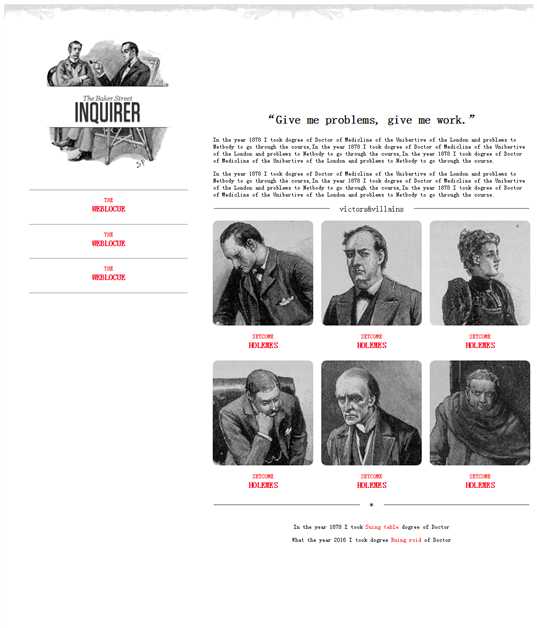
第一张图与第二张图都是在PC端时,适用不同大小浏览器页面,代码展示如下:
<!DOCTYPE html>
<html>
<head>
<meta charset="utf-8" />
<title></title>
<style>
p{
font-size: 12px;
}
header{
width: 100%;
}
header img{
width: 100%;
}
@media (min-width: 1300px) and (max-width:1400px) {
#left{
float: left;
width: 30%;
margin: 0px 50px;
}
#left #logo-bg{
margin: 10% 10%;
width: 80%;
position: relative;
}
#left #logo{
float: left;
width: 12%;
position: absolute;
left: 13%;
top: 230px;
}
#left p{
margin-bottom: -20px;
}
#left p,h4{
text-align: center;
color: red;
}
#right{
float: left;
width: 60%;
margin: 15% 0px;
}
#right h2{
text-align: center;
}
#right fieldset{
text-align: center;
border-left: none;
border-right: none;
border-bottom: none;
}
#right fieldset legend{
padding: 0px 20px;
}
#fen{
width: 100%;
-webkit-column-count: 6;
-moz-column-count: 6;
-o-column-count: 6;
-ms-column-count: 6;
column-count: 6;
-webkit-column-gap: 1em;
-moz-column-gap: 1em;
-o-column-gap: 1em;
-ms-column-gap: 1em;
column-gap: 1em;
}
#fen img{
width: 100%;
border-radius: 10px 10px 10px 10px;
}
#fen p,h4{
text-align: center;
color: red;
}
#fen p{
margin-bottom: -20px;
}
#di p{
text-align: center;
}
#di p span{
color: red;
}
}
@media (min-width: 1000px) and (max-width:1300px){
#left{
float: left;
width: 30%;
margin: 0px 50px;
}
#left #logo-bg{
margin: 10% 10%;
width: 80%;
position: relative;
}
#left #logo{
width: 12%;
position: absolute;
left: 14%;
top: 190px;
}
#left p{
margin-bottom: -20px;
}
#left p,h4{
text-align: center;
color: red;
}
#right{
float: left;
width: 60%;
margin: 15% 0px;
}
#right h2{
text-align: center;
}
#right fieldset{
text-align: center;
border-left: none;
border-right: none;
border-bottom: none;
}
#right fieldset legend{
padding: 0px 20px;
}
#fen{
width: 100%;
-webkit-column-count: 3;
-moz-column-count: 3;
-o-column-count: 3;
-ms-column-count: 3;
column-count: 3;
-webkit-column-gap: 1em;
-moz-column-gap: 1em;
-o-column-gap: 1em;
-ms-column-gap: 1em;
column-gap: 1em;
}
#fen img{
width: 100%;
border-radius: 10px 10px 10px 10px;
}
#fen p,h4{
text-align: center;
color: red;
}
#fen p{
margin-bottom: -20px;
}
#di p{
text-align: center;
}
#di p span{
color: red;
}
}
</style>
</head>
<body>
<header>
<img src="img/rag.png" />
</header>
<aside id="left">
<img src="img/logo-bg.png" id="logo-bg"/>
<img src="img/logo.png" id="logo" />
<hr />
<p>THE</p>
<h4>WEBLOCUE</h4>
<hr />
<p>THE</p>
<h4>WEBLOCUE</h4>
<hr />
<p>THE</p>
<h4>WEBLOCUE</h4>
<hr />
</aside>
<article id="right">
<h2>“Give me problems, give me work.”</h2>
<p>In the year 1878 I took dogree of Doctor of Medicline of the Unibertive of the London and problems to Netbody to go through the course,In the year 1878 I took dogree of Doctor of Medicline of the Unibertive of the London and problems to Netbody to go through the course,In the year 1878 I took dogree of Doctor of Medicline of the Unibertive of the London and problems to Netbody to go through the course.</p>
<p>In the year 1878 I took dogree of Doctor of Medicline of the Unibertive of the London and problems to Netbody to go through the course,In the year 1878 I took dogree of Doctor of Medicline of the Unibertive of the London and problems to Netbody to go through the course,In the year 1878 I took dogree of Doctor of Medicline of the Unibertive of the London and problems to Netbody to go through the course.</p>
<fieldset><legend>victors&villains</legend></fieldset>
<div id="fen">
<img src="img/1.jpg" />
<p>SETCOME</p>
<h4>HOLEMES</h4>
<img src="img/2.jpg" />
<p>SETCOME</p>
<h4>HOLEMES</h4>
<img src="img/3.jpg" />
<p>SETCOME</p>
<h4>HOLEMES</h4>
<img src="img/4.jpg" />
<p>SETCOME</p>
<h4>HOLEMES</h4>
<img src="img/5.jpg" />
<p>SETCOME</p>
<h4>HOLEMES</h4>
<img src="img/6.jpg" />
<p>SETCOME</p>
<h4>HOLEMES</h4>
</div>
<fieldset><legend>*</legend></fieldset>
<div id="di">
<p>In the year 1878 I took <span>Suing table</span> dogree of Doctor</p>
<p>What the year 2016 I took dogree <span>Ruing roid</span> of Doctor</p>
</div>
</article>
</body>
</html>
做的不够严谨,因为时间问题,请见谅。
如有何见解或疑问可私密我,大家共同学习进步。
2016.7.13
标签:
原文地址:http://www.cnblogs.com/duzheqiang/p/5666465.html