标签:
目前越来越多的浏览器都已经支持使用flex来,进行布局了。当然使用flex布局可以解决很多传统布局方式带来的问题,比如居中问题。
这里有阮一峰老师的中文教程:
http://www.ruanyifeng.com/blog/2015/07/flex-grammar.html?utm_source=tuicool 语法篇
http://www.ruanyifeng.com/blog/2015/07/flex-examples.html?bsh_bid=683103006 实战篇
以及一篇英文文档
http://tympanus.net/codrops/css_reference/flexbox/
几个注意点:
1当我们使用了flex布局以后,那么在传统的div盒子布局中的一些属性就会失去作用,比如浮动,columns,clear和vertical-align。
2 使用order时,网页中呈现的布局顺序和代码顺序不同,所以当使用屏幕阅读器等等时,读到的还是源代码中的顺序。可能翻译不太正确。原文在此
Note that the order in which the flex item appears inside its container changes only on screen, not in the source document. This means that screen readers will read the flex items in the order they appear in the document source, not the order specified using the order property.
常见用法:
1 水平垂直居中
.container {
    display: flex;
    align-items: center;
    justify-content: center;
}
2 圣杯布局
    <div class="container">
            <header></header>
            <article>
                <nav></nav>
                <article></article>
                <aside></aside>
            </article>
            <footer></footer>
        </div>
.container {
  height: 100vh;
  border: 1px solid #e5e5e5;
  display: flex;
  flex-direction: column; }
  .container header {
    flex-basis: 20%;
    background: yellow; }
  .container article {
    flex-basis: 60%;
    background: green;
    display: flex; }
    .container article nav {
      flex-basis: 20%;
      background: red;
      order: 3; }
    .container article article {
      flex-basis: 60%;
      background: purple;
      order: 2; }
    .container article aside {
      flex-basis: 20%;
      background: blue;
      order: 1; }
  .container footer {
    flex-basis: 20%;
    background: gray; }
尤其是配上使用vh视窗高度,自适应不仅是宽度,高度也会自适应。
当然也可以做成响应式,利用flex-direction:column改变主轴方向
@media screen and (max-width: 430px) {
    .navigation {
        flex-direction: column;

    }
}
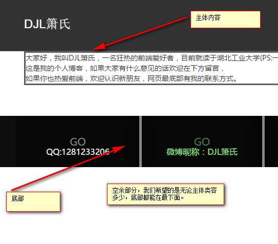
3 使footer始终在底部,有时我们的内容主体部分较短时,位于底部的内容就会上浮,这不是我们想看到的,类似下图。当然我们可以通过js的方法来实现,但是我们更希望能不借助js,就不借助js。
<body>
    <header><!-- header stuff --></header>
    <section class="content"><!-- main content --></section>
    <footer><!-- footer stuff --></footer>
</body>
body {
    display: flex;
    /* 视窗高度 */
    min-height: 100vh;
    /* 改变主轴方向 */
    flex-direction: column;
}
section.content {
    flex-grow: 1;
}
标签:
原文地址:http://www.cnblogs.com/djlxs/p/5754477.html