标签:
Bootstrap 提供了一套响应式、移动设备优先的流式栅格系统,随着屏幕或视口(viewport)尺寸的增加,系统会自动分为最多12列。
<!DOCTYPE html>
<html>
    <head>
        <meta charset="utf-8" />
        <title></title>
        <link rel="stylesheet" href="css/index.css" />
        <meta name="viewport" content="width=device-width,initial-scale=1">
        <meta name="viewport" content="width=device-width, initial-scale=1, maximum-scale=1, user-scalable=no">

        <link rel="icon" href="./img/index.png">
        <link rel="stylesheet" href="http://cdn.bootcss.com/bootstrap/3.3.0/css/bootstrap.min.css">

        <!-- jQuery文件。务必在bootstrap.min.js 之前引入 -->
        <script src="http://cdn.bootcss.com/jquery/1.11.1/jquery.min.js"></script>

        <!-- 最新的 Bootstrap 核心 JavaScript 文件 -->
        <script src="http://cdn.bootcss.com/bootstrap/3.3.0/js/bootstrap.min.js"></script>
    </head>
    <body>
            <h1 class="page-header">使用<small>Bootstrap网格系统布局网页</small></h1>
            <p>11111111111111111111111111111111111111111
            </p>

            <h2 class="page-header">区块一</h2>
            <p>aaaaaaaaaaaaaaaaaaaaaaaaaaaa</p>
            <h2 class="page-header">区块二</h2>
            <p>bbbbbbbbbbbbbbbbbbbbbbbbbbb</p>
            <h2 class="page-header">区块三</h2>
            <p>cccccccccccccccccccccccccccccc</p>

    </body>
</html>
把显示的内容居中,分成三等份显示在同一排
<!DOCTYPE html>
<html>
<head>
<meta charset="utf-8" />
<title></title>
<link rel="stylesheet" href="css/index.css" />
<meta name="viewport" content="width=device-width,initial-scale=1">
<meta name="viewport" content="width=device-width, initial-scale=1, maximum-scale=1, user-scalable=no">
<link rel="icon" href="./img/index.png">
<link rel="stylesheet" href="http://cdn.bootcss.com/bootstrap/3.3.0/css/bootstrap.min.css">
<!-- jQuery文件。务必在bootstrap.min.js 之前引入 -->
<script src="http://cdn.bootcss.com/jquery/1.11.1/jquery.min.js"></script>
<!-- 最新的 Bootstrap 核心 JavaScript 文件 -->
<script src="http://cdn.bootcss.com/bootstrap/3.3.0/js/bootstrap.min.js"></script>
</head>
<body>
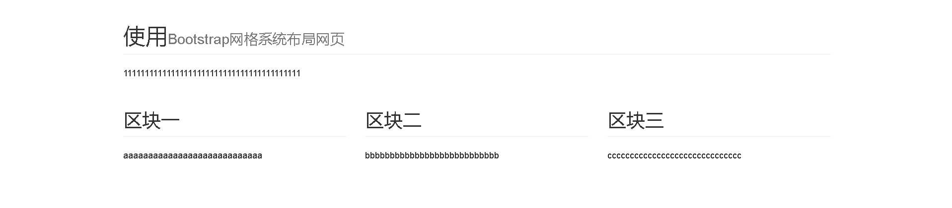
<div class="container">
<h1 class="page-header">使用<small>Bootstrap网格系统布局网页</small></h1>
<p>11111111111111111111111111111111111111111
</p>
<div class="row">
<div class="col-md-4">
<h2 class="page-header">区块一</h2>
<p>aaaaaaaaaaaaaaaaaaaaaaaaaaaa</p>
</div>
<div class="col-md-4">
<h2 class="page-header">区块二</h2>
<p>bbbbbbbbbbbbbbbbbbbbbbbbbbb</p>
</div>
<div class="col-md-4">
<h2 class="page-header">区块三</h2>
<p>cccccccccccccccccccccccccccccc</p>
</div>
</div>
</div>
</body>
</html>
知识点:
1)让显示的内容居中,使用css的class container.
container这个类设置了内容的宽度,并且让现实的内容居中。
2)把显示的内容显示在同一行,并且平均分为三份,需要使用css的class row
显示的页面如下图:
引用资料:
http://v3.bootcss.com/css/#grid
标签:
原文地址:http://www.cnblogs.com/wangshuo1/p/5836184.html