标签:
First, What is directive, what is the difference between component and directive.
For my understanding,
Basic ‘directive‘ and ‘component‘ they are quite similar, so just follow the rules when you want to choose using ‘directive‘ or ‘component‘:
What we want to build is collapse directive:
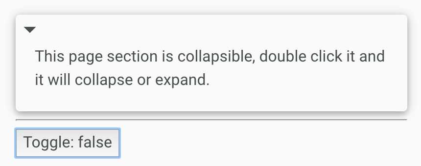
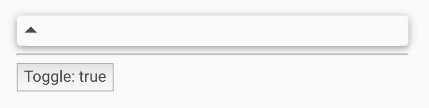
When you double click the panel, it will toggle the content show / hide and change the icon.
Also when you click the button which outside the panel, you will also be able to toggle the panel.
So it requires you know
First. let‘s see how to toggle it by using @HostListener & @HostBinding:
the host element html:
        <div collapse-on-click
             class="card card-strong disable-text-selection">
            <i class="md-icon collapsible-indicator" >arrow_drop_down</i>
            <i class="md-icon collapsible-indicator" >arrow_drop_up</i>

            <div class="collapsible-section" >
                This page section is collapsible, double click it and it will collapse or expand.
            </div>
        </div>
css:
.collapsed .collapsible-section{
    display: none;
}
directive:
import {Directive, HostListener, HostBinding} from "@angular/core";
@Directive({
    selector: ‘[collapse-on-click]‘
})
export class CollapseOnClick {

    collapsed:boolean;
    constructor(){
        this.collapsed = false;
    }

    // set "collapsed" class to the host element according to
    // this.collapsed value
    @HostBinding(‘class.collapsed‘)
    get isCollapsed(){
        return this.collapsed;
    }

    // if the double click the host element, will fire toggle function
    @HostListener(‘dblclick‘)
    toggle(){
        this.collapsed = !this.collapsed;
    }
}
So everytime, when you double click the host element, it will run ‘toggle()‘ function, it will change ‘this.collapsed‘ value to true or false. Then we have a getter and setter to get and set ‘this.collapsed‘. According to ‘this.collapsed‘, we will add ‘collapsed‘ class to host element. This class will help to hide the content, as we define in css file.
So when toggle: true: the host html will change to:
<div collapse-on-click
             class="card card-strong disable-text-selection collasped">
When toggle: false:
<div collapse-on-click
             class="card card-strong disable-text-selection">
To switch the icon, we can use template reference from directive:
@Directive({
    selector: ‘[collapse-on-click]‘,
    exportAs: ‘collapsible‘
})
We define exportAs, which we can refer in host html:
        <div collapse-on-click #panel="collapsible"
             class="card card-strong disable-text-selection">
            <i class="md-icon collapsible-indicator" *ngIf="!panel.collapsed">arrow_drop_down</i>
            <i class="md-icon collapsible-indicator" *ngIf="panel.collapsed">arrow_drop_up</i>

            <div class="collapsible-section" >
                This page section is collapsible, double click it and it will collapse or expand.
            </div>
        </div>
And one improvement for using template reference is we not longer need to depend on a css class ‘collapsed‘, to show / hide the content, we can just use ngIf.
        <div collapse-on-click #panel="collapsible"
             class="card card-strong disable-text-selection">
            <i class="md-icon collapsible-indicator" *ngIf="!panel.collapsed">arrow_drop_down</i>
            <i class="md-icon collapsible-indicator" *ngIf="panel.collapsed">arrow_drop_up</i>

            <div class="collapsible-section" *ngIf="!panel.collapsed">
                This page section is collapsible, double click it and it will collapse or expand.
            </div>
        </div>
This way can make the direcitve more reuseable.
Another benifite for using tempalte reference is that, we can call directive function or access directive props by ref.
        <div collapse-on-click #panel="collapsible"
             class="card card-strong disable-text-selection">
            <i class="md-icon collapsible-indicator" *ngIf="!panel.collapsed">arrow_drop_down</i>
            <i class="md-icon collapsible-indicator" *ngIf="panel.collapsed">arrow_drop_up</i>

            <div class="collapsible-section" *ngIf="!panel.collapsed">
                This page section is collapsible, double click it and it will collapse or expand.
            </div>
        </div>
        <hr />
        <button (click)="panel.toggle()">Toggle: {{panel.collapsed}}</button>
So, we add a button, which stay outside the host element. When it clicked, it will also call the toggle() method on directive to show / hide the content.
Notice: another way to write @HostListener:
@Directive({
    selector: ‘[collapse-on-click]‘,
    exportAs: ‘collapsible‘,
    host: {
        ‘(dblclick)‘: ‘toggle()‘
    }
})
It is also clear.
------------------
app.ts:
import {Component} from "@angular/core";
import {NgModule} from "@angular/core";
import {platformBrowserDynamic} from "@angular/platform-browser-dynamic";
import {BrowserModule} from "@angular/platform-browser";

import {CollapseOnClick} from "./collapse-on-click.directive";


@Component({
    selector:‘app‘,
    template: `

        <div collapse-on-click #panel="collapsible"
             class="card card-strong disable-text-selection">
            <i class="md-icon collapsible-indicator" *ngIf="!panel.collapsed">arrow_drop_down</i>
            <i class="md-icon collapsible-indicator" *ngIf="panel.collapsed">arrow_drop_up</i>

            <div class="collapsible-section" *ngIf="!panel.collapsed">
                This page section is collapsible, double click it and it will collapse or expand.
            </div>
        </div>
        <hr />
        <button (click)="panel.toggle()">Toggle: {{panel.collapsed}}</button>
        `
})
export class App {


}

@NgModule({
    declarations: [App, CollapseOnClick],
    imports: [BrowserModule],
    bootstrap: [App]
})
export class AppModule {

}

platformBrowserDynamic().bootstrapModule(AppModule);
collapsed-on-click.ts:
import {Directive, HostListener, HostBinding} from "@angular/core";
@Directive({
    selector: ‘[collapse-on-click]‘,
    exportAs: ‘collapsible‘
})
export class CollapseOnClick {

    collapsed:boolean;
    constructor(){
        this.collapsed = false;
    }

    // set "collapsed" class to the host element according to
    // this.collapsed value
    /*@HostBinding(‘class.collapsed‘)
    get isCollapsed(){
        return this.collapsed;
    }*/

    // if the double click the host element, will fire toggle function
    @HostListener(‘dblclick‘)
    toggle(){
        this.collapsed = !this.collapsed;
    }
}
[Angular 2] Directive intro and exportAs
标签:
原文地址:http://www.cnblogs.com/Answer1215/p/5870488.html