标签:
对于表单,input[type="radio"] 的样式总是不那么友好,在不同的浏览器中表现不一。
为了最大程度的显示出它们的差别,并且为了好看,首先定义了一些样式:
html:
<form action="">
    <div class="sex">
        <div class="female">
            <label for="female">女</label>
            <input type="radio" name="sex" id="female">
        </div>
        <div class="male">
            <label for="male">男</label>
            <input type="radio" name="sex" id="male">
        </div>
    </div>
</form>
css:
body { margin: 0; }
input { padding: 0; margin: 0; border: 0; }
.female, .male {
    position: relative;
    height: 40px;
    line-height: 40px;
    margin-left: 40px;
}
.sex label {
    display: block;
    height: 40px;
    width: 40px;
    line-height: 40px;
    font-size: 20px;
    cursor: pointer;
}
.sex input {
    z-index: 3;
    position: absolute;
    top: 0;
    bottom: 0;
    left: 40px;
    margin: auto;
    display: block;
    width: 30px;
    height: 30px;
    cursor: pointer;
}
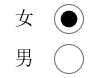
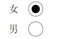
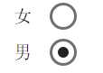
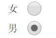
然后在各个浏览器中观察,会发现有很大的差别:
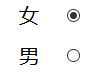
ie:
edge:
opera:
chrome:
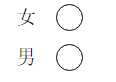
firefox:
对于 firefox 浏览器,即便是设置了宽和高,依然是没有效果,input[type="radio"] 的那个圆圈还是初始状态那么大。其它浏览器的表现也不一致,为了达到一致的效果,我们需要做兼容处理。
思路:
1. 将 input[type="radio"] 隐藏, opacity: 0; 置于上层,当我们点击它时,就能正确的响应原本的事件。
2. 自定义一个圆圈,置于下层,模拟原本相似的样式;
3. 用 js 实现选中 input[type="radio"] 时,在其下层的自定义的元素改变原来的背景颜色。
代码:
html:
<form action="">
    <div class="sex">
        <div class="female">
            <label for="female">女</label>
            <input type="radio" name="sex" id="female">
            <span class="female-custom"></span> <!-- 同下面的 span 一样作为自定义的元素 -->
        </div>
        <div class="male">
            <label for="male">男</label>
            <input type="radio" name="sex" id="male">
            <span class="male-custom"></span>
        </div>
    </div>
</form>
css:
body { margin: 0; }
input { padding: 0; margin: 0; border: 0; }
.female, .male {
    position: relative; /* 设置为相对定位,以便让子元素能绝对定位 */
    height: 40px;
    line-height: 40px;
    margin-left: 40px;
}
.sex label {
    display: block;
    height: 40px;
    width: 40px;
    line-height: 40px;
    font-size: 20px;
    cursor: pointer;
}
.sex input {
    z-index: 3;
    position: absolute;
    top: 0;
    bottom: 0;
    left: 40px;
    margin: auto; /* 这里及以上的定位,可以让该元素竖直居中。(top: 0; bottom: 0;) */
    opacity: 0;
    display: block;
    width: 30px;
    height: 30px;
    cursor: pointer;
}
.sex span {
    position: absolute;
    top: 0;
    bottom: 0;
    left: 40px;
    margin: auto;
    display: block;
    width: 25px;
    height: 25px;
    border: 1px solid #000;
    border-radius: 50%;
    cursor: pointer;
}
.sex span.active {
    background-color: #000;
}
js:
$("#male").click( function () {
    $(this).siblings("span").addClass("active");
    $(this).parents("div").siblings("div").children("span").removeClass("active");
});
$("#female").click( function () {
    $(this).siblings("span").addClass("active");
    $(this).parents("div").siblings("div").children("span").removeClass("active");
});
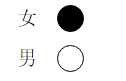
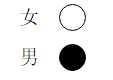
这样处理后,在浏览器中展示效果全部一样了:
扩展:
1. 对于代码中出现的定位,对父元素使用 position: relative; 给子元素使用 position: absolute; top: 0; right: 0; bottom: 0; left: 0; margin: auto; 能实现让子元素相对于父元素居中(满足水平居中和竖直居中)显示。如果只是需要竖直居中,则不需要添加 right: 0; 和 left: 0; 的样式。
2. 有时当我们不容易确定子元素的高度时,可以这样设置:对父元素 position: relative; 对子元素 position: absolute; top: 10px; bottom: 10px; margin: auto; 这样一来,子元素的高度就是父元素的高度减去20px后的值了,同样,top 和 bottom 支持百分数,可扩展性更强。
标签:
原文地址:http://www.cnblogs.com/xinjie-just/p/5911086.html