标签:
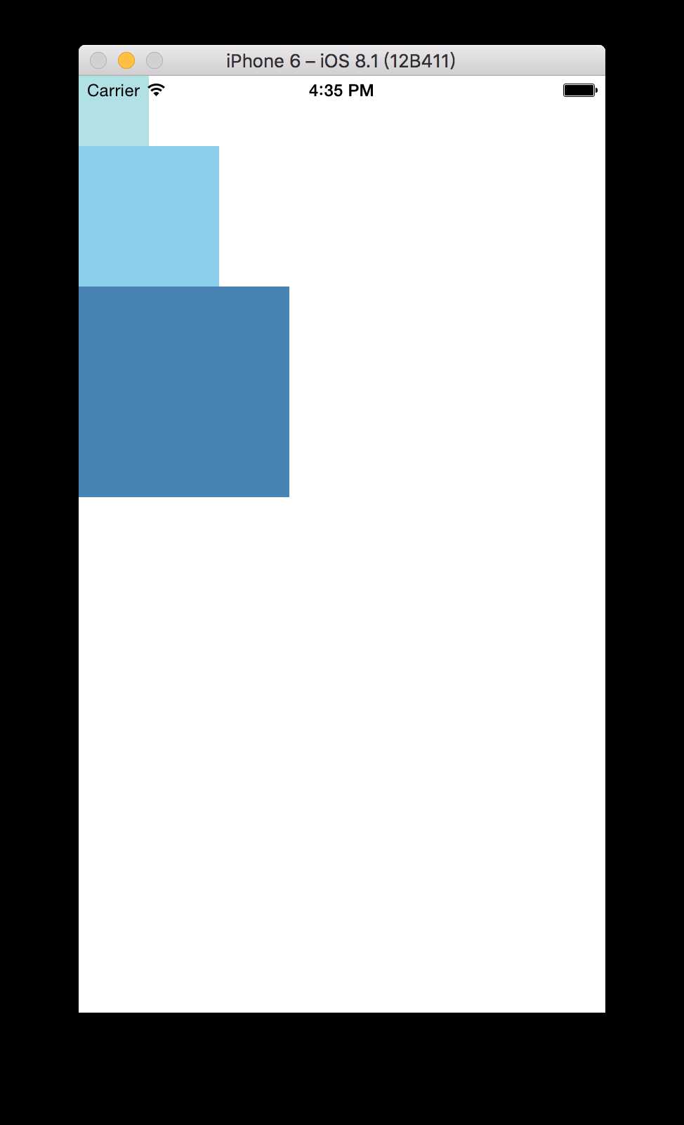
组件的高度,宽度决定了在屏幕上的尺寸。React-Native中尺寸都是无单位的,表示的是与设备像素密度无关的逻辑像素点。
import React, { Component } from ‘react‘;
import { AppRegistry, View } from ‘react-native‘;
class TestSize extends Component {
render() {
return (
<View>
<View style={{width: 50, height: 50, backgroundColor: ‘powderblue‘}} />
<View style={{width: 100, height: 100, backgroundColor: ‘skyblue‘}} />
<View style={{width: 150, height: 150, backgroundColor: ‘steelblue‘}} />
</View>
);
}
};
// 注册应用(registerComponent)后才能正确渲染
// 注意:只把应用作为一个整体注册一次,而不是每个组件/模块都注册
AppRegistry.registerComponent(‘TestSize‘, () =>TestSize);
// 设置了具体的宽、高,那么在任何设备上都是同样的尺寸,不存在适配这么一说。
对应效果图如下:
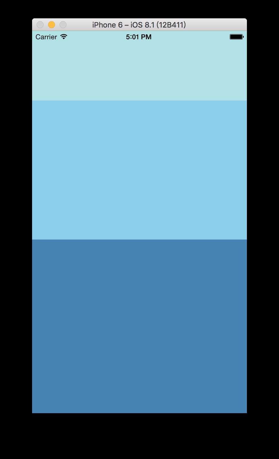
Flex
在组件样式中使用Flex 可以使其可以再可利用的空间内动态扩张或收缩,经常会看到flex:1 指定某个控件扩展以充满所有剩余空间。如果多个并列的子组件都是flex:1,这些子组件平分父容器中剩余空间
,若这些并列子组件flex都不一样,那么他们会按照比例充满父容器剩余空间(例如3个子组件,flex分别是 2,4,5,那么分别占用父容器剩余空间的2/11, 4/11, 5/11)
前提:子组件能够充满父容器剩余空间必须父容器的尺寸不为 0 ,如果父容器既没有指定width+height,同时也没有设定flex:1,那么子组件将不会显示(即使子组件设置了flex)。
import React, { Component } from ‘react‘;
import { AppRegistry, View } from ‘react-native‘;

class TestSize extends Component {
  render() {
return (<View style={{flex: 1}}>
<View style={{flex: 1, backgroundColor: ‘powderblue‘}} />
<View style={{flex: 2, backgroundColor: ‘skyblue‘}} />
<View style={{flex: 3, backgroundColor: ‘steelblue‘}} />
</View> ); } };
AppRegistry.registerComponent(‘TestSize‘, () =>TestSize);
如下图:
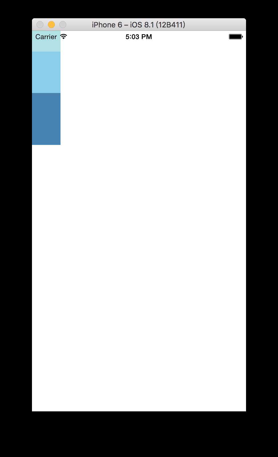
如果设置父容器宽+高(例如width:50,height:200),如下图
标签:
原文地址:http://www.cnblogs.com/madaha/p/5920550.html