标签:head img pos type htm bsp position title ref
/*****************************百度钱包旋转变内容******************************/
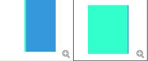
<!DOCTYPE html>
<html>
    <head>
        <meta charset="UTF-8">
        <title>百度钱包旋转变内容</title>
        <style>
            .wallet{
                width: 300px;
                height:300px ;
                margin: 50px auto;
                position: relative;

                transition: all 8s;

                transform-style:preserve-3d;   /* 加了之后父盒子就真正3D*/
            }
            .wallet::before, .wallet::after{
                content: ‘‘;
                display: block;
                position: absolute;
                left:0;
                top:0;
                width:100%;
                height:100%;
                /*right:0;
                bottom:0;*/
                background: red;
            }
            .wallet::before{
                background: #33ffca;        /*可更换为图片*/
                transform: translateZ(-5px);
                /*子元素必须是转换元素,eg两个平面必须要有距离,才起作用transform-style:preserve-3d;*/
            }
            .wallet::after{
                background: #3598db;        /*可更换为图片*/
                transform: translateZ(5px);  /*可以更改两个平面Z距离*/
            }
            .wallet:hover{
                transform: rotateY(180deg);        /*顺时针180*/
            }
        </style>
    </head>
    <body>
    <div class="wallet">
    </div>
    </body>

</html>
/*****************************3D导航******************************/
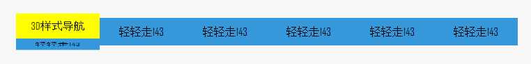
<!DOCTYPE html>
<html>
    <head>
        <meta charset="UTF-8">
        <title>3D导航</title>
        <style>
            body{
                margin: 0;
                padding:0;
                font-family: "Agency FB";
                background: #f7f7f7;
            }
            .nav{
                height:40px;
                margin-top: 50px;
                text-align: center;
                list-style: none;
            }
            li{
                width:120px ;
                height: 40px;
                line-height: 40px;
                float: left;

                position: relative;

                -webkit-transition: all 1s;

                transform-style:preserve-3d;   /*加了之后父盒子就真正3D*/
            }
            li span{
                position: absolute;
                top:0;
                left: 0;
                width:100%;
                height:100%;
            }
            li span:first-child{
                background: yellow;
                transform:rotateX(90deg) translateZ(20px);
            }
            li span:last-child{
                background: #3598db;
                transform: translateZ(20px);
            }
            li:hover{
                transform: rotateX(-90deg);   /*旋转整个标签*/
            }
        </style>
    </head>
    <body>
        <ul class="nav">
            <li>
                <span>3D样式导航</span>
                <span>轻轻走143</span>
            </li>
            <li>
                <span>3D样式导航</span>
                <span>轻轻走143</span>
            </li>
            <li>
                <span>3D样式导航</span>
                <span>轻轻走143</span>
            </li>
            <li>
                <span>3D样式导航</span>
                <span>轻轻走143</span>
            </li>
            <li>
                <span>3D样式导航</span>
                <span>轻轻走143</span>
            </li>
        </ul>
    </body>

</html>
/*****************************3D导航升级->3D轮播图******************************/
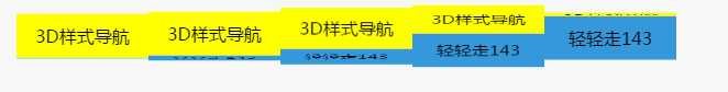
<!DOCTYPE html>
<html>
    <head>
        <meta charset="UTF-8">
        <title>3D导航升级->3D轮播图</title>
        <style>
            body{
                margin: 0;
                padding:0;
                font-family:"微软雅黑";
                background: #f7f7f7;
            }
            .nav{
                height:40px;
                margin-top: 50px;
                text-align: center;
                list-style: none;
            }
            li{
                width:120px ;
                height: 40px;
                line-height: 40px;
                float: left;

                position: relative;

                -webkit-transition: all 1s;

                transform-style:preserve-3d;   /*加了之后父盒子就真正3D*/
            }
            li span{
                position: absolute;
                top:0;
                left: 0;
                width:100%;
                height:100%;
            }
            li span:first-child{
                background: yellow;
                transform:rotateX(90deg) translateZ(20px);
            }
            li span:last-child{
                background: #3598db;
                transform: translateZ(20px);
            }


            /*旋转整个li标签*/
            /*li:hover{
                transform: rotateX(-90deg);
            }*/


            /*旋转整个ul标签*/
            /*类似3D轮播图*/
            .nav:hover li{
                transform: rotateX(-90deg);
            }
            .nav li:nth-child(1){
                transition-delay: 0s;   /*延迟0s*/
            }
            .nav li:nth-child(1){
                transition-delay: 0.2s;   /*延迟0s*/
            }
            .nav li:nth-child(2){
                transition-delay: 0.4s;   /*延迟0s*/
            }
            .nav li:nth-child(3){
                transition-delay: 0.6s;   /*延迟0s*/
            }
            .nav li:nth-child(4){
                 transition-delay: 0.8s;   /*延迟0s*/
             }
            .nav li:nth-child(5){
                  transition-delay: 1s;   /*延迟0s*/
              }

        </style>
    </head>
    <body>
        <ul class="nav">
            <li>
                <span>3D样式导航</span>
                <span>轻轻走143</span>
            </li>
            <li>
                <span>3D样式导航</span>
                <span>轻轻走143</span>
            </li>
            <li>
                <span>3D样式导航</span>
                <span>轻轻走143</span>
            </li>
            <li>
                <span>3D样式导航</span>
                <span>轻轻走143</span>
            </li>
            <li>
                <span>3D样式导航</span>
                <span>轻轻走143</span>
            </li>
        </ul>
    </body>

</html>
| 【作者】:轻轻走143 |
| 【出处】:http://www.cnblogs.com/qingqingzou-143/ |
| 【声明】:所有博文标题后加(share)的表示收集的他人优秀文章,其余的则为原创。欢迎转载,但请在显要位置显示本文链接,并保留本段声明,否则追究法律责任,谢谢! |
标签:head img pos type htm bsp position title ref
原文地址:http://www.cnblogs.com/qingqingzou-143/p/6129776.html