标签:order back 划线 alt splay 20px 分享 char http
此例中:
1.ul li a{display:block}用block是因为不把它变成块元素是不显示背景的,
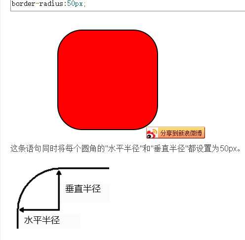
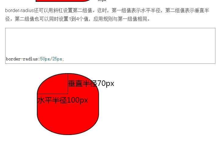
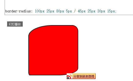
2.border-radius:50% :
radius,就是半径的意思,用这个属性可以做出圆角效果,也可以做出圆形效果。当元素的width和height相等,border-radius:50%时,就是圆形了。
其他相关属性:border-top-right-radius,border-bottom-right-radius,border-bottom-left-radius,border-top-left-radius, 分别是举行的四个角的表示。
border-radius可以同时设置4个值,如果设置1个值,表示4个角都是用这个值;如果设置两个值,左上角和右下角使用第一个值,右上角和左下角使用第二个值;
如果设置三个值,左上角使用第一个值,右上和左下角使用第二个值,右下角使用第三个值;如果设置4个值,则依次对应左上、右上、左下、右下角(顺时针顺序)。
看图:
3.text-decoration:none;color:red;规定添加到文本的修饰。修饰的颜色由color属性来定义
意思是文本样式无,就把下划线去掉了。

代码如下:
<!DOCTYPE html>
<html>
<head>
<meta charset="UTF-8">
<title></title>
<style type="text/css">
div{width: 730px; height: 455px; background: url("img/QQ截图20161221181519.png"); position: relative;}
div:hover::before,div:hover::after{
content: "<";
display: block;
width: 30px; height: 60px;
background: rgba(0,0,0,.3);
position: absolute;
top: 190px;
left: 0px;
font-size: 40px;
color: #fff;
line-height: 60px;
text-align: center;
}
div:hover::after{
content: ">";
left: 700px;/*(这里不写right因为左右都有的左的优先级高,所以直接写成这样.这里如果写right:0px 没用)*/
}
ul li{list-style: none; float: left; width: 30px;}
ul{position: absolute; bottom: 10px; left: 300px;}
ul li a{display: block; border-radius: 50%; width: 20px; height: 20px; background: gray;
text-align: center; line-height: 20px; text-decoration: none; color: #fff;
}
ul li a:hover{background: red;}
</style>
</head>
<body>
<div>
<ul>
<li><a href="#">1</a></li>
<li><a href="#">2</a></li>
<li><a href="#">3</a></li>
<li><a href="#">4</a></li>
</ul>
</div>
</body>
</html>
标签:order back 划线 alt splay 20px 分享 char http
原文地址:http://www.cnblogs.com/1111duguxiaoyu/p/6213187.html