标签:web selector ane 通过 style cto add float strong
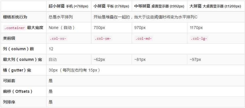
Bootstrap 提供了一套响应式、移动设备优先的流式栅格系统,随着屏幕或视口(viewport)尺寸的增加,系统会自动分为最多12列。
bootstrap通过媒体查询解决不同分辨率屏幕下,页面主内容的宽度问题:
@media (min-width: 1200px){.container:width: }
@media (min-width: 992px){.container :width: }
以class-----col-sm-xx为例子
@media (min-width: 768px) {
  .col-sm-1, .col-sm-2, .col-sm-3, .col-sm-4, .col-sm-5, .col-sm-6, .col-sm-7, .col-sm-8, .col-sm-9, .col-sm-10, .col-sm-11, .col-sm-12 {
    float: left;
  }
  .col-sm-12 {width: 100%; }
  .col-sm-11 {width: 91.66666667%; }
  .col-sm-10 {width: 83.33333333%;}
  .col-sm-9 { width: 75%;}
  .col-sm-8 {width: 66.66666667%;}
  .col-sm-7 { width: 58.33333333%;}
  .col-sm-6 { width: 50%;}
  .col-sm-5 { width: 41.66666667%;}
  .col-sm-4 { width: 33.33333333%;}
  .col-sm-3 {width: 25%;}
  .col-sm-2 {width: 16.66666667%;}
  .col-sm-1 {width: 8.33333333%;}
}
根据媒体查询和宽度百分比设置,设置相应class,就能够设置相应宽度
标签:web selector ane 通过 style cto add float strong
原文地址:http://www.cnblogs.com/ldmblog/p/6216055.html