标签:flow relative sans pos add ott lin 设计 ref
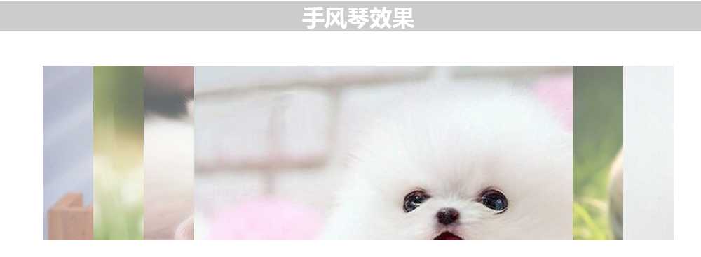
功能描述:
鼠标移到每一个图片上,显示当前图片,其余图片变成宽度为原来的6%,同时图片透明度为1,0.5s后显示图片说明。鼠标移除后,每张照片宽度变为16%的宽度。其中图片说明,没有设计样式,有兴趣的可以自己动手。
html代码:
<body>
   <h1>手风琴效果</h1>
    <div id="content">
        <ul>
            <li>
                <a href="#">
                    <h2>图片名称</h2>
                    <p>图片描述</p>
                </a>
            </li>
            <li>
                <a href="#">
                    <h2>图片名称</h2>
                    <p>图片描述</p>
                </a>
            </li>
            <li>
                <a href="#">
                    <h2>图片名称</h2>
                    <p>图片描述</p>
                </a>
            </li>
            <li>
                <a href="#">
                    <h2>图片名称</h2>
                    <p>图片描述</p>
                </a>
            </li>
            <li>
                <a href="#">
                    <h2>图片名称</h2>
                    <p>图片描述</p>
                </a>
            </li>
            <li>
                <a href="#">
                    <h2>图片名称</h2>
                    <p>图片描述</p>
                </a>
            </li>

        </ul>
    </div>
</body>
样式:
<style>
        h1{
            background: #ccc;
            font-family: sans-serif;
            color: #fff;
            text-align: center;
        }
        #content{
            width: 100%;
            max-width: 900px;
            height: 250px;
            overflow: hidden;
            margin: 50px auto;;
        }
        #content ul{
            width: 100%;
            display: table;
            table-layout: fixed;
            margin: 0;
            padding:0;
        }
        /*每个元素以表格单元格方式布局*/
        #content ul li{
            display: table-cell;
            vertical-align: bottom;
            width: 16%;
            height: 250px;
            background-repeat: no-repeat;
            background-position: center center;
            opacity: 0.6;
            transition:all 200ms ease;

        }
        #content ul li:nth-child(1){
            background:url("http://img3.imgtn.bdimg.com/it/u=1025520666,4232188538&fm=214&gp=0.jpg")
        }
        #content ul li:nth-child(2){
            background:url("http://img.pconline.com.cn/images/upload/upc/tx/wallpaper/1507/01/c0/9172246_1435759929415_800x600.jpg")
        }
         #content ul li:nth-child(3){
            background:url("http://c.hiphotos.baidu.com/zhidao/pic/item/9c16fdfaaf51f3de869cd51592eef01f3a297990.jpg")
        }
        #content ul li:nth-child(4){
            background:url("http://img4q.duitang.com/uploads/item/201506/07/20150607215320_fEMrv.thumb.700_0.jpeg")
        }
         #content ul li:nth-child(5){
            background:url("http://img15.3lian.com/2015/a1/16/d/206.jpg")
        }
        #content ul li:nth-child(6){
            background:url("http://img.yanj.cn/store/goods/2093/2093_75db88665f8edbf6db1bb500c64a5dc9.jpg_max.jpg")
        }
         /*设置说明样式*/
        #content ul li a{
            display: block;
            color: #ffffff;
            position: relative;
            left: 10px;
            text-decoration: none;
            opacity: 0;
            transition:all .5s ease 200ms;
        }
        /*移到li上时宽度变化*/
        #content ul:hover li{
            width: 8%;
        }
        #content ul:hover li:hover{
            width: 60%;
            opacity: 1;
        }
        #content ul:hover li:hover a{
            opacity: 1;
        }


    </style>
标签:flow relative sans pos add ott lin 设计 ref
原文地址:http://www.cnblogs.com/wjylca/p/6523135.html