标签:灰色 primary div ext head 基于 蓝色 处理 特性
bootstrap简介:
? 简单灵活可用于架构流行的用户界面和交互接口的html、css、javascript工具集。
? 基于html5、css3的bootstrap,具有大量的诱人特性:友好的学习曲线,卓越的兼容性,响应式设计,12列格网,样式向导文档。
? 自定义JQuery插件,完整的类库,基于Less等。
排版:
标题:
①.h1=36px,h2=30px,h3=24px,h4=18px,h5=14px、h6=12px
②<small>标签来制作副标题
强调内容:
class="lead" 另外还有元素标签:<small>、<strong>、<em>、<cite>、<b>、<em>、<i>给文本做突出样式处理。

.text-muted:提示,使用浅灰色(#999)
.text-primary:主要,使用蓝色(#428bca)
.text-success:成功,使用浅绿色(#3c763d)
.text-info:通知信息,使用浅蓝色(#31708f)
.text-warning:警告,使用黄色(#8a6d3b)
.text-danger:危险,使用褐色(#a94442)
文本对齐风格:
.text-left:左对齐 .text-center:居中对齐 .text-right:右对齐 .text-justify:两端对齐
.text-left {
text-align: left;
}
.text-right {
text-align: right;
}
.text-center {
text-align: center;
}
.text-justify {
text-align: justify;
}
列表:
1 无序列表、有序列表<ul>、<ol>
2 定义列表 <dl><dt><dd>
表格:
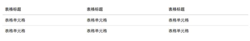
1.基础表格 类名“.table”:后面各种表格都要加上这个类名。
2.斑马线表格 类名“table-striped”
.table-striped > tbody > tr:nth-child(odd) > td,
.table-striped > tbody > tr:nth-child(odd) > th {
background-color: #f9f9f9;
}
3.带边框的表格 类名“.table-bordered”
.table-bordered {
  border: 1px solid #ddd;/*整个表格设置边框*/
}
.table-bordered > thead > tr > th,
.table-bordered > tbody > tr > th,
.table-bordered > tfoot > tr > th,
.table-bordered > thead > tr > td,
.table-bordered > tbody > tr > td,
.table-bordered > tfoot > tr > td {
  border: 1px solid #ddd; /*每个单元格设置边框*/
}
.table-bordered > thead > tr > th,
.table-bordered > thead > tr > td {
  border-bottom-width: 2px;/*表头底部边框*/
}
4.鼠标悬浮高亮的表格 类名“table-hover”
.table-hover > tbody > tr:hover > td,
.table-hover > tbody > tr:hover > th {
background-color: #f5f5f5;
}
5.紧凑型表格 类名“table-condensed”
.table-condensed > thead > tr > th,
.table-condensed > tbody > tr > th,
.table-condensed > tfoot > tr > th,
.table-condensed > thead > tr > td,
.table-condensed > tbody > tr > td,
.table-condensed > tfoot > tr > td {
padding: 5px;
}
6.响应式表格 类名“.table-responsive”:当你的浏览器可视区域小于768px时,表格底部会出现水平滚动条。
Bootstrap提供了一个容器,并且此容器设置类名“.table-responsive”,此容器就具有响应式效果,然后将<table class="table">置于这个容器当中,这样表格也就具有响应式效果

<div class="table-responsive">
<table class="table table-bordered">
   …
</table>
</div>
标签:灰色 primary div ext head 基于 蓝色 处理 特性
原文地址:http://www.cnblogs.com/linjiaxiaomeiainia/p/6932516.html
