标签:条纹 title 边框 content boot image warning 消失 状态
表格是Bootstrap的一个基础组件之一,Bootstrap为表格提供了1种基础样式和4种附加样式以及1个支持响应式的表格。在使用Bootstrap的表格过程中,只需要添加对应的类名就可以得到不同的表格风格,本文将详细介绍Boostrap表格
Boostrap将表格<table>的样式重置如下
table {
    background-color: transparent;
    border-spacing: 0;
    border-collapse: collapse;
}

<table>
  <caption>Optional table caption.</caption>
  <thead>
    <tr>
      <th>#</th>
      <th>First Name</th>
      <th>Last Name</th>
      <th>Username</th>
    </tr>
  </thead>
  <tbody>
    <tr>
      <th scope="row">1</th>
      <td>Mark</td>
      <td>Otto</td>
      <td>@mdo</td>
    </tr>
    <tr>
      <th scope="row">2</th>
      <td>Jacob</td>
      <td>Thornton</td>
      <td>@fat</td>
    </tr>
    <tr>
      <th scope="row">3</th>
      <td>Larry</td>
      <td>the Bird</td>
      <td>@twitter</td>
    </tr>
  </tbody>
</table>
为任意<table>标签添加.table类可以为其赋予基本的样式—少量的内边距(padding)和水平方向的分隔线
<table class="table">
  ...
</table>
通过 .table-striped 类可以给 <tbody> 之内的每一行增加斑马条纹样式
[注意]条纹状表格是依赖 :nth-child CSS 选择器实现的,而这一功能不被IE8-支持
.table-striped > tbody > tr:nth-of-type(odd) {
    background-color: #f9f9f9;
}
<table class="table table-striped">
  ...
</table>
添加 .table-bordered 类为表格和其中的每个单元格增加边框
<table class="table table-bordered">
  ...
</table>
通过添加 .table-hover 类可以让 <tbody> 中的每一行对鼠标悬停状态作出响应
<table class="table table-hover">
  ...
</table>
.table-hover > tbody > tr:hover {
    background-color: #f5f5f5;
}
通过添加 .table-condensed 类可以让表格更加紧凑,单元格中的内补(padding)均会减半
<table class="table table-condensed">
  ...
</table>
通过这些状态类可以为行或单元格设置颜色
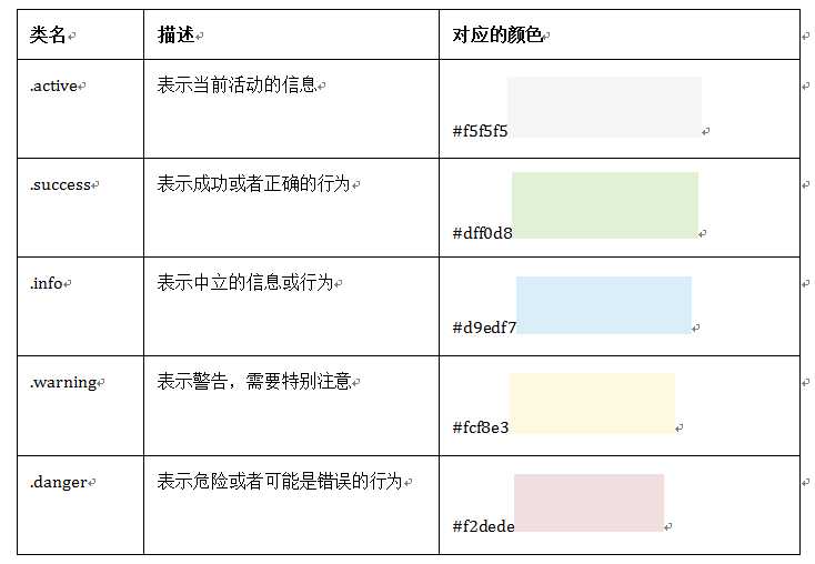
<table class="table">
  <thead>
    <tr>
      <th>#</th>
      <th>Column heading</th>
      <th>Column heading</th>
      <th>Column heading</th>
    </tr>
  </thead>
  <tbody>
    <tr class="active">
      <th scope="row">1</th>
      <td>Column content</td>
      <td>Column content</td>
      <td>Column content</td>
    </tr>
    <tr class="success">
      <th scope="row">2</th>
      <td>Column content</td>
      <td>Column content</td>
      <td>Column content</td>
    </tr>
    <tr class="info">
      <th scope="row">3</th>
      <td>Column content</td>
      <td>Column content</td>
      <td>Column content</td>
    </tr>
    <tr class="warning">
      <th scope="row">4</th>
      <td>Column content</td>
      <td>Column content</td>
      <td>Column content</td>
    </tr>
    <tr class="danger">
      <th scope="row">5</th>
      <td>Column content</td>
      <td>Column content</td>
      <td>Column content</td>
    </tr>
    <tr>
      <th scope="row">6</th>
      <td>Column content</td>
      <td>Column content</td>
      <td>Column content</td>
    </tr>
  </tbody>
</table>
将任何 .table 元素包裹在 .table-responsive 元素内,即可创建响应式表格,其会在小屏幕设备上(小于768px)水平滚动。当屏幕大于 768px 宽度时,水平滚动条消失
<div class="table-responsive">
  <table class="table">
    <thead>
      <tr>
        <th>#</th>
        <th>Table heading</th>
        <th>Table heading</th>
        <th>Table heading</th>
      </tr>
    </thead>
    <tbody>
      <tr>
        <th scope="row">1</th>
        <td>Table cell</td>
        <td>Table cell</td>
        <td>Table cell</td>
      </tr>
      <tr>
        <th scope="row">2</th>
        <td>Table cell</td>
        <td>Table cell</td>
        <td>Table cell</td>
      </tr>
      <tr>
        <th scope="row">3</th>
        <td>Table cell</td>
        <td>Table cell</td>
        <td>Table cell</td>
      </tr>
    </tbody>
  </table>
</div>
标签:条纹 title 边框 content boot image warning 消失 状态
原文地址:http://www.cnblogs.com/zuiai/p/7078476.html