标签:案例 分解 dash 提前 pre 等于 .com 动画 官方
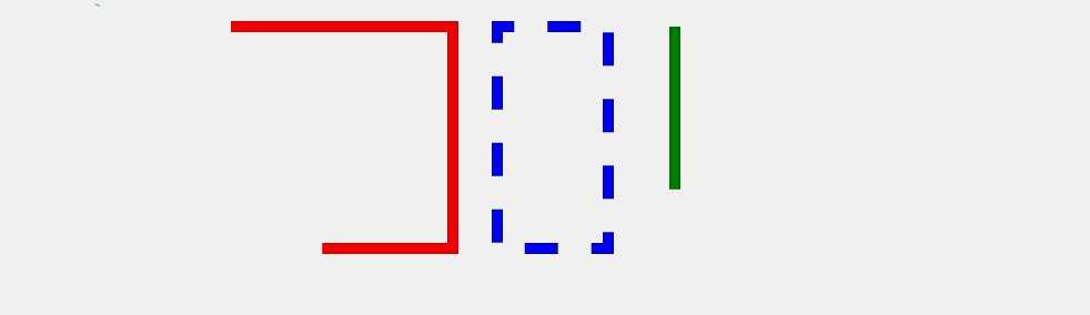
先上个动画图
说道SVG动画不得不提到两个属性:stroke-dasharray(这个前面有提到,做虚线的)stroke-dashoffset (这个是关键)。
先说说stroke-dasharray 之前提过 可以把线条做成虚线状,值可以为一个数值 也可以是一个数组。详见:SVG 学习<二>进阶 SVG世界,视野,视窗 stroke属性 svg分组 最后一段。在动画里 stroke-dasharray 用来绘制路径或者虚线环绕效果。
stroke-dashoffset : 官方解释 svg的偏移
做了几个demo后发现 stroke-dashoffset 类似margin只不过 stroke-dashoffset 的偏移是相对于 图形或线段的第一个点,比如 矩形就是相对于矩形右上角的点,偏移则是相对于svg元素路径的偏移。
案例分解
先看上图的第二个图形(红色矩形)
HTML代码
<rect class="No1" x="220" y="30" width="200" height="200" fill="none" stroke-width="10" stroke="red"/>
css代码
        .No1{
            stroke-dasharray: 900;
              stroke-dashoffset: 900;
              -webkit-animation: dash 5s linear infinite;
              animation: dash 5s linear infinite;
        }
/*动画*/
        @-webkit-keyframes anim { to { stroke-dashoffset: 0; } }
        @keyframes anim { to { stroke-dashoffset: 0; } }
代码解析
stroke-dasharray 的值 大于等于 矩形周长,若等于周长动画完成后动画立刻结束,这里我设置的值比周长多100 动画会在图形绘制结束后几秒后结束,视觉效果会好一些。
stroke-dashoffset 的值 一般等于 矩形周长 ,若大于 矩形周长 动画效果延时出现, 若小于 矩形周长 动画效果提前出现。
第三个蓝色虚线环绕矩形
HTML代码
<rect class="No2" x="460" y="30" width="100" height="200" fill="none" stroke-width="10" stroke="blue"/>
css代码
        .No2{
            stroke-dasharray: 30;
              stroke-dashoffset: 600;
              -webkit-animation: anim 5s linear infinite;
              animation: anim 5s linear infinite;
        }
/*动画*/
        @-webkit-keyframes anim { to { stroke-dashoffset: 0; } }
        @keyframes anim { to { stroke-dashoffset: 0; } }
stroke-dasharray和矩形周长差值成倍数 则形成虚线环绕效果。
标签:案例 分解 dash 提前 pre 等于 .com 动画 官方
原文地址:http://www.cnblogs.com/MirageFox/p/7486042.html