标签:多少 tom 方式 超过 ott sticky 超出 height 自适应大小
Sticky Footer即绝对底部,是一种常用的布局方式,页脚在内容区未超出窗口高度时一直保持在最底部显示,而超过窗口高度时则保持在内容区最底部。
有两种实现方法:
第一种:经典的实现方式
html
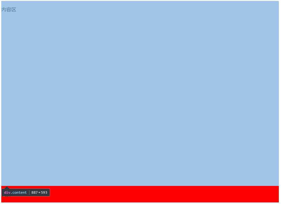
<div class="box">
     <div class="content">
         <p>内容区</p>
     </div>
</div>
<div class="footer">
     <p>页脚</p>
</div>
css:
        html,body{
            height: 100%;
        }
        .box{
            min-height: 100%;  //将footer挤到屏幕最底下
        }
        .content {
            padding-bottom: 60px;
        }
        .footer {
            height: 60px;
            margin-top: -60px;
        }
这种方法需要将内容区包裹在一个外层容器里,将外层容器的最小高度设置为100%,这样不管内容有多少,footer都将被挤在最下面,还有关键的一点就是要为内容区设置一个padding-bottom,这个值需要和footer的height还有margin-top保持一直,这样footer的就可以显示在内容底部。
第二种:flex布局
html:
    <div class="content">
        <p>内容区</p>
    </div>
    <div class="footer">
        <p>页脚</p>
    </div>
css:
        html,body{
            display: flex;
            height: 100%;
            flex-direction: column;
        }
        .content {
            flex: 1;
        }
这种实现方法更加简便,不需要外层包裹层,利用flex的特性,当其值为1的时候会自动分配剩余可用空间,这样只要不为footer设置flex,内容区就将占据处footer的全部空间,而且是自适应大小的,所以不必设置padding和margin。
标签:多少 tom 方式 超过 ott sticky 超出 height 自适应大小
原文地址:http://www.cnblogs.com/cjw-ryh/p/7624191.html