背景:2009年,W3C 提出了一种新的方案----Flex 布局,可以简便、完整、响应式地实现各种页面布局。目前,它已经得到了所有浏览器的支持,这意味着,现在就能很安全地使用这项功能。-- 阮一峰
下面是Flex在各大浏览器的兼容问题:
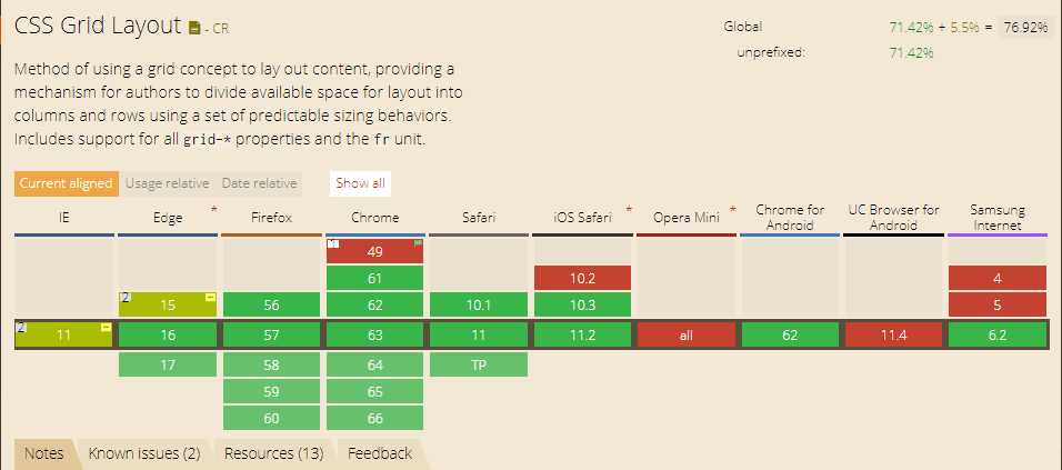
在过去几年里,Flexbox已经成了前端最流行的布局框架,在以后的日常开发里,必须熟练掌握 Flexbox 的用法。然而,前端村儿里面还有个叫Grid的小孩儿横空出世,下面是Grid在各大浏览器的兼容问题:Opera,Uc,IE10 和 IE11 支持带有 -ms 前缀的原始规格,Grid的兼容性确实不太好,不过我相信你以后Grid必定会和Flex互补,主宰css布局。
选择:
Flexbox用来做一维布局,Grid用来做二维布局
意思是如果你只在一个方向上布局(比如在header里面放三个button),你需要使用Flexbox
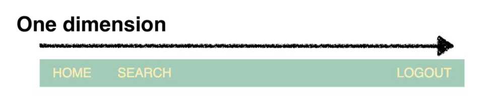
他将会比Grid更加灵活,可以用更少的代码去实现并且更加容易维护。
但是,如果你打算在两个维度上创建一个完整的布局,同时使用行和列,那么你应该使用Grid
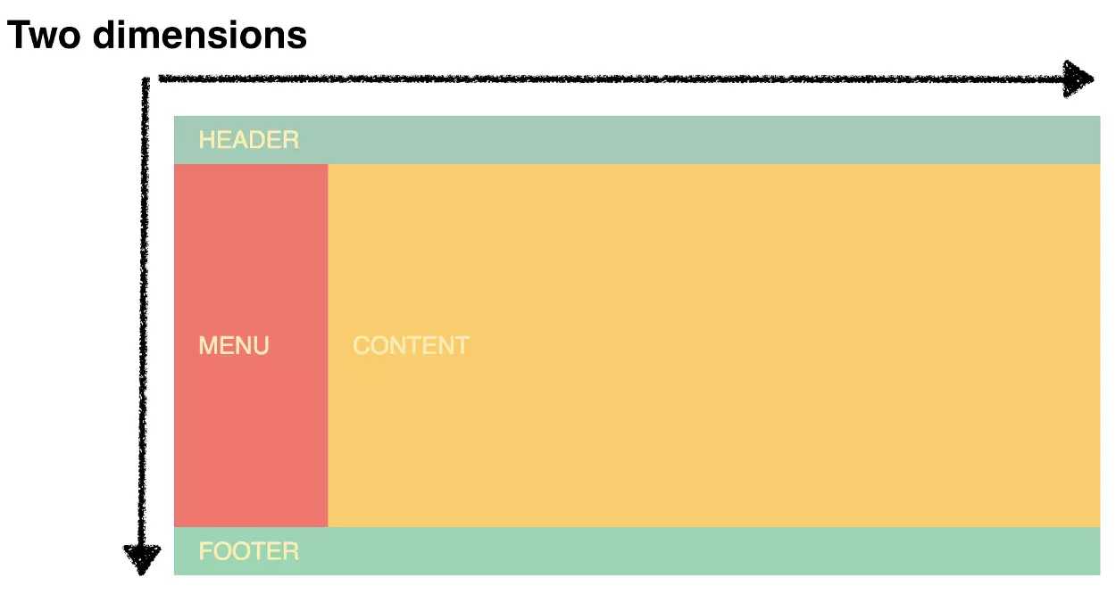
在这种情况下,Grid会更加灵活,并且会使你的标签更简单,代码更容易维护。
你可以结合两者一起使用,在上面的例子中最完美的做法是使用Grid来布局页面,使用Flexbox去对齐header里面的内容。
语法:Flex语法:http://www.ruanyifeng.com/blog/2015/07/flex-grammar.html?utm_source=tuicool
Grid语法:https://www.cnblogs.com/xiaohuochai/p/7083153.html#anchor1
例子:用Flex和Grid两种布局做一个圣杯布局,比较一下。
Flex 布局:
  .content{
        /* background:red; */

        /*
        横向中间内容区自适应,即使未指定宽度,但会分配宽度
        块级元素未主动设置宽度或未被子元素撑起宽度,浏览器默认为块级元素分配宽度为可使用的全部宽度,比如全屏宽。
        */
         /*
        flex:1 == 1 1 auto:剩余空间放大比例(flex-grow)  空间不足缩小比例(flex-shrink)    分配多余空间之前项目占据的主轴空间(flex-basis)
        flex:1指的是:中部区域自由伸缩
        auto指的是项目本来大小,因未给main设置高度,main高度由子元素最高者决定,若子元素高度为0,则main高度为0
        块级元素未主动设置高度或未被子元素撑起高度,浏览器默认为块级元素分配高度为0。
        */
        flex:1;
   }
   .left,.right{
        height:100%;
        background:blue;
        flex:0 0 100px;/* 左右两列固定宽 */
   }
    <header>The Holy Grail Layout with CSS flex</header>
    <div class="main">
        <div class="left">左边</div>
        <div class="content">
             <p>You smart, you loyal, you a genius. Let’s see what Chef Dee got that they don’t want us to eat. I’m up to something. The key to more success is to have a lot of pillows. I told you all this before, when you have a swimming pool, do not use chlorine, use salt water, the healing, salt water is the healing. I’m up to something. Lion! We the best. To be successful you’ve got to work hard, to make history, simple, you’ve got to make it. Hammock talk come soon.</p>
            <p>It’s on you how you want to live your life. Everyone has a choice. I pick my choice, squeaky clean. They don’t want us to eat. Let’s see what Chef Dee got that they don’t want us to eat. The weather is amazing, walk with me through the pathway of more success. Take this journey with me, Lion! The key is to enjoy life, because they don’t want you to enjoy life. I promise you, they don’t want you to jetski, they don’t want you to smile.</p>
           <p>Lorem ipsum dolor sit amet, consectetur adipisicing elit. Beatae earum, unde et! Iste ab deleniti facere et nemo ut ipsa. Placeat ex qui, nulla quaerat! Esse totam aliquam, sed ullam?></p>
        </div>
        <div class="right">右边</div>
    </div>
    <footer>footer</footer>
Grid 布局:
      //先定义每一个模块的名字
      .hg-header { grid-area: header; }
        .hg-footer { grid-area: footer; }
        .hg-main { grid-area: main; }
        .hg-left { grid-area: navigation; }
        .hg-right { grid-area: ads; }

     //定义行列的大小和各个模块摆放的位置
        .hg {
            display: grid;
            grid-template-columns: 150px 1fr 150px;
            grid-template-rows: 100px 1fr 30px;
            grid-template-areas: "header header header"
                        "navigation main ads"
                        "footer footer footer";
            min-height: 100vh;
        }


    //当屏幕宽度小于600px时,改变各个模块的位置
        @media screen and (max-width: 600px) {
            .hg {
                grid-template-areas: "header"
                            "navigation"
                            "main"
                            "ads"
                            "footer";

                grid-template-columns: 100%;
                grid-template-rows: 100px 50px 1fr 50px 30px;
            }
        }
<body class="hg">
        <header class="hg-header">The Holy Grail Layout with CSS Grid</header>
         <main class="hg-main">
            <p>You smart, you loyal, you a genius. Let’s see what Chef Dee got that they don’t want us to eat. I’m up to something. The key to more success is to have a lot of pillows. I told you all this before, when you have a swimming pool, do not use chlorine, use salt water, the healing, salt water is the healing. I’m up to something. Lion! We the best. To be successful you’ve got to work hard, to make history, simple, you’ve got to make it. Hammock talk come soon.</p>
            <p>It’s on you how you want to live your life. Everyone has a choice. I pick my choice, squeaky clean. They don’t want us to eat. Let’s see what Chef Dee got that they don’t want us to eat. The weather is amazing, walk with me through the pathway of more success. Take this journey with me, Lion! The key is to enjoy life, because they don’t want you to enjoy life. I promise you, they don’t want you to jetski, they don’t want you to smile.</p>
           <p>Lorem ipsum dolor sit amet, consectetur adipisicing elit. Beatae earum, unde et! Iste ab deleniti facere et nemo ut ipsa. Placeat ex qui, nulla quaerat! Esse totam aliquam, sed ullam?></p>
         </main>
          <aside class="hg-left">Menu</aside>
          <aside class="hg-right">Ads</aside>
          <footer class="hg-footer">Footer</footer>

</body>
注: 做着demo的时候突然想起了 cacl() 是不是也可以做圣杯布局,而且很简单。
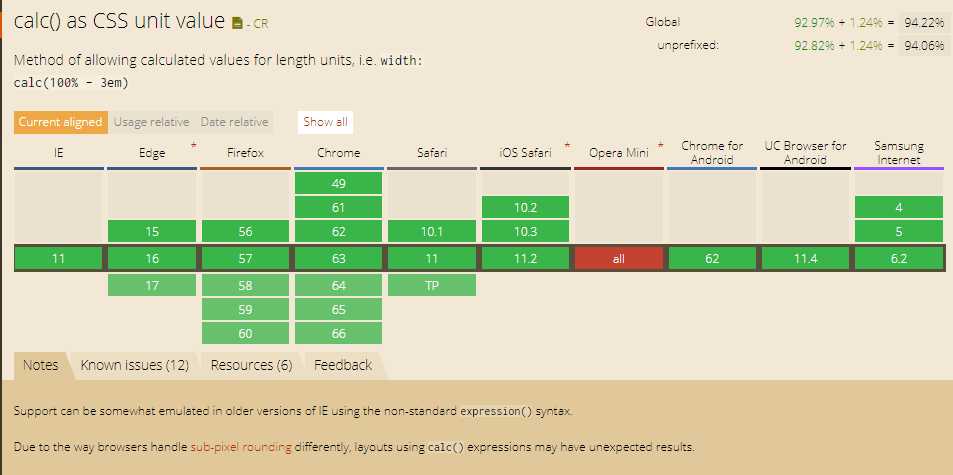
何为cacl():calc()从字面我们可以把他理解为一个函数function。其实calc是英文单词calculate(计算)的缩写,是css3的一个新增的功能,用来指定元素的长度。比如说,你可以使用calc()给元素的border、margin、pading、font-size和width等属性设置动态值。例如:width: calc(100% - 200px);
兼容性:感觉各大浏览器对cacl()的兼容性还好,但需要在其前面加上各浏览器厂商的识别符。只有在Opera上不友好。
识别符://-ms代表【ie】内核识别码
//-moz代表火狐【firefox】内核识别码
//-webkit代表谷歌【chrome】/苹果【safari】内核识别码
//-o代表欧朋【opera】内核识别码
        <div class="parent">
                <div class="left w200">左边</div>
                <div class="center">中间</div>
                <div class="right w200">右边</div>
        </div>


      <style>
        .w200{
            width: 100px;
            height: 500px;
            background-color: green;
        }
        .parent{
            display: flex;
            flex-direction: row;
            width: 100%;
        }
        .center{
            width:-webkit-calc(100% - 200px);
            height: 500px;
        }
    </style>
查阅资料: