参考教程《Flex布局完全教程》
Flexbox 布局(也叫Flex布局,弹性盒子布局)模块目标在于提供一个更有效地布局、对齐方式,并且能够使父元素在子元素的大小未知或动态变化情况下仍然能够分配好子元素之间的间隙。
Flex布局是一个完整的模块而不是一个单独的属性,它包括了完整的一套属性。其中有的属性是设置在容器(container,也可以叫做父元素,称为flex container)上,有的则是设置在容器的项目上(item,也可以叫做子元素,称为flex items)上。
Flex布局有一个主轴,以及和主轴垂直的交叉轴,主轴默认是水平从左至右的。
一、container的属性
通过 display:flex 定义一个flex布局父容器, display:inline-flex 则父元素为行内元素。
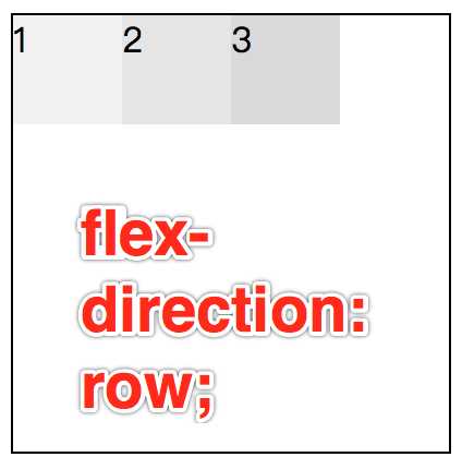
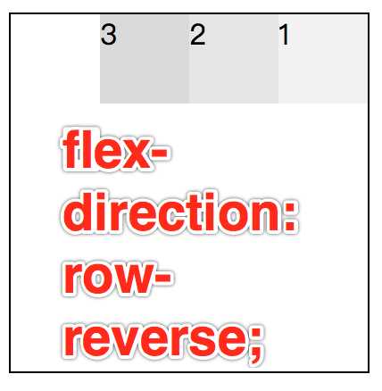
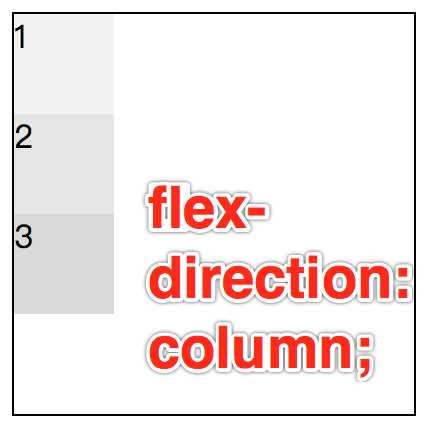
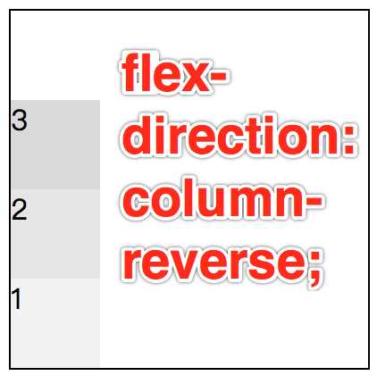
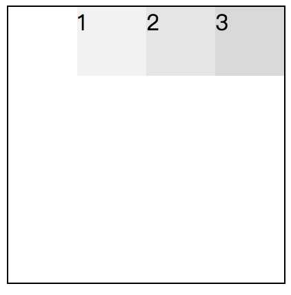
1. flex-direction
flex-direction定义flex布局的主轴方向。flex布局是单方向布局,子元素主要沿着水平行或者垂直列布局。
.container {
  flex-direction: row | row-reverse | column | column-reverse; /* default row */
}
测试一下效果:
<!DOCTYPE HTML>
<html>
  <head>
    <meta http-equiv="Content-Type" content="text/html; charset=utf-8">
    <title></title>
    <style media="screen">
        .box-wrapper {
            display: flex;
            flex-direction: row; /* 默认值为row,加不加这句效果相同 */
            width: 200px;
            height: 200px;
            border: 1px solid;
        }
        .box {
            width: 50px;
            height: 50px;
        }
        .box1 {
            background-color: rgba(0,0,0,0.05);
        }
        .box2 {
            background-color: rgba(0,0,0,0.10);
        }
        .box3 {
            background-color: rgba(0,0,0,0.15);
        }
    </style>
  </head>

  <body>
      <div class="box-wrapper">
          <div class="box box1">1</div>
          <div class="box box2">2</div>
          <div class="box box3">3</div>
      </div>
  </body>
</html>
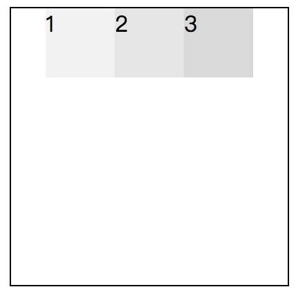
2. flex-wrap
.container{
  flex-wrap: nowrap | wrap | wrap-reverse; /* default nowrap */
}
接下来我想试一下如果一行放不下是怎么换行的


<!DOCTYPE HTML>
<html>
  <head>
    <meta http-equiv="Content-Type" content="text/html; charset=utf-8">
    <title></title>
    <style media="screen">
        .box-wrapper {
            display: flex;
            flex-direction: column-reverse;
            width: 200px;
            height: 200px;
            border: 1px solid;
            /* flex-wrap: nowrap; 默认值 加不加效果相同  */
        }
        .box {
            width: 50px;
            height: 50px;
        }
        .box:nth-child(3n+1) {
            background-color: rgba(0,0,0,0.05);
        }
        .box:nth-child(3n+2) {
            background-color: rgba(0,0,0,0.10);
        }
        .box:nth-child(3n+3) {
            background-color: rgba(0,0,0,0.15);
        }
    </style>
  </head>

  <body>
      <div class="box-wrapper">
          <div class="box box1">1</div>
          <div class="box box2">2</div>
          <div class="box box3">3</div>
          <div class="box box4">4</div>
          <div class="box box5">5</div>
          <div class="box box6">6</div>
      </div>
  </body>
</html>
结果……
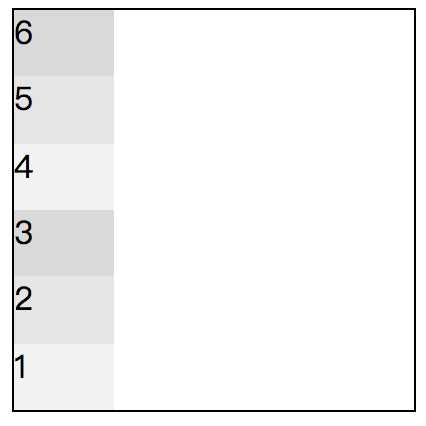
没换行,挤得都变形了……
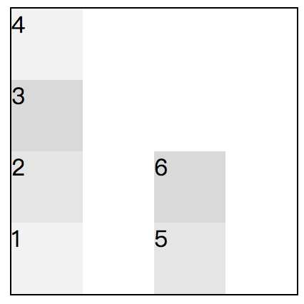
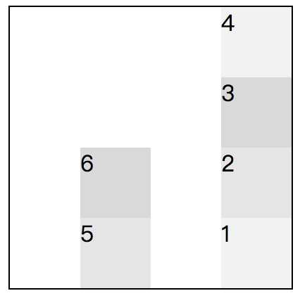
flex-wrap 默认值是 nowrap ,不换行,改变一下,以下是 flex-wrap: wrap; 和 flex-wrap: wrap-reverse; 的效果。
3. flex-flow
flex-flow属性是flex-direction属性和flex-wrap属性的简写形式,默认值为row nowrap。
.box {
  flex-flow: <flex-direction> || <flex-wrap>;
}
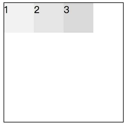
4. justify-content
justify-content 属性定义了浏览器如何分配顺着父容器主轴的弹性元素之间及其周围的空间。
.container {
  justify-content: flex-start | flex-end | center | space-between | space-around; /* default flex-start */
}
默认是 justify-content:flex-start;
.box-wrapper {
    display: flex;
    width: 200px;
    height: 200px;
    border: 1px solid;
    flex-wrap: wrap;
    justify-content: flex-start;
}
分别测试 flex-end center space-around space-between
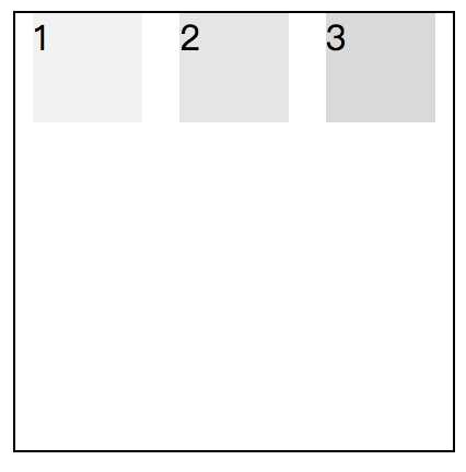
其中space-around能看出来,两边的空白是中间方块间隙的一半。
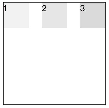
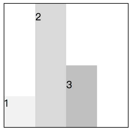
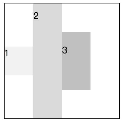
5. align-items属性
.container {
  align-items: flex-start | flex-end | center | baseline | stretch; /* default flex-start */
}
align-items属性定义项目在交叉轴上如何对齐。
<!DOCTYPE HTML>
<html>
  <head>
    <meta http-equiv="Content-Type" content="text/html; charset=utf-8">
    <title></title>
    <style>
        .box-wrapper {
            display: flex;
            width: 200px;
            height: 200px;
            border: 1px solid;
            flex-wrap: wrap;
            align-items: stretch; /* 默认值 */
        }
        .box {
            width: 50px;
            box-sizing: border-box;
        }
        .box1 {
            background-color: rgba(0,0,0,0.05);
            height: 50px;
        }
        .box2 {
            background-color: rgba(0,0,0,0.15);
            height: 200px;
            padding-top: 10px;
        }
        .box3 {
            background-color: rgba(0,0,0,0.25);
            height: 100px;
            padding-top: 20px;
        }
    </style>
  </head>

  <body>
      <div class="box-wrapper">
          <div class="box box1">1</div>
          <div class="box box2">2</div>
          <div class="box box3">3</div>
      </div>
  </body>
</html>
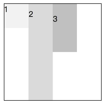
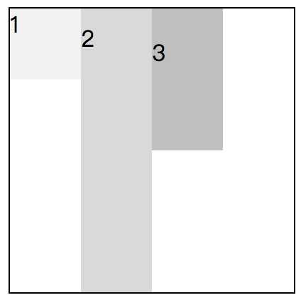
stretch(默认值):如果项目未设置高度或设为auto,将占满整个容器的高度。
flex-start:交叉轴的起点对齐。
flex-end:交叉轴的终点对齐。
center:交叉轴的中点对齐。
baseline: 项目的第一行文字的基线对齐。
6. align-content属性定义了多根轴线的对齐方式。如果项目只有一根轴线,该属性不起作用。(????看不懂,以后再说)
二、item的属性
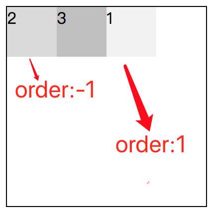
1. order
格式: order: <integer> order的默认值为0,子元素的order值越小,布局越排在前面
<!DOCTYPE HTML>
<html>
  <head>
    <meta http-equiv="Content-Type" content="text/html; charset=utf-8">
    <title></title>
    <style>
        .box-wrapper {
            display: flex;
            width: 200px;
            height: 200px;
            border: 1px solid;        }
        .box {
            width: 50px;
            height: 50px;        }
        .box1 {
            background-color: rgba(0,0,0,0.05);
            order: 1;
        }
        .box2 {
            background-color: rgba(0,0,0,0.15);
            order: -1;
        }
        .box3 {
            background-color: rgba(0,0,0,0.25);
        }
    </style>
  </head>

  <body>
      <div class="box-wrapper">
          <div class="box box1">1</div>
          <div class="box box2">2</div>
          <div class="box box3">3</div>
      </div>
  </body>
</html>
2. flex-grow
flex-grow规定在空间允许的情况下,子元素如何按照比例分配可用剩余空间。如果所有的子元素的属性都设定为1,则父元素中的剩余空间会等分给所有子元素。如果其中某个子元素的flex-grow设定为2,则在分配剩余空间时该子元素将获得其他元素二倍的空间(至少会尽力获得)。默认值为0,意味着即使有剩余空间,各子元素也不会放大。
.box1 {
    background-color: rgba(0,0,0,0.05);
    width: 50px;
    flex-grow: 1;
}
.box2 {
    background-color: rgba(0,0,0,0.15);
    width: 20px;
    flex-grow: 1;

}
.box3 {
    background-color: rgba(0,0,0,0.25);
    width: 10px;
    flex-grow: 1;
}
剩余宽度为 200 - (50+20+10) = 120px
剩余宽度被4分 一份为30px
这样三个方块宽度分别为 (50+30) (20+60) (10+30)
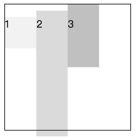
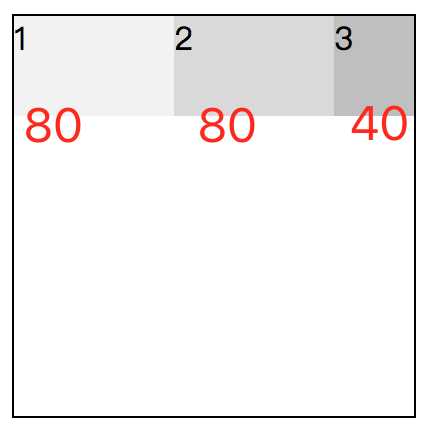
3. flex-shrink
与flex-grow属性类似,flex-shrink定义了空间不足时项目的缩小比例。flex-shrink不接受负值。flex-shrink默认值为1, 当所有子元素都为默认值时,则空间不足时子元素会同比例缩小。如果其中某个子元素的flex-shrink值为0,则空间不足时该子元素并不会缩小。如果其中某个子元素的flex-shrink值为2时,则空间不足时该子元素会以二倍速度缩小。
.box {
    height: 50px;
    width: 100px;
}
.box1 {
    background-color: rgba(0,0,0,0.05);
    flex-shrink: 1;
}
.box2 {
    background-color: rgba(0,0,0,0.15);
    flex-shrink: 1;

}
.box3 {
    background-color: rgba(0,0,0,0.25);
    flex-shrink: 3;
}
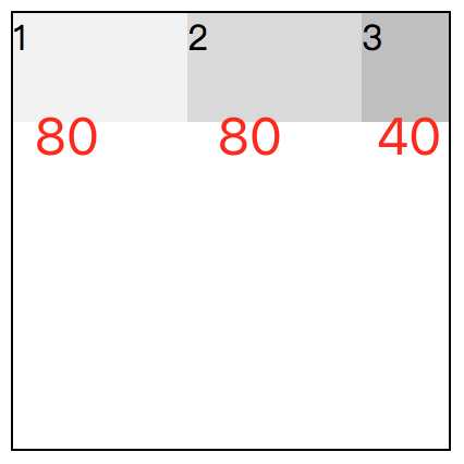
超出宽度:80+80+40 - 200 = 100px
一共分为 1+1+3=5份 一份 20px
三个方块分别为 100-20、100-20、100-20*3
4. flex-basis
emmmm……没看懂……有什么意义,和width有什么区别。
flex-basis定义了在计算剩余空间之前子元素默认的大小。可以设置为某个长度(e.g. 20%, 5rem, etc.)或者关键字。关键字auto意味着子元素会按照其本来的大小显示。关键字content意味着根据内容来确定大小——这个关键字到目前没有被很好地支持,所以测试起来比较困难,与content的类似的关键字还有max-content, min-content, fit-content。
如果设置为0, 则子元素内容周围的空隙不会根据flex-grow按比例分配,如果设置为auto,则子元素周围额外的空袭会根据flex-grow按照比例分配。
.item {
  flex-basis: <length> | auto; /* default auto */
}
5. flex
flex是flex-grow、flex-shrink、flex-basis三个属性的缩写。其中第二个和第三个参数(flex-grow,flex-basis)是可选的。默认值为0 1 auto。
.item {
  flex: none | [ <‘flex-grow‘> <‘flex-shrink‘>? || <‘flex-basis‘> ]
}
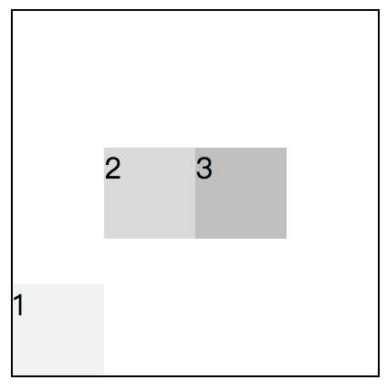
<style>
        .box-wrapper {
            display: flex;
            width: 200px;
            height: 200px;
            border: 1px solid;
            align-items: center;
        }
        .box {
            height: 50px;
            width: 50px;
        }
        .box1 {
            background-color: rgba(0,0,0,0.05);
            align-self: flex-end;
        }
        .box2 {
            background-color: rgba(0,0,0,0.15);
        }
        .box3 {
            background-color: rgba(0,0,0,0.25);
        }
    </style>
6. align-self
通过设置某个子元素的align-self属性,可以覆盖align-items所设置的对齐方式。属性值与align-items中的意义相同,不再赘述。
.item {
  align-self: auto | flex-start | flex-end | center | baseline | stretch;
}
<style>
    .box-wrapper {
        display: flex;
        width: 200px;
        height: 200px;
        border: 1px solid;
        align-items: center;
    }
    .box {
        height: 50px;
        width: 50px;
    }
    .box1 {
        background-color: rgba(0,0,0,0.05);
        align-self: flex-end;
    }
    .box2 {
        background-color: rgba(0,0,0,0.15);
    }
    .box3 {
        background-color: rgba(0,0,0,0.25);
    }
</style>
具体用到了在补充笔记吧。