标签:平移 osi pos ota ora img otto 角度 auto
效果图
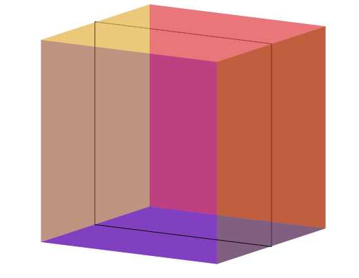
主要用到的3D属性
1、保留子元素的3d属性:transform-style:preserve-3d;
2、2D变形属性:
①transform:translate()平移,分X轴,Y轴,Z轴3个方向;单位是像素
②transform:rotate()旋转,分X轴,Y轴,Z轴3个方向;单位是deg角度
③transform:scale()缩放,0~1表示缩小倍数,1~正无穷表示放大倍数(本案例没有用到)
④transform:skew()斜切,两个参数:水平斜切,垂直斜切;单位deg角度(本案例没有用到)
注意:同一个元素多个变形属性用空格隔开,不能写多个transform;
3D立方体:
<!DOCTYPE html>
<html lang="en">
<head>
    <meta charset="UTF-8">
    <title>Document</title>
    <style type="text/css">
        * {
            margin: 0;
            padding: 0;
        }
        .box {
            width: 300px;
            height: 300px;
            border: 1px solid #000;
            margin: 100px auto;
            position: relative;
            transform-style: preserve-3d;
            transform: rotateX(10deg) rotateY(30deg);
            animation: move 2s ease 0s infinite;
        }
        .box div {
            position: absolute;
            top: 0;
            left: 0;
            opacity: .5;
        }
        .front {
            width: 300px;
            height: 300px;
            background-color: red;
            transform:translateZ(150px);
        }
        .back {
            width: 300px;
            height: 300px;
            background-color: blue;
            transform: translateZ(-150px);
        }
        .left {
            width: 300px;
            height: 300px;
            background-color: orange;
            transform: rotateY(90deg) translateZ(-150px);
        }
         .right {
            width: 300px;
            height: 300px;
            background-color: green;
            transform: rotateY(90deg) translateZ(150px);
        }
        .top {
            width: 300px;
            height: 300px;
            background-color: lightblue;
            transform: rotateX(90deg) translateZ(150px);
        }
        .bottom {
            width: 300px;
            height: 300px;
            background-color: purple;
            transform: rotateX(90deg) translateZ(-150px);
        }
        @keyframes move {
            from{
                transform: rotateX(10deg) rotateY(30deg);
            }
            to{
                transform: rotateX(370deg) rotateY(390deg);
            }
        }
     </style>
</head>
<body>
    <div class="box">
        <div class="front"></div>
        <div class="back"></div>
        <div class="left"></div>
        <div class="right"></div>
        <div class="top"></div>
        <div class="bottom"></div>
    </div>
</body>
</html>
标签:平移 osi pos ota ora img otto 角度 auto
原文地址:https://www.cnblogs.com/zjp-/p/9149835.html