标签:port 显示 content lib tle 根据 页面 round doctype
官网: www.bootcss.com
bootstrap 响应式的: 根据浏览器的放大缩小,内容也跟着放大缩小
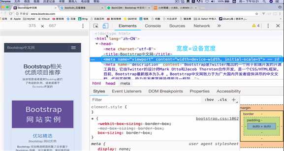
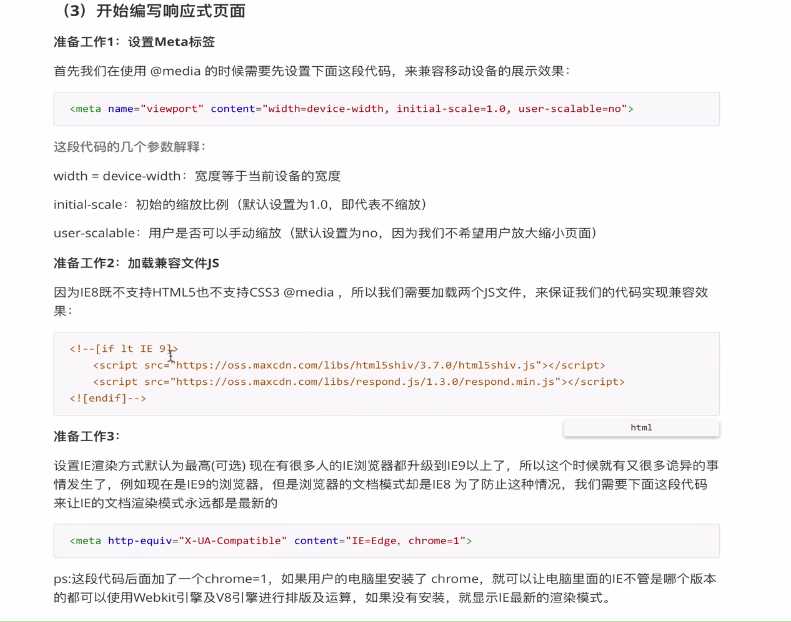
需要添加:html的head中添加meta name="viewport" content="width=device-width, initial-scale=1"
@media媒体查询
一套页面适用于pc,手机,平板设备
但需要写多套css
准备工作3点:
<!DOCTYPE html>
<html>
	<head>
		<meta charset="UTF-8">
		<title></title>
		<!--使用@media  必须做以下操作-->
		<meta name="viewport" content="width=device-width,initial-scale=1,minimum-scale=1,maximum-scale=1,user-scalable=no" />
		<!--  去掉注释
		[if lt IE 9]>
		<script src="https://oss.maxcdn.com/libs/html5shiv/3.7.0/html5shiv.js"></script>
		<script scr="https://oss.maxcdn.com/libs/respond.js/1.3.0/respond.min.js"></script>
		<![endif]
		-->
		<meta http-equiv="X-UA-Compatible" content="IE=Edge, chrome=1">
		<style type="text/css">
			*{padding: 0;margin: 0;}


			@media  screen and (max-width:500px ) {
				.box{
					width: 200px;
					height: 300px;
					background: yellow;
				}

			}


			/*300px ~600px之间显示的样式*/
			@media  screen and (min-width: 500px) and (max-width: 800px) {

				.box{
					width: 200px;
					height: 300px;
					background: red;
				}

			}

			@media  screen and (min-width:800px ) {
				.box{
					width: 200px;
					height: 300px;
					background: green;
				}

			}
		</style>
	</head>
	<body>
		<div class="box">

		</div>
	</body>


</html>
标签:port 显示 content lib tle 根据 页面 round doctype
原文地址:https://www.cnblogs.com/beallaliu/p/9718828.html