标签:depend ons ati osi cer height https orb method
坐标轴的操作
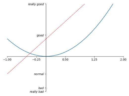
import matplotlib.pyplot as plt
import numpy as np

x = np.linspace(-3, 3, 50)
y1 = 2*x + 1
y2 = x**2

plt.figure()
plt.plot(x, y2)
# plot the second curve in this figure with certain parameters
plt.plot(x, y1, color=‘red‘, linewidth=1.0, linestyle=‘--‘)
# set x limits
plt.xlim((-1, 2))
plt.ylim((-2, 3))

# set new ticks
new_ticks = np.linspace(-1, 2, 5)
plt.xticks(new_ticks)
# set tick labels
plt.yticks([-2, -1.8, -1, 1.22, 3],
           [‘$really\ bad$‘, ‘$bad$‘, ‘$normal$‘, ‘$good$‘, ‘$really\ good$‘])
# to use ‘$ $‘ for math text and nice looking, e.g. ‘$\pi$‘

# gca = ‘get current axis‘
ax = plt.gca()
ax.spines[‘right‘].set_color(‘none‘)    #让右边的轴消失
ax.spines[‘top‘].set_color(‘none‘)    #让上边的轴消失

ax.xaxis.set_ticks_position(‘bottom‘)    #设置x轴是底下的轴 其实默认也是bottom
# ACCEPTS: [ ‘top‘ | ‘bottom‘ | ‘both‘ | ‘default‘ | ‘none‘ ]

ax.spines[‘bottom‘].set_position((‘data‘, 0))    #设置位置,当数据的值是0
# the 1st is in ‘outward‘ | ‘axes‘ | ‘data‘
# axes: percentage of y axis
# data: depend on y data

ax.yaxis.set_ticks_position(‘left‘)
# ACCEPTS: [ ‘left‘ | ‘right‘ | ‘both‘ | ‘default‘ | ‘none‘ ]

ax.spines[‘left‘].set_position((‘data‘,0))
plt.show()
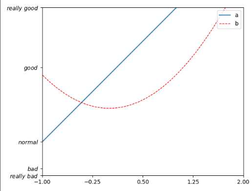
legend图例
import matplotlib.pyplot as plt
import numpy as np

x = np.linspace(-3, 3, 50)
y1 = 2*x + 1
y2 = x**2

plt.figure()
# set x limits
plt.xlim((-1, 2))
plt.ylim((-2, 3))

# set new sticks
new_sticks = np.linspace(-1, 2, 5)
plt.xticks(new_sticks)
# set tick labels
plt.yticks([-2, -1.8, -1, 1.22, 3],
           [r‘$really\ bad$‘, r‘$bad$‘, r‘$normal$‘, r‘$good$‘, r‘$really\ good$‘])

l1, = plt.plot(x, y1, label=‘linear line‘)        #在plot的时候标记上label
l2, = plt.plot(x, y2, color=‘red‘, linewidth=1.0, linestyle=‘--‘, label=‘square line‘) #在plot的时候标记上label

plt.legend(loc=‘upper right‘)
# plt.legend(handles=[l1, l2], labels=[‘up‘, ‘down‘],  loc=‘best‘)    如果传入handles参数,就只会legend handles中的线,labels属性是曲线的名称
# the "," is very important in here l1, = plt... and l2, = plt... for this step
"""legend( handles=(line1, line2, line3),
           labels=(‘label1‘, ‘label2‘, ‘label3‘),
           ‘upper right‘)
    The *loc* location codes are::
          ‘best‘ : 0,          (currently not supported for figure legends)
          ‘upper right‘  : 1,
          ‘upper left‘   : 2,
          ‘lower left‘   : 3,
          ‘lower right‘  : 4,
          ‘right‘        : 5,
          ‘center left‘  : 6,
          ‘center right‘ : 7,
          ‘lower center‘ : 8,
          ‘upper center‘ : 9,
          ‘center‘       : 10,"""

plt.show()
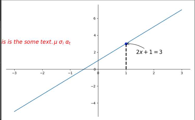
annotation标注
# View more python tutorials on my Youtube and Youku channel!!!

# Youtube video tutorial: https://www.youtube.com/channel/UCdyjiB5H8Pu7aDTNVXTTpcg
# Youku video tutorial: http://i.youku.com/pythontutorial

# 8 - annotation
"""
Please note, this script is for python3+.
If you are using python2+, please modify it accordingly.
Tutorial reference:
http://www.scipy-lectures.org/intro/matplotlib/matplotlib.html
Mathematical expressions:
http://matplotlib.org/users/mathtext.html#mathtext-tutorial
"""

import matplotlib.pyplot as plt
import numpy as np

x = np.linspace(-3, 3, 50)
y = 2*x + 1

plt.figure(num=1, figsize=(8, 5),)
plt.plot(x, y,)

ax = plt.gca()
ax.spines[‘right‘].set_color(‘none‘)
ax.spines[‘top‘].set_color(‘none‘)
ax.spines[‘top‘].set_color(‘none‘)
ax.xaxis.set_ticks_position(‘bottom‘)
ax.spines[‘bottom‘].set_position((‘data‘, 0))
ax.yaxis.set_ticks_position(‘left‘)
ax.spines[‘left‘].set_position((‘data‘, 0))

x0 = 1        #x坐标
y0 = 2*x0 + 1    #坐标
plt.plot([x0, x0,], [0, y0,], ‘k--‘, linewidth=2.5)     #画出虚线 颜色是‘k‘即black linewidth 是宽度
plt.scatter([x0, ], [y0, ], s=50, color=‘b‘)        #显示点

# method 1:annotation
#####################
plt.annotate(r‘$2x+1=%s$‘ % y0, xy=(x0, y0), xycoords=‘data‘, xytext=(+30, -30),
             textcoords=‘offset points‘, fontsize=16,
             arrowprops=dict(arrowstyle=‘->‘, connectionstyle="arc3,rad=.2"))
#xy是从哪个位置开始 xycoords     以data的值作为基准 xytext是x加30,y减去30  arrowprops是箭头
# method 2:text
########################
plt.text(-3.7, 3, r‘$This\ is\ the\ some\ text. \mu\ \sigma_i\ \alpha_t$‘,
         fontdict={‘size‘: 16, ‘color‘: ‘r‘})
#text(位置,)
plt.show()
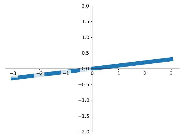
tick能见度:
主要是为了防止tick被线遮挡住
import matplotlib.pyplot as plt
import numpy as np

x = np.linspace(-3, 3, 50)
y = 0.1*x

plt.figure()
plt.plot(x, y, linewidth=10, zorder=1)      # set zorder for ordering the plot in plt 2.0.2 or higher
plt.ylim(-2, 2)
ax = plt.gca()
ax.spines[‘right‘].set_color(‘none‘)
ax.spines[‘top‘].set_color(‘none‘)
ax.spines[‘top‘].set_color(‘none‘)
ax.xaxis.set_ticks_position(‘bottom‘)
ax.spines[‘bottom‘].set_position((‘data‘, 0))
ax.yaxis.set_ticks_position(‘left‘)
ax.spines[‘left‘].set_position((‘data‘, 0))


for label in ax.get_xticklabels() + ax.get_yticklabels():
    label.set_fontsize(12)
    # set zorder for ordering the plot in plt 2.0.2 or higher
    label.set_bbox(dict(facecolor=‘white‘, edgecolor=‘none‘, alpha=0.8, zorder=2))
plt.show()
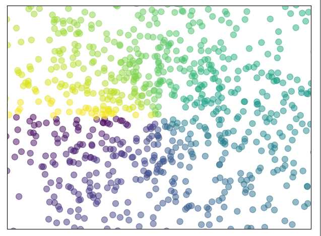
scatter散点图
import matplotlib.pyplot as plt
import numpy as np

n = 1024    # data size
X = np.random.normal(0, 1, n)
Y = np.random.normal(0, 1, n)
T = np.arctan2(Y, X)    # 为了每个点的颜色

plt.scatter(X, Y, s=75, c=T, alpha=.5)

plt.xlim(-1.5, 1.5)
plt.xticks(())  # ignore xticks
plt.ylim(-1.5, 1.5)
plt.yticks(())  # ignore yticks

plt.show()
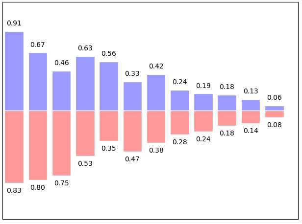
bar柱状图
import matplotlib.pyplot as plt
import numpy as np

n = 12
X = np.arange(n)
Y1 = (1 - X / float(n)) * np.random.uniform(0.5, 1.0, n)
Y2 = (1 - X / float(n)) * np.random.uniform(0.5, 1.0, n)

plt.bar(X, +Y1, facecolor=‘#9999ff‘, edgecolor=‘white‘)
plt.bar(X, -Y2, facecolor=‘#ff9999‘, edgecolor=‘white‘)

for x, y in zip(X, Y1):
    # ha: horizontal alignment
    # va: vertical alignment
    plt.text(x , y + 0.05, ‘%.2f‘ % y, ha=‘center‘, va=‘bottom‘)

for x, y in zip(X, Y2):
    # ha: horizontal alignment
    # va: vertical alignment
    plt.text(x , -y - 0.05, ‘%.2f‘ % y, ha=‘center‘, va=‘top‘)

plt.xlim(-.5, n)
plt.xticks(())
plt.ylim(-1.25, 1.25)
plt.yticks(())

plt.show()
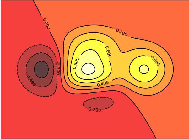
contour 等高线
import matplotlib.pyplot as plt
import numpy as np


def f(x, y):         #定义高度函数
    # the height function
    return (1 - x / 2 + x ** 5 + y ** 3) * np.exp(-x ** 2 - y ** 2)


n = 256
x = np.linspace(-3, 3, n)
y = np.linspace(-3, 3, n)
X, Y = np.meshgrid(x, y)

# use plt.contourf to filling contours
# X, Y and value for (X,Y) point
plt.contourf(X, Y, f(X, Y), 8, alpha=.75, cmap=plt.cm.hot) #填充颜色
                        #数字8代表的意思是分成几块 alpha是不透明度 cmap是颜色对应图

# use plt.contour to add contour lines 画等高线的线
C = plt.contour(X, Y, f(X, Y), 8, colors=‘black‘, linewidth=.5)
# adding label  等高线线的数值添加
plt.clabel(C, inline=True, fontsize=10)
                 #画在线里面
plt.xticks(())
plt.yticks(())
plt.show()
img图像 (数值色块 热力图)
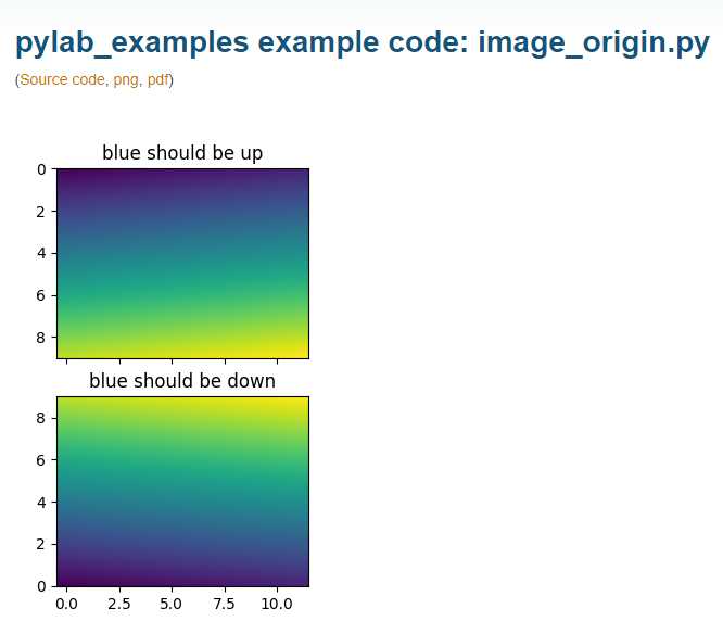
import matplotlib.pyplot as plt
import numpy as np

# image data
a = np.array([0.313660827978, 0.365348418405, 0.423733120134,
              0.365348418405, 0.439599930621, 0.525083754405,
              0.423733120134, 0.525083754405, 0.651536351379]).reshape(3,3)

"""
for the value of "interpolation", check this:
http://matplotlib.org/examples/images_contours_and_fields/interpolation_methods.html
for the value of "origin"= [‘upper‘, ‘lower‘], check this:
http://matplotlib.org/examples/pylab_examples/image_origin.html
"""
plt.imshow(a, interpolation=‘nearest‘, cmap=‘hot‘, origin=‘lower‘)
                                                  #origin大致是色块的整体方向左上角是值最小的还是最大的

plt.colorbar(shrink=0.9)    #colorbar ,这边我们压缩成百分之90

plt.xticks(())
plt.yticks(())
plt.show()
interpolation参数: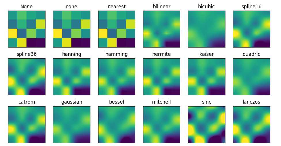
origin参数
标签:depend ons ati osi cer height https orb method
原文地址:https://www.cnblogs.com/francischeng/p/9742270.html