标签:方式 条目 网格 显示 display margin css oom box
浮动布局:
dom文档
<div class="container">
        <div class="wrap clearfix">
            <div class="box1"></div>
            <div class="box2"></div>
        </div>
 </div>
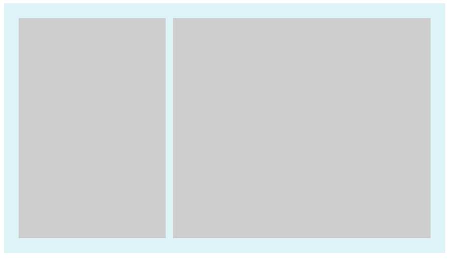
1:
固定布局:
实现如图
样式:
<style>
.container{
    width: 600px;
    background-color: #DDF3F7;
}
.wrap{
    padding:20px;
    overflow: hidden;
}
.box1{
     float: left;
     width: 200px;
     height:300px;
     background-color: #ccc;
}
.box2{
     float: right;
     width: 350px;
     height:300px;
     background-color: #ccc;
}

.clearfix:after{
    clear: both;
    display:table;

}
</style>
关键点:box1 和box2设置固定width,浮动,
2:流体布局
<style>
.container{
    width: 600px;
    background-color: #DDF3F7;
}
.wrap{
    padding:20px;
    overflow: hidden;
}
.box1{
     float: left;
     width: 200px;
     height:300px;
     background-color: #ccc;
}
.box2{

     margin-left:220px;
     height:300px;
     background-color: #ccc;
}

.clearfix:after{
    clear: both;
    display:table;

}
 .clearfix{
     *zoom:1;
 }

</style>
和固定布局对比:
box1 float left 设置width
box2: marign-left 为box1.width (效果和固定效果一样,不截图了)
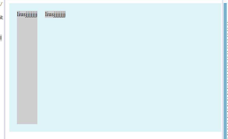
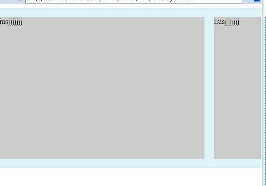
3:浮动与两侧皆自适应的流体布局
样式
<style>
.container{
    width: 600px;
    background-color: #DDF3F7;
}
.wrap{
    padding:20px;
    overflow: hidden;
}
.box1{
     float: left;
     margin-right:20px;
     height:300px;
     background-color: #ccc;
}
.box2{
     display:table-cell;
     width:auto;
     height:300px;
     background-color: #ccc;
}

.clearfix:after{
    content:‘‘;
    clear: both;
    display:table;

}
 .clearfix{
     *zoom:1;
 }

</style>
注意点:1、box1 float left
2、margin-right:某px;
box2 width auto, display:table-cell;
3、 box1和box2 必须有内容。
效果如图
4.右浮动,改变dom位置的流体布局:
样式:
<style>
.container{
    width: 600px;
    background-color: #DDF3F7;
}
.wrap{
    padding:20px;
    overflow: hidden;
}
.box1{
     float: right;
     width:100px;
     height:300px;
     background-color: #ccc;
}
.box2{
     margin-right:120px;
     height:300px;
     background-color: #ccc;
}

.clearfix:after{
    content:‘‘;
    clear: both;
    display:table;

}
 .clearfix{
     *zoom:1;
 }

</style>
box1设置width float right
box2 margin-right:box1.width;
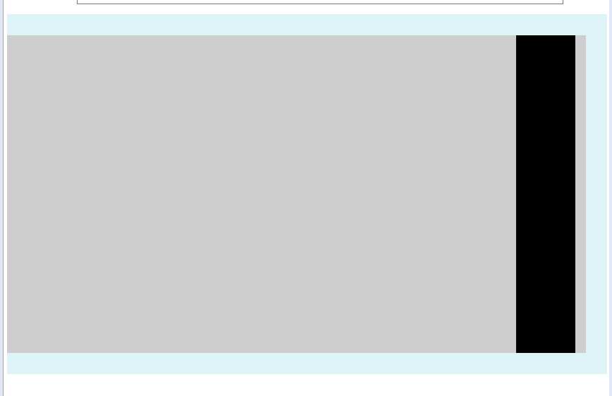
5.左浮动,不改变dom位置的流体布局写法
样式
<style>
.container{
    width: 600px;
    background-color: #DDF3F7;
}
.wrap{
    padding:20px;
    overflow: hidden;
}
.box1{

     width: 100%;
     float:left;
     height: 300px;
     background-color: #ccc;
}
.box2{

     width: 56px;
     float:left;
     margin-left:-56px;
     height:300px;
     background-color: #000;
}

.clearfix:after{
    content:‘‘;
    clear: both;
    display:table;

}
 .clearfix{
     *zoom:1;
 }

</style>
关键点:box1 width 100% float left
box2 float left width 某px margin-leftf 某px
如下图
弹性布局
对于下面html
<div>
        <p>榴莲披萨榴莲披萨榴莲披萨榴莲披萨榴莲披萨榴莲披萨榴莲披萨榴莲披萨榴莲披萨榴莲披萨榴莲披萨榴莲披萨</p>
        <p>榴莲披萨榴莲披萨榴莲披萨榴莲披萨榴莲披萨榴莲披萨榴莲披萨榴莲披萨榴莲披萨榴莲披萨榴莲披萨榴莲披萨</p>
        <p>榴莲披萨榴莲披萨榴莲披萨榴莲披萨榴莲披萨榴莲披萨榴莲披萨榴莲披萨榴莲披萨榴莲披萨榴莲披萨榴莲披萨</p>
</div>
一个div 加三个p的块级元素
加些基本样式
p{
    width:150px;
    border:3px solid lightblue;
    background:lightgreen;
    padding:5px;
    margin:5px;
}
显示如下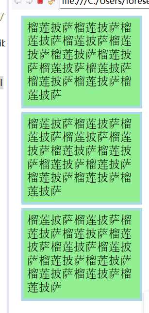
给外层div加个样式就变成
div{
    display:-webkit-box;
    display:flex;
}
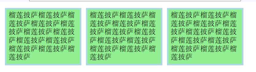
现在每一个p元素都变成一个box了
这种弹性布局还能
justify-content:flex-end 类似的 对齐方式样式 不详述。
补充:
使用flex九宫格布局:
<div class="parent">
	<div class="row">
	    <div class="item"></div>
	    <div class="item"></div>
	    <div class="item"></div>
	</div>
	<div class="row">
	    <div class="item"></div>
	    <div class="item"></div>
	    <div class="item"></div>
	</div>
	<div class="row">
	    <div class="item"></div>
	    <div class="item"></div>
	    <div class="item"></div>
	</div>
</div>
样式:
.parent{display: flex; flex-direction: column;width: 300px;}
.row{height: 100px; display: flex;border: 1px solid red;}
.item{width: 100px; background-color: #ccc;border: 1px solid red;}
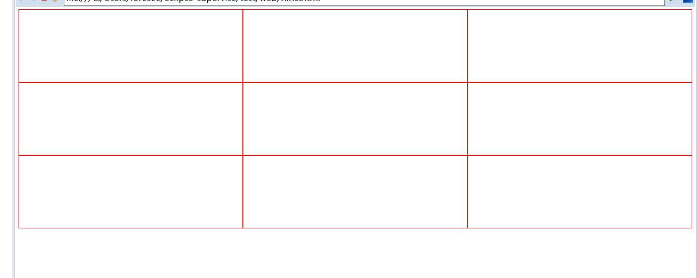
使用table九宫格布局:
样式
.parent{display: table; table-layout: fixed; width: 100%;}
.row{display: table-row;}
.item{display: table-cell; width: 33.3%; height: 200px; border: 1px solid red;}
结果截图
提供一种更加有效的方式来对一个容器中的条目进行排列、对齐和分配空白空间。
响应式布局:
布局特点:每个屏幕分辨率下面会有一个布局样式,即元素位置和大小都会变
设计方法:媒体查询加流式布局
通常使用 @media 媒体查询 和网格系统 (Grid System) 配合相对布局单位进行布局,实际上就是综合响应式、流动等上述技术通过 CSS 给单一网页不同设备返回不同样式的技术统称。
单列布局:(最常见的布局)
<div class="child"></div>
标签:方式 条目 网格 显示 display margin css oom box
原文地址:https://www.cnblogs.com/yizhizhangBlog/p/9969981.html