标签:比较 oat 宽度 margin htm war 设置 title png
在Html布局中,双飞翼布局是不可缺少的一部分,它是最完善的三列布局。很好的做到了以下三点。
1.两边固定,当中自适应
2.当中列完整显示
3.当中列要优先加载
<!DOCTYPE html>
<html>
    <head>
        <meta charset="UTF-8">
        <title></title>
        <style>
            .warp{
                width: 1000px;
                height: 500px;
                background: #666;
                margin: 0 auto;
            }
            .content{
                float: left;
                width: 100%;
                height:500px ;
            }
            .main{
                background: darkgoldenrod;

                margin: 0 210px;
                height: 500px;
            }
            .left{
                float: left;
                width: 200px;
                height: 500px;
                background: salmon;
                margin-left: -100%;
            }
            .right{
                float: left;
                width: 200px;
                height: 500px;
                background:salmon ;
                margin-left: -200px;
            }
        </style>
    </head>
    <body>
        <div class="warp">
            <div class="content">
                <div class="main">content</div>
            </div>
            <div class="left">left</div>
            <div class="right">right</div>
        </div>
    </body>
</html>
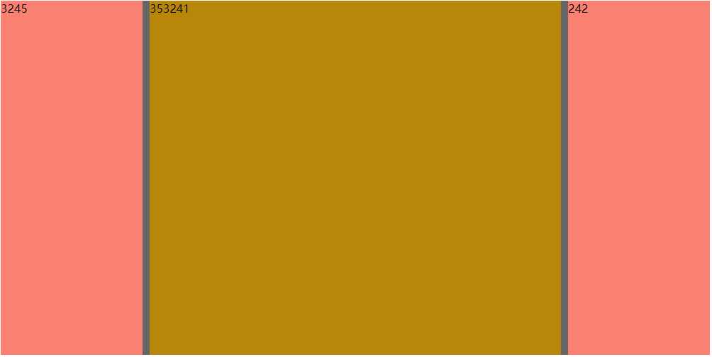
双飞翼布局的核心是,依靠width百分比的特性。相比较使用定位和浮动,双飞翼布局就要优雅的多,不会影响到其他盒子的位置。当中一列用一个盒子包裹起来,外部的大盒子设置内边距,为左右盒子留出位置,内部的小盒子宽度则为100%。两侧的盒子再通过负margin回到直接左侧和右侧。
标签:比较 oat 宽度 margin htm war 设置 title png
原文地址:https://www.cnblogs.com/xupanyuan/p/10136492.html