标签:round bubuko article 固定 网格 图片 布局 img 内容
css
* {
        margin: 0;
        padding: 0;
    }
    .layout .content div{
        min-height: 100px;
    }
    .layout .content .left{
        float: left;
        width: 300px;
        background: pink;

    }
    .layout .content .right{
        float: right;
        width: 300px;
        background: yellow;
    }
     .layout .content .center {
        background: red;
     }
html
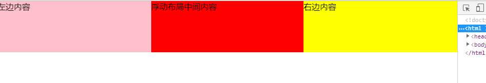
<section class="layout">
    <article class="content">
        <div class="left">左边内容</div>
        <div class="right">右边内容</div>
        <div class="center">浮动布局中间内容</div>
    </article>
</section>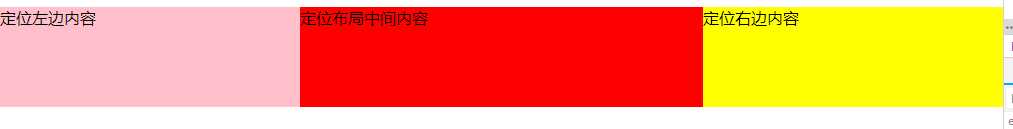
css
.layout-absolute .absolute-content {
    position: relative;
 }
 .layout-absolute .absolute-content div {
    min-height: 100px;
 }
 .layout-absolute .absolute-content .left {
    position: absolute;
    left: 0;
    width: 300px;
    background: pink;
 }
 .layout-absolute .absolute-content .right {
    position: absolute;
    right: 0;
    width: 300px;
    background: yellow;
 }
 .layout-absolute .absolute-content .center {
    position:absolute;
    left: 300px;
    right: 300px;
    background: red;
 }
html
<section class="layout-absolute">
    <article class="absolute-content">
        <div class="left">定位左边内容</div>
        <div class="center">定位布局中间内容</div>
        <div class="right">定位右边内容</div>
    </article>
</section>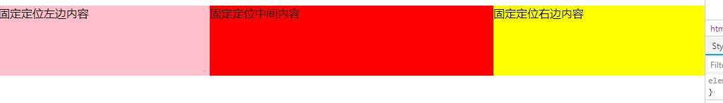
css
.flexbox-content {
    display: flex;
    width: 100%;

 }
 .flexbox-content div {
    min-height: 100px;
 }
 .flexbox-content .left {
    width: 300px;
    background: pink;
 }
 .flexbox-content .right {
    width: 300px;
    background: yellow;
}
.flexbox-content .center {
    flex: 1;
    background: red;
}
html
<section class="flexbox">
    <article class="flexbox-content">
        <div class="left">固定定位左边内容</div>
        <div class="center">固定定位中间内容</div>
        <div class="right">固定定位右边内容</div>
    </article>
</section>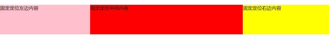
css
.table-content {
    display: table;
    width: 100%;
}
 .table-content div{
    display: table-cell;
    height: 100px;
 }
 .table-content .left {
    width: 300px;
    background: pink;
 }
 .table-content .center {
    background: red;
 }
 .table-content .right {
    width: 300px;
    background: yellow;
 }
html
<section class="flexbox">
    <article class="flexbox-content">
        <div class="left">固定定位左边内容</div>
        <div class="center">固定定位中间内容</div>
        <div class="right">固定定位右边内容</div>
    </article>
</section>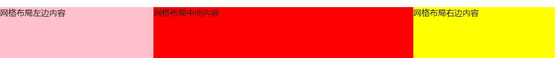
css
.grid-content {
    display: grid;
    width: 100%;
    grid-template-rows: 100px;
    grid-template-columns: 300px auto 300px;
 }
 .grid-content .left {
    background: pink;

 }
 .grid-content .center {
    background: red;

 }
 .grid-content .right {
    background: yellow;
 }
html
<section class="grid">
    <article class="grid-content">
        <div class="left">网格布局左边内容</div>
        <div class="center">网格布局中间内容</div>
        <div class="right">网格布局右边内容</div>
    </article>
</section>标签:round bubuko article 固定 网格 图片 布局 img 内容
原文地址:https://www.cnblogs.com/DCL1314/p/10230779.html