标签:dash def label amount att gate interval set 尊重
关注本人微信和易信公众号: 微软动态CRM专家罗勇 ,回复147或者20150728可方便获取本文,同时可以在第一时间得到我发布的最新的博文信息,follow me!
制作图表你会发现,在界面上只能选择主实体的字段,不能选择关联实体的字段,有没有办法突破?这就是今天博文的内容。我这里以一个简单的例子说明,就是订单按照客户的性别来分类汇总金额。
我打开 素格格新疆特产店解决方案 ,在订单实体的 图表 节点新建一个图表如下,可以知道,我无法在水平(分类)轴标签中选择和订单关联的实体字段,而只能选择订单实体的字段。
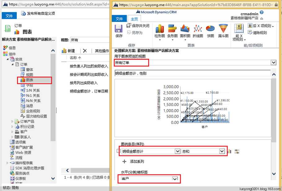
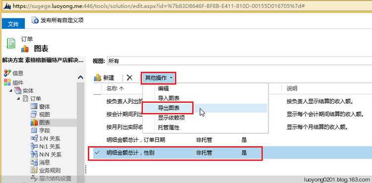
保存后我导出该图表。
导出后的XML如下所示:
<visualization>
  <visualizationid>{9448A1C1-B634-E511-80CF-00155D016400}</visualizationid>
  <name>明细金额总计,性别</name>
  <primaryentitytypecode>salesorder</primaryentitytypecode>
  <datadescription>
    <datadefinition>
      <fetchcollection>
        <fetch mapping="logical" aggregate="true">
          <entity name="salesorder">
            <attribute groupby="true" alias="_CRMAutoGen_groupby_column_Num_0" name="customerid" />
            <attribute alias="_CRMAutoGen_aggregate_column_Num_0" name="totallineitemamount" aggregate="sum" />
          </entity>
        </fetch>
      </fetchcollection>
      <categorycollection>
        <category alias="_CRMAutoGen_groupby_column_Num_0">
          <measurecollection>
            <measure alias="_CRMAutoGen_aggregate_column_Num_0" />
          </measurecollection>
        </category>
      </categorycollection>
    </datadefinition>
  </datadescription>
  <presentationdescription>
    <Chart Palette="None" PaletteCustomColors="91,151,213; 237,125,49; 160,116,166; 255,192,0; 68,114,196; 112,173,71; 37,94,145; 158,72,14; 117,55,125; 153,115,0; 38,68,120; 67,104,43; 124,175,221; 241,151,90; 186,144,192; 255,205,51; 105,142,208; 140,193,104; 50,125,194; 210,96,18; 150,83,159; 204,154,0; 51,90,161; 90,138,57;">
      <Series>
        <Series ChartType="Column" IsValueShownAsLabel="True" Font="{0}, 9.5px" LabelForeColor="59, 59, 59" CustomProperties="PointWidth=0.75, MaxPixelPointWidth=40"></Series>
      </Series>
      <ChartAreas>
        <ChartArea BorderColor="White" BorderDashStyle="Solid">
          <AxisY LabelAutoFitMinFontSize="8" TitleForeColor="59, 59, 59" TitleFont="{0}, 10.5px" LineColor="165, 172, 181" IntervalAutoMode="VariableCount">
            <MajorGrid LineColor="239, 242, 246" />
            <MajorTickMark LineColor="165, 172, 181" />
            <LabelStyle Font="{0}, 10.5px" ForeColor="59, 59, 59" />
          </AxisY>
          <AxisX LabelAutoFitMinFontSize="8" TitleForeColor="59, 59, 59" TitleFont="{0}, 10.5px" LineColor="165, 172, 181" IntervalAutoMode="VariableCount">
            <MajorTickMark LineColor="165, 172, 181" />
            <MajorGrid LineColor="Transparent" />
            <LabelStyle Font="{0}, 10.5px" ForeColor="59, 59, 59" />
          </AxisX>
        </ChartArea>
      </ChartAreas>
      <Titles>
        <Title Alignment="TopLeft" DockingOffset="-3" Font="{0}, 13px" ForeColor="59, 59, 59"></Title>
      </Titles>
    </Chart>
  </presentationdescription>
  <isdefault>false</isdefault>
</visualization>
为了方便我更改其中的Fetch XML,我这里通过高级查询构造一个如下的高级查询,并下载Fetch XML.
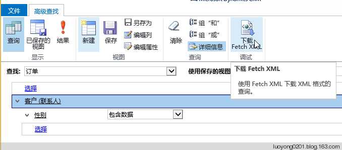
下载的Fetch XML如下:
<fetch version="1.0" output-format="xml-platform" mapping="logical" distinct="false">
  <entity name="salesorder">
    <attribute name="name" />
    <attribute name="customerid" />
    <attribute name="statuscode" />
    <attribute name="totalamount" />
    <attribute name="salesorderid" />
    <order attribute="name" descending="false" />
    <link-entity name="contact" from="contactid" to="customerid" alias="ab">
      <filter type="and">
        <condition attribute="gendercode" operator="not-null" />
      </filter>
    </link-entity>
  </entity>
</fetch>
我这里对图表的XML改动很简单,主要是修改了fetch元素,删除了salesorder实体的customerid属性,增加了和contact实体的关联,并且将性别属性(gendercode)设置为分组属性。
<fetch mapping="logical" aggregate="true">
  <entity name="salesorder">
    <attribute alias="_CRMAutoGen_aggregate_column_Num_0" name="totallineitemamount" aggregate="sum" />
    <link-entity name="contact" from="contactid" to="customerid" alias="ab">
      <attribute name ="gendercode" groupby="true" alias="_CRMAutoGen_groupby_column_Num_0" />
      <filter type="and">
        <condition attribute="gendercode" operator="not-null" />
      </filter>
    </link-entity>
  </entity>
</fetch>
为了更好的对比,我将默认的条形图改成了饼状图,也就是将ChartType属性值从Column改成了Pie。
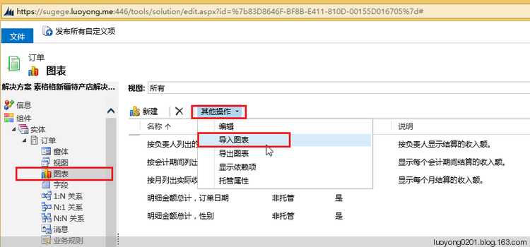
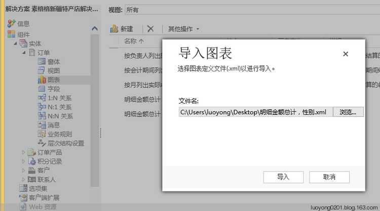
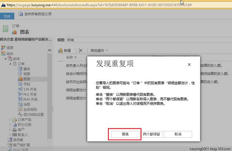
然后我导入这个图表,发现重复项的时候选择替换。
发布解决方案后我们去看效果如下:
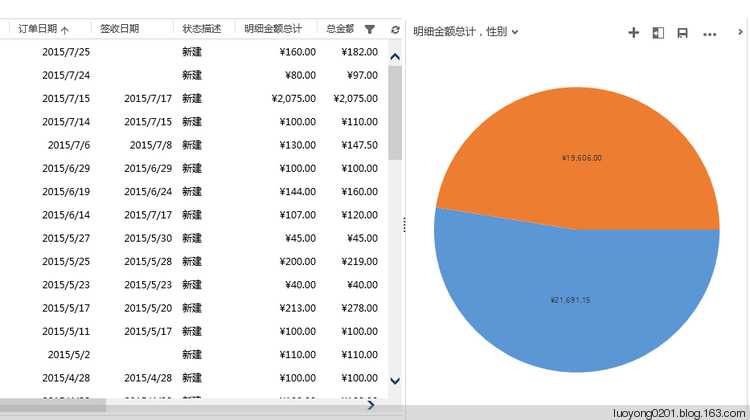
当然这个图表依然是可以点击饼状图的部分进行钻取的。
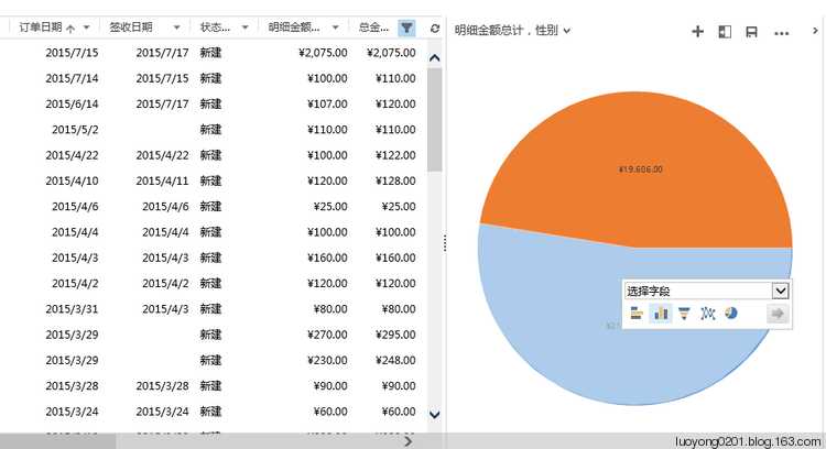
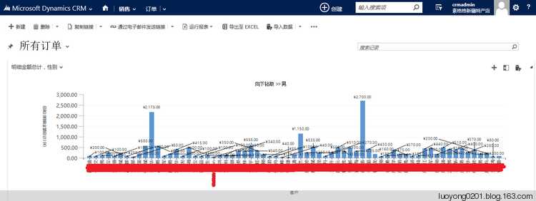
我们看看是哪些男客户,为了尊重隐私我将姓名做了处理,因为我这里是真实订单信息:
标签:dash def label amount att gate interval set 尊重
原文地址:https://www.cnblogs.com/luoyong0201/p/Dynamics_365_Advanced_Chart_Skill.html