标签:形式 ora 百分比 min ali 流式 www. width cal
flex语法布局,可以参考菜鸟教程。http://www.runoob.com/w3cnote/flex-grammar.html
我主要是把flex布局运用到实例中,看看flex布局的效果。
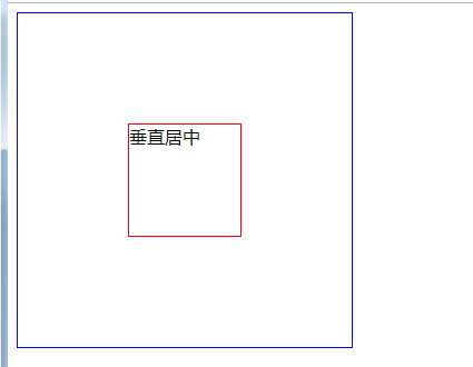
1、垂直居中,学习flex布局以后,实现起来很方便;
    <style type="text/css">
        .demo{
            display: flex;
            width: 300px;
            height: 300px;
            border: 1px solid blue;
            justify-content: center;
            align-items: center;
        }
        .inner{
            width: 100px;
            height: 100px;
            border: 1px solid red;
        }
    </style>

     <div class="demo">
        <div class="inner">垂直居中</div>
     </div>
效果如下:
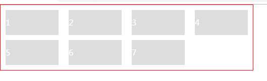
2、用flex制作列表,流式布局,每行数目固定,会自动分行。如商品列表这种,固定一排四个,平均宽度显示;
        .demo{
            width:500px;
            padding-top: 10px;
            display: flex;
            /* flex-direction: row;
            flex-wrap: wrap; */
            flex-flow: row wrap;
            color: #fff;
            border: 1px solid red;
        }
        .demo .item{
            width: calc((100% - 80px) / 4);
            margin: 0 10px 10px;
            background: #dddddd;
            line-height: 50px;
        }
     <div class="demo">
        <div class="item">1</div>
        <div class="item">2</div>
        <div class="item">3</div>
        <div class="item">4</div>
        <div class="item">5</div>
        <div class="item">6</div>
        <div class="item">7</div>
     </div>
注:flex-flow:是flex-direction 和flex-wrap的简写形式,默认是 row nowrap;
效果如下:
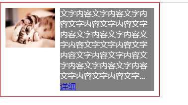
3、flex制作图文混排
        .demo{
            width:300px;
            padding: 10px;
            display: flex;
            flex-flow: row nowrap;
            align-items: flex-start;
            color: #fff;
            border: 1px solid red;
        }
        .demo .img{
            margin-right: 10px;
        }

        .demo .item{
            width: 190px;
            background: gray;
        }
     <div class="demo">
        <img class="img" width="100" height="80" src="img/7.jpg" />
        <div class="item">
            文字内容文字内容文字内容文字内容文字内容文字内容文字内容文字内容文字内容文字文字内容文字内容文字内容文字内容文字内容文字内容文字内容文字内容文字内容文字...
            <a href="#">详细</a>
        </div>
     </div>
效果如下:
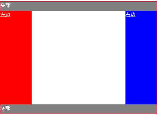
4、flex制作圣杯布局
        .demo{
            width:500px;
            display: flex;
            flex-direction: column;
            color: #fff;
            border: 1px solid red;
        }
        .header,.footer{
            background: gray;
            height: 30px;
            flex: 1;
        }
        .body{
            height: 300px;
            display: flex;
        }
        .body div{
            flex: 1;
        }
        .left{
            background:red;
        }
        .right{
            background:blue;
        }
        .left,.right{
            flex: 0 0 20%!important;
        }
     <div class="demo">
        <header class="header">头部</header>
        <div class="body">
            <div class="left">左边</div>
            <div class="center">中间</div>
            <div class="right">右边</div>
        </div>
        <footer class="footer">底部</footer>
     </div>
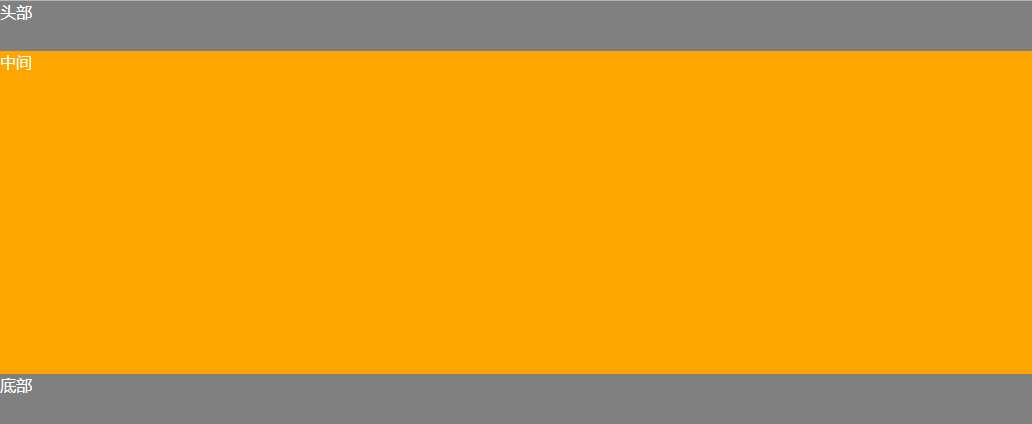
5、固定的底栏
        .demo {
            display: flex;
            min-height: 100vh;
            flex-direction: column;
            color: #ffffff;
        }
        .Site-content {
            flex: 1;
            background: orange;
        }
        .header,.footer{
            background: gray;
            height: 50px;
        }
    <div class="demo">
        <header class="header">头部</header>
        <main class="Site-content">中间</main>
        <footer class="footer">底部</footer>
    </div>
效果如下:
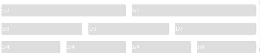
6、网格布局---基本网格布局
最简单的网格,就是平均分布。在容器里平均分配空间,但是需要设置项目的自动缩放。
        .Grid {
            display: flex;
            color: #ffffff;
        }
        .Grid-cell {
            background: #dddddd;
            flex: 1;
            margin:0 10px;
            line-height: 40px;
            border-radius: 3px;
        }
    <div class="Grid">
        <div class="Grid-cell">1/2</div>
        <div class="Grid-cell">1/2</div>
    </div>
    <br/>
    <div class="Grid">
        <div class="Grid-cell">1/3</div>
        <div class="Grid-cell">1/3</div>
        <div class="Grid-cell">1/3</div>
    </div>
    <br/>
    <div class="Grid">
        <div class="Grid-cell">1/4</div>
        <div class="Grid-cell">1/4</div>
        <div class="Grid-cell">1/4</div>
        <div class="Grid-cell">1/4</div>
    </div>
效果如下:
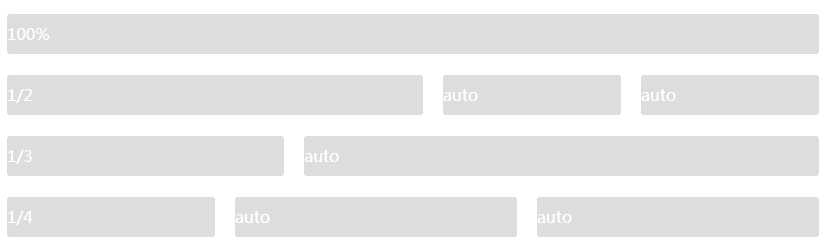
6、网格布局---百分比布局
某个网格的宽度为固定百分比,其余的网格平均分配剩余的空间。
        .Grid {
            display: flex;
            color: #ffffff;
        }
        .Grid-cell {
            background: #dddddd;
            flex: 1;
            margin:0 10px;
            line-height: 40px;
            border-radius: 3px;
        }
        .type_one{
            flex: 0 0 50%;
        }
        .type_two{
            flex: 0 0 25%;
        }
        .type_three{
            flex: 0 0 33.33%;
        }
    <div class="Grid">
        <div class="Grid-cell">100%</div>
    </div>
    <br/>
    <div class="Grid">
        <div class="Grid-cell type_one">1/2</div>
        <div class="Grid-cell">auto</div>
        <div class="Grid-cell">auto</div>
    </div>
    <br/>
    <div class="Grid">
        <div class="Grid-cell type_three">1/3</div>
        <div class="Grid-cell">auto</div>
    </div>
    <br/>
    <div class="Grid">
        <div class="Grid-cell type_two">1/4</div>
        <div class="Grid-cell">auto</div>
        <div class="Grid-cell">auto</div>
    </div>
效果如下:
标签:形式 ora 百分比 min ali 流式 www. width cal
原文地址:https://www.cnblogs.com/tanweiwei/p/10609063.html