标签:src ase idt form wrap int poi latex color
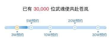
1,记录一次步骤条来实现人数不同显示的进度不同
效果如图:
废话不多说 上代码:
html文件:
 <div class="gift">
        <p class="prenum">已有
        <countTo
            :startVal=‘0‘
            :endVal=‘userNums‘
            :duration=‘3000‘/>
            位武魂使共赴苍岚</p>
        <div class="bg_range">
            <div class="awards-progress-wrap">
                <div class="awards-progress">
                    <div class=‘awards-progress-cur‘
                        :class="classObject"
                        style="transition: all 1s ease 0s;"></div>
                    <ol class="awards-progress-points">
                        <li
                            @click="scanList(0)"
                            :class="[‘down‘,activeNum === 0? ‘activeLi‘ : ‘‘]">
                            3W预约
                        </li>
                        <li
                            @click="scanList(1)"
                            class="up"
                            :class="[‘down‘,activeNum === 1? ‘activeLi‘ : ‘‘]"
                        >
                            5W预约
                        </li>
                        <li
                            @click="scanList(2)"
                            :class="[‘down‘,activeNum === 2? ‘activeLi‘ : ‘‘]"
                            class="down">
                            10W预约
                        </li>
                        <li
                            @click="scanList(3)"
                            :class="[‘down‘,activeNum === 3? ‘activeLi‘ : ‘‘]"
                            class="up">
                            20W预约
                        </li>
                        <li
                            @click="scanList(4)"
                            :class="[‘down‘,activeNum === 4? ‘activeLi‘ : ‘‘]"
                            class="down">
                            30W预约
                        </li>
                    </ol>
                    <ul class="awards-progress-text">
                        <li class="item1 unreach finished">3W预约</li>
                        <li class="item2 unreach finished">5W预约</li>
                        <li class="item3 unreach finished">10W预约</li>
                        <li class="item4 unreach">20W预约</li>
                        <li class="item5 unreach">30W预约</li>
                    </ul>
                </div>
            </div>
        </div>
        <div class="gift_container">
            <div class="gift_detail" v-for="item in dataInfo" :key="item.imgUrl">
                <div class="dj">
                    <img :src="item.imgUrl">
                    <span>{{item.num}}</span>
                </div>
                <p>{{item.name}}</p>
            </div>
        </div>
    </div>
css 代码:
.awards-progress {
        width: 100%;
        height: 75%;
        border-radius: 6px;
        position: relative;
        top: 1px;
    }

    .awards-progress-cur {
        height: 100%;
        width: 0;
        border-radius: 6px;
        background: linear-gradient(to right, #b5ddfa 0, #a3d4f7 50%, #4b97cf 100%);
    }

    .awards-progress-cur.item0 {
        width: 10%;
    }

    .awards-progress-cur.item1 {
        width: 20%;
    }

    .awards-progress-cur.item2 {
        width: 40%;
    }

    .awards-progress-cur.item3 {
        width: 65%;
    }

    .awards-progress-cur.item4 {
        width: 90%;
    }

    .awards-progress-cur.item5 {
        width: 98%;
    }

    .awards-progress-points {
        position: absolute;
        top: -2.5px;
        left: 0;
    }

    .awards-progress-points li {
        width: 11px;
        height: 11px;
        border: 2px solid #b2d8f3;
        background-color: #fff;
        border-radius: 50%;
        position: absolute;
        top: 0;
        font-size: 0;
    }

    .awards-progress-points li:after {
        content: "";
        position: absolute;
        top: 50%;
        left: 50%;
        transform: translate(-50%, -50%);
        width: 5.5px;
        height: 5.5px;
        background-color: #b2d8f3;
        border-radius: 50%;
    }

    .awards-progress-points li:nth-child(1) {
        left: 20px;
    }

    .awards-progress-points li:nth-child(2) {
        left: 68px;
    }

    .awards-progress-points li:nth-child(3) {
        left: 132px;
    }

    .awards-progress-points li:nth-child(4) {
        left: 215px;
    }

    .awards-progress-points li:nth-child(5) {
        left: 293px;
    }

    .awards-progress-points li:before {
        content: "";
        display:block;
        width:0;
        height:0;
        border-style:solid;
        border-color:transparent;
        position:absolute;
        left: 50%;
        transform: translateX(-50%);
    }

    .awards-progress-points li.down:before {
        border-bottom-color: #4b97cf;
        top: 16px;
        border-width:0 3px 5px;
    }

    .awards-progress-points li.up:before {
        border-top-color: #4b97cf;
        top: -12px;
        border-width:5px 3px 0;
    }
    .awards-progress-points li.activeLi{
        border-color: rgb(240, 202, 121) !important
    }
    .awards-progress-points li.activeLi:after {
        background-color: rgb(240, 202, 121) !important
    }

    .awards-progress-text {
        position: absolute;
        top: 0;
        left: 0;
    }
    .awards-progress-text li {
        position: absolute;
        width: 50px;
        height: 12px;
        font-size: 12px;
        color: #21679B;
    }
    .awards-progress-text li:nth-child(odd) {
        top: 24px;
    }

    .awards-progress-text li:nth-child(even) {
        top: -24px;
    }
    .awards-progress-text li:nth-child(1) {
        left:8px;
    }
    .awards-progress-text li:nth-child(2) {
        left: 59px;
    }
    .awards-progress-text li:nth-child(3) {
        left: 118px;
    }
    .awards-progress-text li:nth-child(4) {
        left: 200px;
    }
    .awards-progress-text li:nth-child(5) {
        left: 281px;
    }
    .awards-progress-text li.finished {
        background-position-x: -.1rem;
    }
简单实现:
ps有个弊端: 不能根据后端传入的数值来计算进度比例,只是写死的item来控制大概的进度,如果有更好的意见请留言给我 谢谢
标签:src ase idt form wrap int poi latex color
原文地址:https://www.cnblogs.com/sanye00liubingjian/p/10827095.html