标签:使用 class 相同 宽度 效果 pre apply pad 技术
最终效果如下:
思路分析: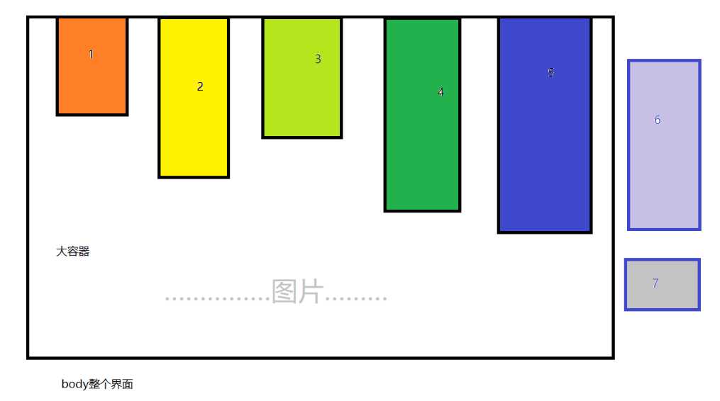
我们有很多图片,设置相同的宽度,高度不做设置,后面自动获取。
当对所有图片浮动后,图片会自动换行排列。
瀑布流:对图片进行设置,进行一个最优的排列。如上图所示,当一行排列完成后,后续的图片该如何排列?
这里有,对后续图片进行处理,找出图片高度最小的那张图片,将它排列到第一行(上一列高度最小的那一列)。
这里图片7最小,将它放置到图片1下面。如下所示: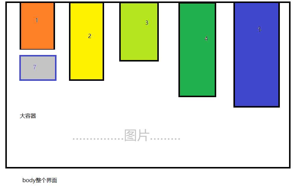
上图组成新的一行,图片3为高度最小那一列,重复操作,将后续图片最小放置到图片3下。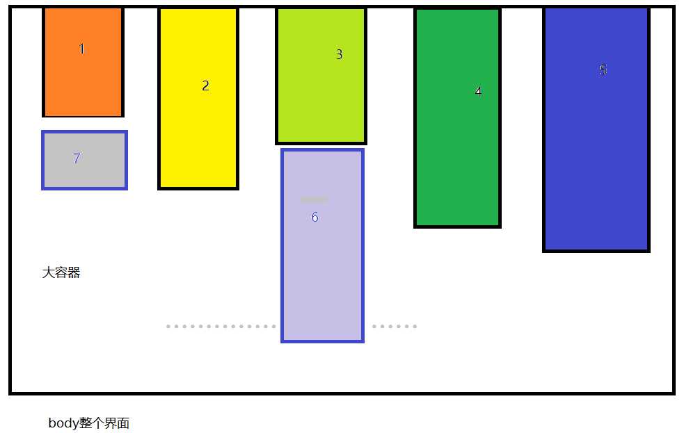
一直循环,直至所有图片排列结束。完成瀑布流样式布局。
具体代码如下:
html部分代码,图片可以放很多张。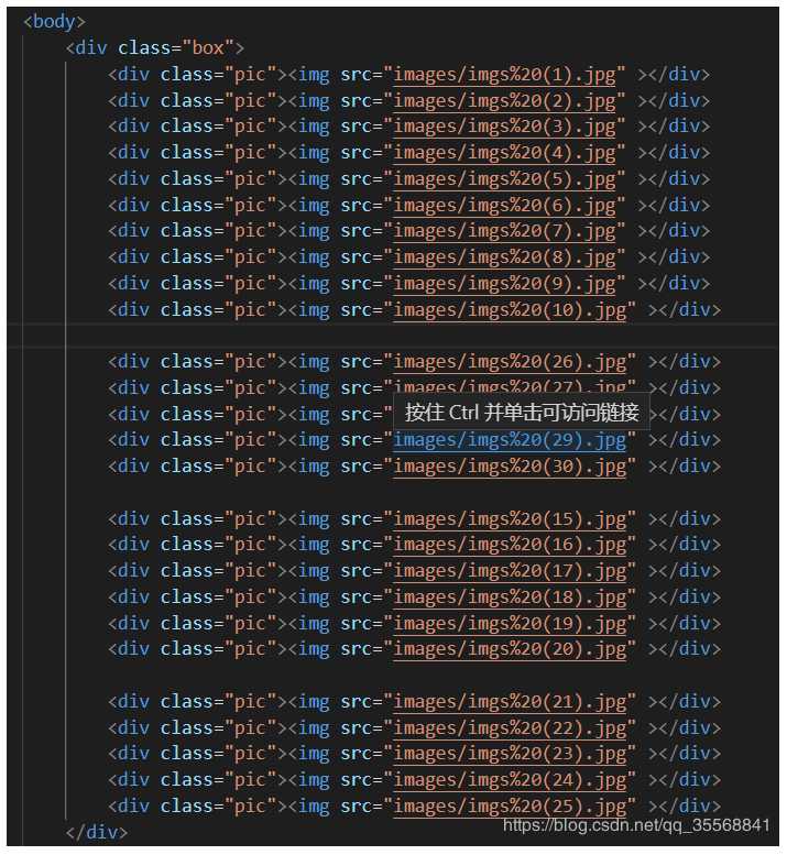
css代码:
<style type="text/css">
*{
margin: 0;
padding: 0;
}
.box{
position: relative;
}
.box>div{
float: left;
padding: 5px;
}

.pic img{
border: 1px solid silver;
padding: 5px;
width: 167px;
border-radius: 10px;
}
</style>
js代码:
`//让图片加载完成在执行JS代码 方便93行 打印每张照片的高度
window.onload=function(){
// 获取元素
//获取所有图片
var pic=document.querySelectorAll(".pic");
//获取大盒子 因为要box容器居中
var box=document.querySelector(".box");
```

//求出单个pic元素的宽度
var picWidth=pic[0].offsetWidth;
// console.log(picWidth);做的习惯打印,看看是不是正确

//求出浏览器的宽度
var screenWidth=document.body.offsetWidth;
// console.log(screenWidth);

//求出一行可以放多少列
var cols=Math.floor(screenWidth/picWidth);
// console.log(cols);6

//给box容器设置宽度
box.style.width=cols*picWidth+"px";
// console.log(box.offsetWidth);

//让main容器在页面中水平居中
box.style.margin="0 auto";

//对第二行图片进行设置 将第一张定位到第一行高度最小的位置
//使用数组保存第一行元素的高度
var arrHeight=[];
for(var i=0;i<pic.length;i++){
//定义一个变量 用来表示每个图片的高度
var picHeight=pic[i].offsetHeight;
// console.log(picHeight);
//如果小于第一行6张照片
if(i<cols){
//把高度储存到定义的数组中
arrHeight.push(picHeight);
// console.log(arrHeight);
}else{
//找出除第一行外其他图片中高度最小的 并赋值给minHeightbox
var minHightbox= Math.min.apply(" ",arrHeight);
// console.log(minHightbox)

//z最矮元素高度的索引 是第几张
var minIndex=getMinIndex(arrHeight,minHightbox);
//定位
pic[i].style.position="absolute";

//设置pic[i]的top值
pic[i].style.top = minHightbox + "px";

//设置pic[i]的left值
pic[i].style.left = picWidth * minIndex + "px";

//更新最矮元素的高度
arrHeight[minIndex]+=picHeight;
}
}//循环到这里

//获取下标方法
function getMinIndex(arr, val){
for(var j=0; j<arr.length; j++){
if(arr[j] === val){
return j;
}
}
// console.log(j);
// 第六张最小
}
}`
标签:使用 class 相同 宽度 效果 pre apply pad 技术
原文地址:https://www.cnblogs.com/znegkaisheng/p/11020531.html