标签:rap efi treemap mes scale his 适合 manual life
Part 3: Top 50 ggplot2 Visualizations - The Master List,
结合进阶1、2内容构建图形
有效的图形是:
最常用
# install.packages("ggplot2")
# load package and data
options(scipen=999) # turn-off scientific notation like 1e+48
library(ggplot2)
theme_set(theme_bw()) # pre-set the bw theme.
data("midwest", package = "ggplot2")
# midwest <- read.csv("http://goo.gl/G1K41K") # bkup data source
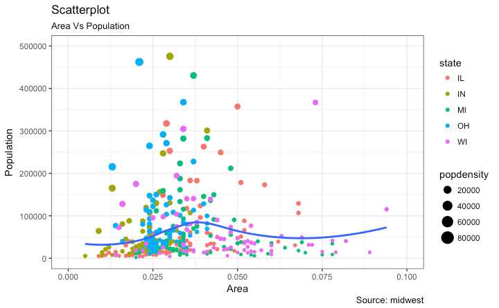
# Scatterplot
gg <- ggplot(midwest, aes(x=area, y=poptotal)) +
geom_point(aes(col=state, size=popdensity)) +
geom_smooth(method="loess", se=F) +
xlim(c(0, 0.1)) +
ylim(c(0, 500000)) +
labs(subtitle="Area Vs Population",
y="Population",
x="Area",
title="Scatterplot",
caption = "Source: midwest")
plot(gg)
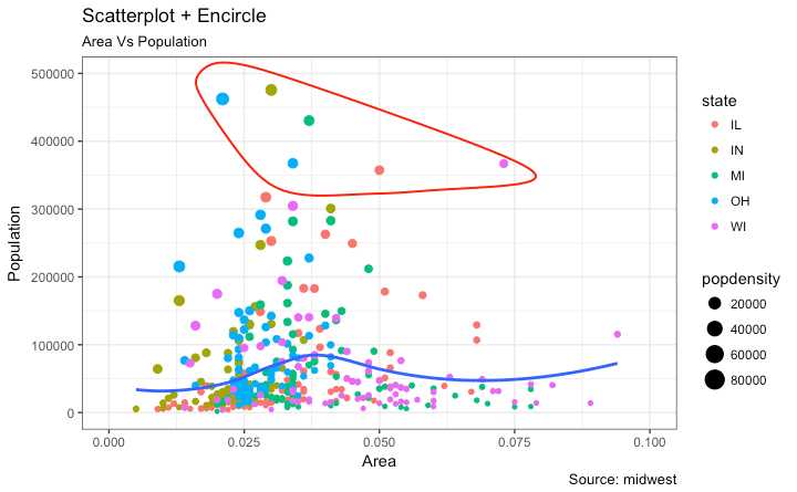
展示结果时,在图中圈出特定的点有注意吸引注意力,使用ggalt包中的geom_encircle() 可以方便实现
在 geom_encircle()中把数据 data 设为只包括兴趣点的数据框 并且 你可以 expand 曲线使其刚好绕过点的外围. 曲线的颜色 粗细也能被修改
# install ‘ggalt‘ pkg
# devtools::install_github("hrbrmstr/ggalt")
options(scipen = 999)
library(ggplot2)
library(ggalt)
midwest_select <- midwest[midwest$poptotal > 350000 &
                            midwest$poptotal <= 500000 &
                            midwest$area > 0.01 &
                            midwest$area < 0.1, ]

# Plot
ggplot(midwest, aes(x=area, y=poptotal)) +
  geom_point(aes(col=state, size=popdensity)) +   # draw points
  geom_smooth(method="loess", se=F) +
  xlim(c(0, 0.1)) +
  ylim(c(0, 500000)) +   # draw smoothing line
  geom_encircle(aes(x=area, y=poptotal),
                data=midwest_select,
                color="red",
                size=2,
                expand=0.08) +   # encircle
  labs(subtitle="Area Vs Population",
       y="Population",
       x="Area",
       title="Scatterplot + Encircle",
       caption="Source: midwest")
# load package and data
library(ggplot2)
data(mpg, package="ggplot2") # alternate source: "http://goo.gl/uEeRGu")
theme_set(theme_bw())  # pre-set the bw theme.

g <- ggplot(mpg, aes(cty, hwy))

# Scatterplot
g + geom_point() +
  geom_smooth(method="lm", se=F) +
  labs(subtitle="mpg: city vs highway mileage",
       y="hwy",
       x="cty",
       title="Scatterplot with overlapping points",
       caption="Source: midwest")
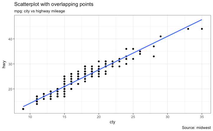
上图中其实有很多点是重合的 原始数据是整数
dim(mpg)
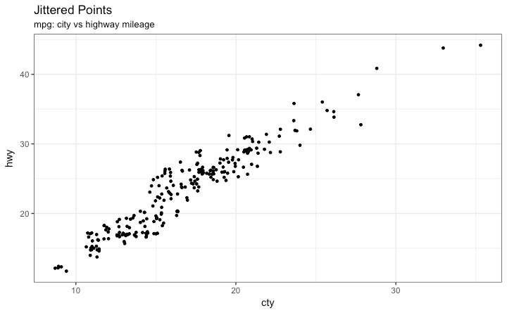
用 jitter_geom()画抖动图 重合的点在原先的位置基于一定阈值范围(width)随机抖动
library(ggplot2)
data(mpg, package="ggplot2")
# mpg <- read.csv("http://goo.gl/uEeRGu")

# Scatterplot
theme_set(theme_bw())  # pre-set the bw theme.
g <- ggplot(mpg, aes(cty, hwy))
g + geom_jitter(width = .5, size=1) +
  labs(subtitle="mpg: city vs highway mileage",
       y="hwy",
       x="cty",
       title="Jittered Points")
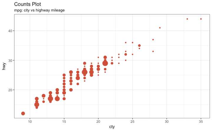
处理数据点重合也可以用 counts chart. 重合点越多 圈就越大
# load package and data
library(ggplot2)
data(mpg, package="ggplot2")
# mpg <- read.csv("http://goo.gl/uEeRGu")

# Scatterplot
theme_set(theme_bw())  # pre-set the bw theme.
g <- ggplot(mpg, aes(cty, hwy))
g + geom_count(col="tomato3", show.legend=F) +
  labs(subtitle="mpg: city vs highway mileage",
       y="hwy",
       x="cty",
       title="Counts Plot")
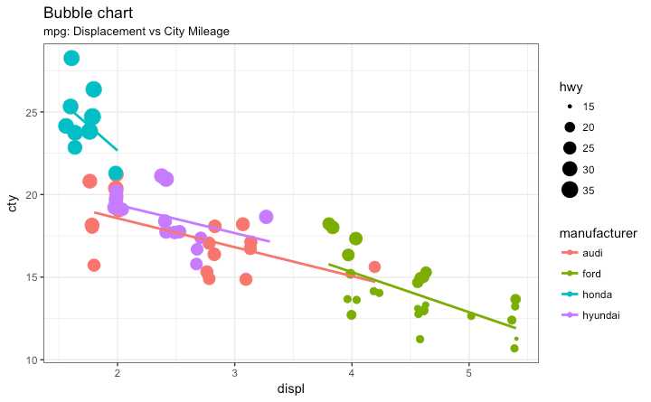
比较两个变量之间的关系时,如果数据还包括以下:
如果你有四维数据 使用气泡图更好 其中两个变量是数值 numeric (X and Y) 一个是类型 categorical (color) 另一个是数值型 numeric variable (size).
提供不同群组间更好的可视化比较效果
# load package and data
library(ggplot2)
data(mpg, package="ggplot2")
# mpg <- read.csv("http://goo.gl/uEeRGu")

mpg_select <- mpg[mpg$manufacturer %in% c("audi", "ford", "honda", "hyundai"), ]

# Scatterplot
theme_set(theme_bw())  # pre-set the bw theme.
g <- ggplot(mpg_select, aes(displ, cty)) +
  labs(subtitle="mpg: Displacement vs City Mileage",
       title="Bubble chart")

g + geom_jitter(aes(col=manufacturer, size=hwy)) +
  geom_smooth(aes(col=manufacturer), method="lm", se=F)
使用 gganimate 包实现. 其余和气泡图一样 但是需要在时间维度上展示
关键是设置 aes(frame) 到你想展示的列变量
使用 gganimate()设置时间间隔 interval.动画化
# Source: https://github.com/dgrtwo/gganimate
# install.packages("cowplot")  # a gganimate dependency
# devtools::install_github("dgrtwo/gganimate")
library(ggplot2)
library(gganimate)
library(gapminder)
theme_set(theme_bw())  # pre-set the bw theme.

g <- ggplot(gapminder, aes(gdpPercap, lifeExp, size = pop, frame = year)) +
  geom_point() +
  geom_smooth(aes(group = year),
              method = "lm",
              show.legend = FALSE) +
  facet_wrap(~continent, scales = "free") +
  scale_x_log10()  # convert to log scale

gganimate(g, interval=0.2)
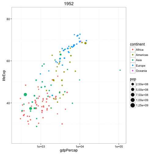
Error: It appears that you are trying to use the old API, which has been deprecated.(或许会出现这个问题 或许可以换一个数据集试一试)
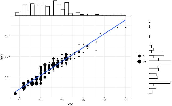
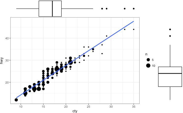
可以在一张图中展示关系和分布 在散点图周围有 X and Y 变量的直方图
使用 ggMarginal() 函数 来自‘ggExtra’ 包 除去 histogram 也可以选则 boxplot or density 图 通过设置 type 选项
# load package and data
library(ggplot2)
library(ggExtra)
data(mpg, package="ggplot2")
# mpg <- read.csv("http://goo.gl/uEeRGu")

# Scatterplot
theme_set(theme_bw())  # pre-set the bw theme.
mpg_select <- mpg[mpg$hwy >= 35 & mpg$cty > 27, ]
g <- ggplot(mpg, aes(cty, hwy)) +
  geom_count() +
  geom_smooth(method="lm", se=F)

ggMarginal(g, type = "histogram", fill="transparent")
ggMarginal(g, type = "boxplot", fill="transparent")
# ggMarginal(g, type = "density", fill="transparent")
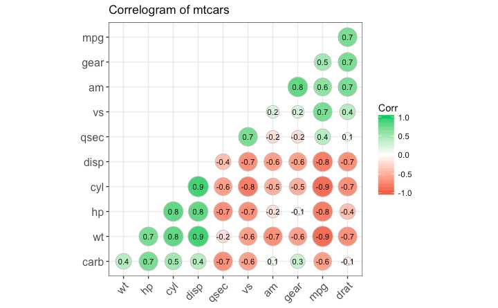
同一数据框中多个连续变量之间的相关关系 使用 ggcorrplot 包
# devtools::install_github("kassambara/ggcorrplot")
library(ggplot2)
library(ggcorrplot)

# Correlation matrix
data(mtcars)
corr <- round(cor(mtcars), 1)#生成相关系数矩阵

# Plot
ggcorrplot(corr, hc.order = TRUE,
           type = "lower",
           lab = TRUE,
           lab_size = 3,
           method="circle",
           colors = c("tomato2", "white", "springgreen3"), #设置颜色表
           title="Correlogram of mtcars",
           ggtheme=theme_bw)
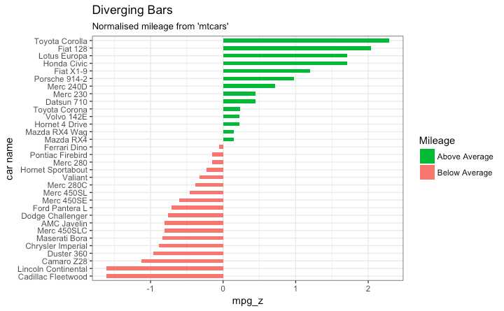
geom_bar() 可以用来画直方图或者条形图
geom_bar() 默认设置 stat 来计数 这意味着当你只提供一个连续变量时,画出的图是直方图
为了做条形图
stat=identityx and y inside aes() where, x is either character or factor and y is numeric.分歧条形图要求分类变量只有两个类别 在连续变量的特定阈值改变类型
library(ggplot2)
theme_set(theme_bw())

# Data Prep
data("mtcars")  # load data
mtcars$`car name` <- rownames(mtcars)  # create new column for car names
mtcars$mpg_z <- round((mtcars$mpg - mean(mtcars$mpg))/sd(mtcars$mpg), 2)  # compute normalized mpg 计算归一化
mtcars$mpg_type <- ifelse(mtcars$mpg_z < 0, "below", "above")  # above / below avg flag 分类
mtcars <- mtcars[order(mtcars$mpg_z), ]  # sort 排序
mtcars$`car name` <- factor(mtcars$`car name`, levels = mtcars$`car name`)  # convert to factor to retain sorted order in plot.

# Diverging Barcharts
ggplot(mtcars, aes(x=`car name`, y=mpg_z, label=mpg_z)) +
  geom_bar(stat=‘identity‘, aes(fill=mpg_type), width=.5)  +
  scale_fill_manual(name="Mileage",
                    labels = c("Above Average", "Below Average"),
                    values = c("above"="#00ba38", "below"="#f8766d")) +
  labs(subtitle="Normalised mileage from ‘mtcars‘",
       title= "Diverging Bars") +
  coord_flip()
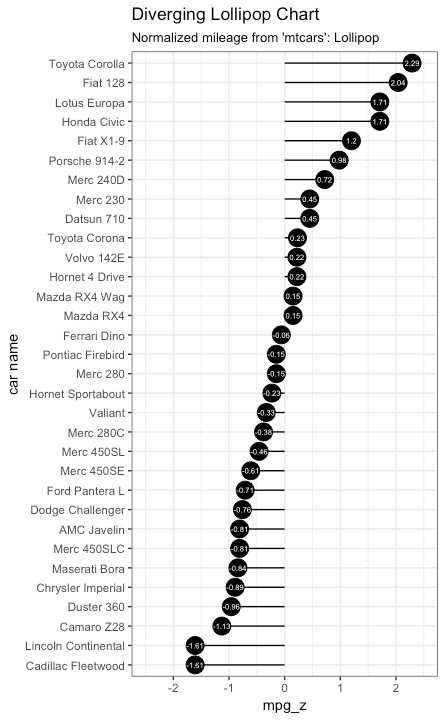
使用 geom_point and geom_segment
library(ggplot2)
theme_set(theme_bw())

ggplot(mtcars, aes(x=`car name`, y=mpg_z, label=mpg_z)) +
  geom_point(stat=‘identity‘, fill="black", size=6)  +
  geom_segment(aes(y = 0,
                   x = `car name`,
                   yend = mpg_z,
                   xend = `car name`),
               color = "black") +
  geom_text(color="white", size=2) +
  labs(title="Diverging Lollipop Chart",
       subtitle="Normalized mileage from ‘mtcars‘: Lollipop") +
  ylim(-2.5, 2.5) +
  coord_flip()
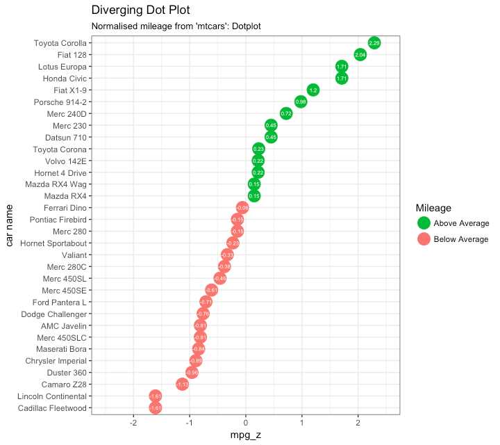
library(ggplot2)
theme_set(theme_bw())

# Plot
ggplot(mtcars, aes(x=`car name`, y=mpg_z, label=mpg_z)) +
  geom_point(stat=‘identity‘, aes(col=mpg_type), size=6)  +
  scale_color_manual(name="Mileage",
                     labels = c("Above Average", "Below Average"),
                     values = c("above"="#00ba38", "below"="#f8766d")) +
  geom_text(color="white", size=2) +
  labs(title="Diverging Dot Plot",
       subtitle="Normalized mileage from ‘mtcars‘: Dotplot") +
  ylim(-2.5, 2.5) +
  coord_flip()
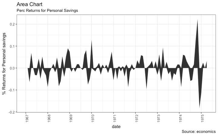
%returns or %change 数据 geom_area()
library(ggplot2)
library(quantmod)
data("economics", package = "ggplot2")

# Compute % Returns
economics$returns_perc <- c(0, diff(economics$psavert)/economics$psavert[-length(economics$psavert)])

# Create break points and labels for axis ticks
brks <- economics$date[seq(1, length(economics$date), 12)]
lbls <- lubridate::year(economics$date[seq(1, length(economics$date), 12)])

# Plot
ggplot(economics[1:100, ], aes(date, returns_perc)) +
  geom_area() +
  scale_x_date(breaks=brks, labels=lbls) +
  theme(axis.text.x = element_text(angle=90)) +
  labs(title="Area Chart",
       subtitle = "Perc Returns for Personal Savings",
       y="% Returns for Personal savings",
       caption="Source: economics")
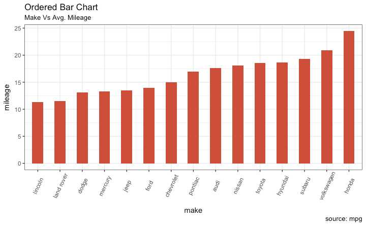
通过y轴变量排序 X 轴变量需要是类型变量或者被转换为 a factor.
Let’s plot the mean city mileage for each manufacturer from mpg dataset.
# Prepare data: group mean city mileage by manufacturer. 准备数据
cty_mpg <- aggregate(mpg$cty, by=list(mpg$manufacturer), FUN=mean)  # aggregate
colnames(cty_mpg) <- c("make", "mileage")  # change column names
cty_mpg <- cty_mpg[order(cty_mpg$mileage), ]  # sort
cty_mpg$make <- factor(cty_mpg$make, levels = cty_mpg$make)  # to retain the order in plot.
head(cty_mpg, 4)
#>          make  mileage
#> 9     lincoln 11.33333
#> 8  land rover 11.50000
#> 3       dodge 13.13514
#> 10    mercury 13.25000
x轴已经是一个factor变量
library(ggplot2)
theme_set(theme_bw())

# Draw plot
ggplot(cty_mpg, aes(x=make, y=mileage)) +
  geom_bar(stat="identity", width=.5, fill="tomato3") +
  labs(title="Ordered Bar Chart",
       subtitle="Make Vs Avg. Mileage",
       caption="source: mpg") +
  theme(axis.text.x = element_text(angle=65, vjust=0.6))
重点在值上 好看现代
library(ggplot2)
theme_set(theme_bw())

# Plot
ggplot(cty_mpg, aes(x=make, y=mileage)) +
  geom_point(size=3) +
  geom_segment(aes(x=make,
                   xend=make,
                   y=0,
                   yend=mileage)) +
  labs(title="Lollipop Chart",
       subtitle="Make Vs Avg. Mileage",
       caption="source: mpg") +
  theme(axis.text.x = element_text(angle=65, vjust=0.6))
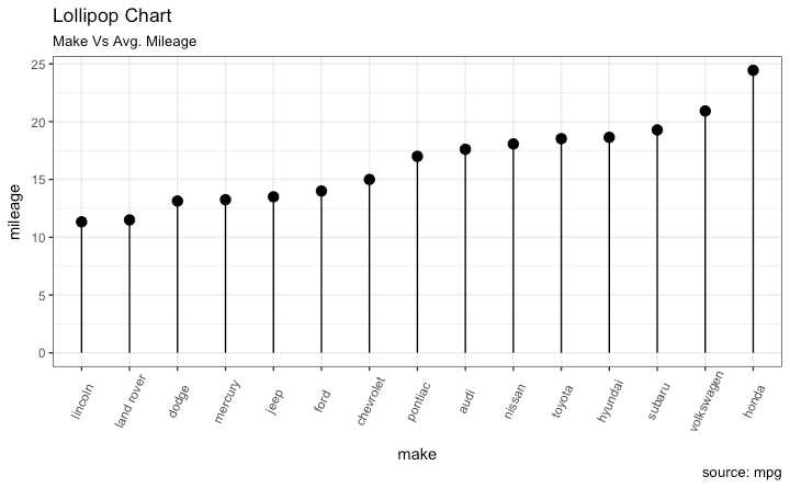
It emphasizes more on the rank ordering of items with respect to actual values and how far apart are the entities with respect to each other.
library(ggplot2)
library(scales)
theme_set(theme_classic())

# Plot
ggplot(cty_mpg, aes(x=make, y=mileage)) +
  geom_point(col="tomato2", size=3) +   # Draw points
  geom_segment(aes(x=make,
                   xend=make,
                   y=min(mileage),
                   yend=max(mileage)),
               linetype="dashed",
               size=0.1) +   # Draw dashed lines
  labs(title="Dot Plot",
       subtitle="Make Vs Avg. Mileage",
       caption="source: mpg") +
  coord_flip()
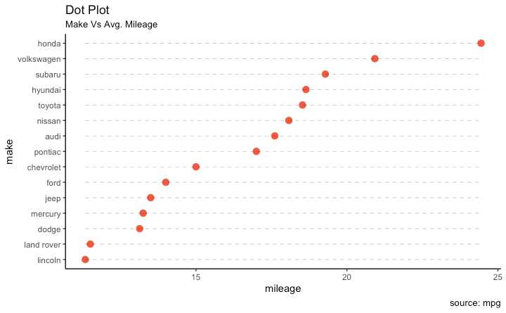
Slope charts are an excellent way of comparing the positional placements between 2 points on time.比较时间上两点的位置
目前没有内置函数来构建 以下代码是一个启示:
library(ggplot2)
library(scales)
theme_set(theme_classic())

# prep data
df <- read.csv("https://raw.githubusercontent.com/selva86/datasets/master/gdppercap.csv")
colnames(df) <- c("continent", "1952", "1957")
left_label <- paste(df$continent, round(df$`1952`),sep=", ")
right_label <- paste(df$continent, round(df$`1957`),sep=", ")
df$class <- ifelse((df$`1957` - df$`1952`) < 0, "red", "green")

# Plot
p <- ggplot(df) + geom_segment(aes(x=1, xend=2, y=`1952`, yend=`1957`, col=class), size=.75, show.legend=F) +
                  geom_vline(xintercept=1, linetype="dashed", size=.1) +
                  geom_vline(xintercept=2, linetype="dashed", size=.1) +
                  scale_color_manual(labels = c("Up", "Down"),
                                     values = c("green"="#00ba38", "red"="#f8766d")) +  # color of lines
                  labs(x="", y="Mean GdpPerCap") +  # Axis labels
                  xlim(.5, 2.5) + ylim(0,(1.1*(max(df$`1952`, df$`1957`))))  # X and Y axis limits

# Add texts
p <- p + geom_text(label=left_label, y=df$`1952`, x=rep(1, NROW(df)), hjust=1.1, size=3.5)
p <- p + geom_text(label=right_label, y=df$`1957`, x=rep(2, NROW(df)), hjust=-0.1, size=3.5)
p <- p + geom_text(label="Time 1", x=1, y=1.1*(max(df$`1952`, df$`1957`)), hjust=1.2, size=5)  # title
p <- p + geom_text(label="Time 2", x=2, y=1.1*(max(df$`1952`, df$`1957`)), hjust=-0.1, size=5)  # title

# Minify theme
p + theme(panel.background = element_blank(),
           panel.grid = element_blank(),
           axis.ticks = element_blank(),
           axis.text.x = element_blank(),
           panel.border = element_blank(),
           plot.margin = unit(c(1,2,1,2), "cm"))
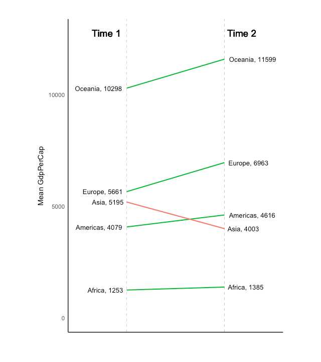
1. Visualize relative positions (like growth and decline) between two points in time.
2. Compare distance between two categories.比较两类间距离
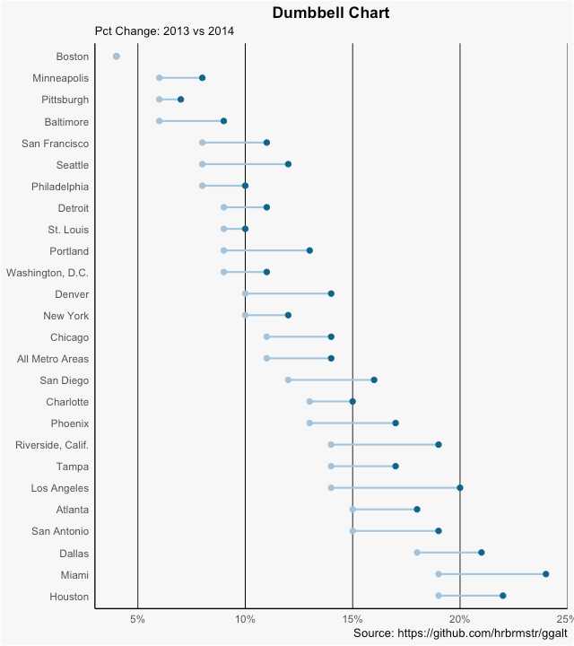
Y 变量应该是 a factor and the levels of the factor variable should be in the same order as it should appear in the plot.
# devtools::install_github("hrbrmstr/ggalt")
library(ggplot2)
library(ggalt)
theme_set(theme_classic())

health <- read.csv("https://raw.githubusercontent.com/selva86/datasets/master/health.csv")
health$Area <- factor(health$Area, levels=as.character(health$Area))  # for right ordering of the dumbells

# health$Area <- factor(health$Area)
gg <- ggplot(health, aes(x=pct_2013, xend=pct_2014, y=Area, group=Area)) +
        geom_dumbbell(color="#a3c4dc",
                      size=0.75,
                      point.colour.l="#0e668b") +
        scale_x_continuous(label=percent) +
        labs(x=NULL,
             y=NULL,
             title="Dumbbell Chart",
             subtitle="Pct Change: 2013 vs 2014",
             caption="Source: https://github.com/hrbrmstr/ggalt") +
        theme(plot.title = element_text(hjust=0.5, face="bold"),
              plot.background=element_rect(fill="#f7f7f7"),
              panel.background=element_rect(fill="#f7f7f7"),
              panel.grid.minor=element_blank(),
              panel.grid.major.y=element_blank(),
              panel.grid.major.x=element_line(),
              axis.ticks=element_blank(),
              legend.position="top",
              panel.border=element_blank())
plot(gg)
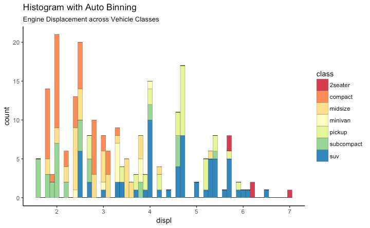
有很多数据点 想研究怎么分布
只有一个变量 geom_bar()会计算每种变量的数量 stat=identity 选项一定要设置 而且x和y轴的变量都要提供
使用 geom_bar() 或者 geom_histogram()生成 使用geom_histogram()时 使用 bins 选项控制条形的个数.设置 binwidth控制bin的范围宽度
geom_histogram 同时控制bins 和 binwidth 更常用
library(ggplot2)
theme_set(theme_classic())
# Histogram on a Continuous (Numeric) Variable
g <- ggplot(mpg, aes(displ)) + scale_fill_brewer(palette = "Spectral")
g + geom_histogram(aes(fill=class),
binwidth = .1,
col="black",
size=.1) + # change binwidth
labs(title="Histogram with Auto Binning",
subtitle="Engine Displacement across Vehicle Classes")
g + geom_histogram(aes(fill=class),
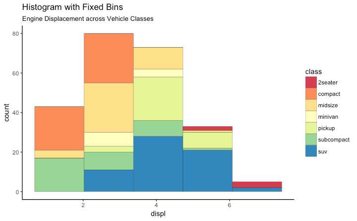
bins=5,
col="black",
size=.1) + # change number of bins
labs(title="Histogram with Fixed Bins",
subtitle="Engine Displacement across Vehicle Classes")
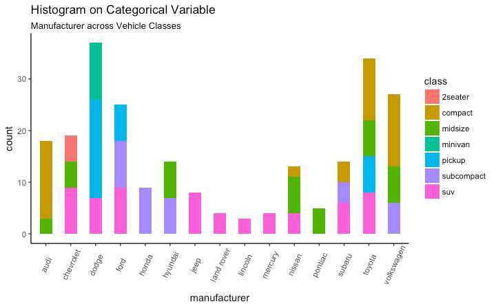
生成不同种类的频率图 通过调整 width, 你可以调整条形的厚度
library(ggplot2)
theme_set(theme_classic())

# Histogram on a Categorical variable
g <- ggplot(mpg, aes(manufacturer))
g + geom_bar(aes(fill=class), width = 0.5) +
  theme(axis.text.x = element_text(angle=65, vjust=0.6)) +
  labs(title="Histogram on Categorical Variable",
       subtitle="Manufacturer across Vehicle Classes")
library(ggplot2)
theme_set(theme_classic())
# Plot
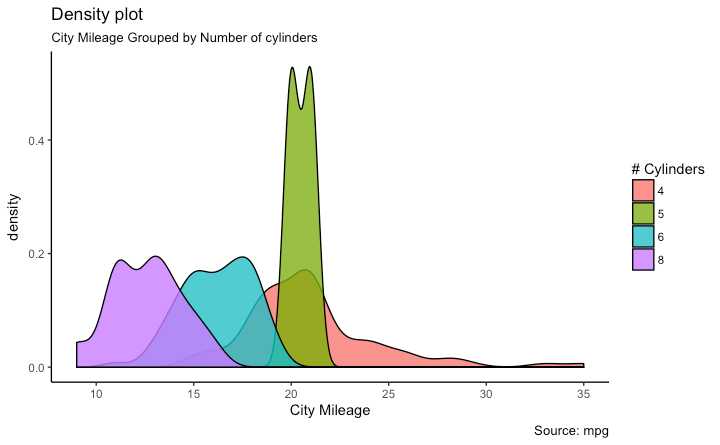
g <- ggplot(mpg, aes(cty))
g + geom_density(aes(fill=factor(cyl)), alpha=0.8) +
labs(title="Density plot",
subtitle="City Mileage Grouped by Number of cylinders",
caption="Source: mpg",
x="City Mileage",
fill="# Cylinders")
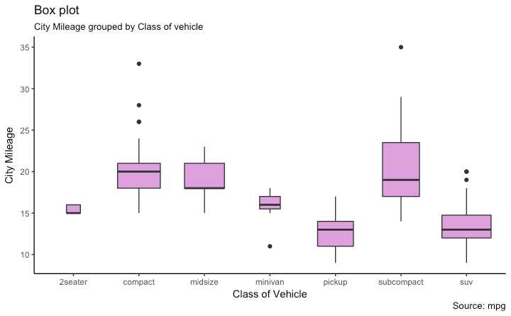
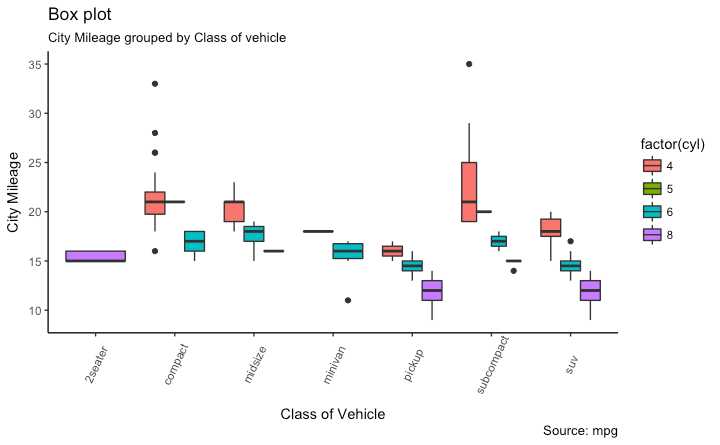
中位数 范围 异常值
箱子顶部是 75% 底部是 25% 线的端点是在 1.5*IQR处 IQR 或者 Inter Quartile Range 是 25th 和 75th 百分位置的距离 线端点之外的点被认为是极端异常点
设置 varwidth=T 可以自动调整箱子的宽度到合适比例
library(ggplot2)
theme_set(theme_classic())

# Plot
g <- ggplot(mpg, aes(class, cty))
g + geom_boxplot(varwidth=T, fill="plum") +
    labs(title="Box plot",
         subtitle="City Mileage grouped by Class of vehicle",
         caption="Source: mpg",
         x="Class of Vehicle",
         y="City Mileage")
library(ggthemes)
g <- ggplot(mpg, aes(class, cty))
g + geom_boxplot(aes(fill=factor(cyl))) +
  theme(axis.text.x = element_text(angle=65, vjust=0.6)) +
  labs(title="Box plot",
       subtitle="City Mileage grouped by Class of vehicle",
       caption="Source: mpg",
       x="Class of Vehicle",
       y="City Mileage")
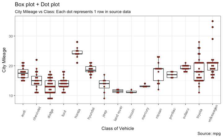
library(ggplot2)
theme_set(theme_bw())

# plot
g <- ggplot(mpg, aes(manufacturer, cty))
g + geom_boxplot() +
  geom_dotplot(binaxis=‘y‘,
               stackdir=‘center‘,
               dotsize = .5,
               fill="red") +
  theme(axis.text.x = element_text(angle=65, vjust=0.6)) +
  labs(title="Box plot + Dot plot",
       subtitle="City Mileage vs Class: Each dot represents 1 row in source data",
       caption="Source: mpg",
       x="Class of Vehicle",
       y="City Mileage")
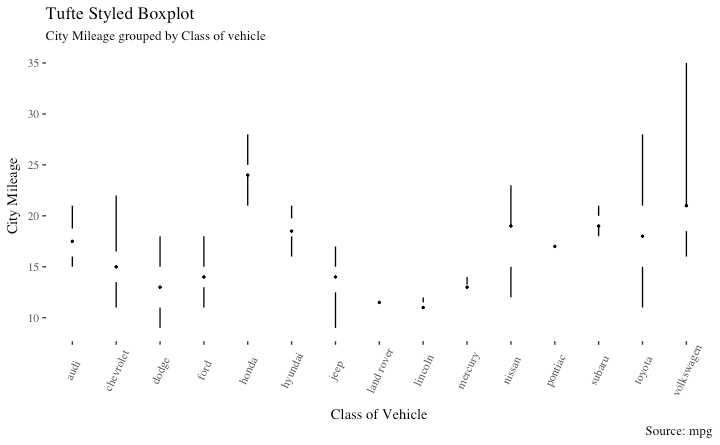
ggthemes 包提供 受启发于 Edward Tufte.
library(ggthemes)
library(ggplot2)
theme_set(theme_tufte())  # from ggthemes

# plot
g <- ggplot(mpg, aes(manufacturer, cty))
g + geom_tufteboxplot() +
      theme(axis.text.x = element_text(angle=65, vjust=0.6)) +
      labs(title="Tufte Styled Boxplot",
           subtitle="City Mileage grouped by Class of vehicle",
           caption="Source: mpg",
           x="Class of Vehicle",
           y="City Mileage")
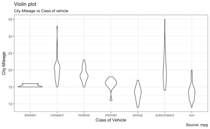
使用 geom_violin().
library(ggplot2)
theme_set(theme_bw())

# plot
g <- ggplot(mpg, aes(class, cty))
g + geom_violin() +
  labs(title="Violin plot",
       subtitle="City Mileage vs Class of vehicle",
       caption="Source: mpg",
       x="Class of Vehicle",
       y="City Mileage")
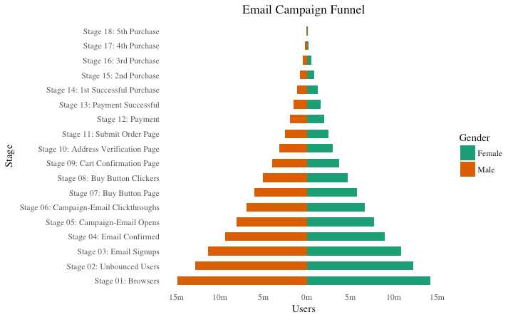
男性女性用户在不同阶段类别的分布
library(ggplot2)
library(ggthemes)
options(scipen = 999)  # turns of scientific notations like 1e+40

# Read data
email_campaign_funnel <- read.csv("https://raw.githubusercontent.com/selva86/datasets/master/email_campaign_funnel.csv")

# X Axis Breaks and Labels
brks <- seq(-15000000, 15000000, 5000000)
lbls = paste0(as.character(c(seq(15, 0, -5), seq(5, 15, 5))), "m")

# Plot
ggplot(email_campaign_funnel, aes(x = Stage, y = Users, fill = Gender)) +   # Fill column
                              geom_bar(stat = "identity", width = .6) +   # draw the bars
                              scale_y_continuous(breaks = brks,   # Breaks
                                                 labels = lbls) + # Labels
                              coord_flip() +  # Flip axes
                              labs(title="Email Campaign Funnel") +
                              theme_tufte() +  # Tufte theme from ggfortify
                              theme(plot.title = element_text(hjust = .5),
                                    axis.ticks = element_blank()) +   # Centre plot title
                              scale_fill_brewer(palette = "Dark2")  # Color palette
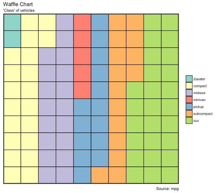
展示总人口的种类构成 虽然没有直接的函数 但是可以通过巧妙地使用 geom_tile()函数实现
var <- mpg$class  # the categorical data

## Prep data (nothing to change here)
nrows <- 10
df <- expand.grid(y = 1:nrows, x = 1:nrows)
categ_table <- round(table(var) * ((nrows*nrows)/(length(var))))
categ_table
#>   2seater    compact    midsize    minivan     pickup subcompact        suv
#>         2         20         18          5         14         15         26

df$category <- factor(rep(names(categ_table), categ_table))
# NOTE: if sum(categ_table) is not 100 (i.e. nrows^2), it will need adjustment to make the sum to 100.

## Plot
ggplot(df, aes(x = x, y = y, fill = category)) +
        geom_tile(color = "black", size = 0.5) +
        scale_x_continuous(expand = c(0, 0)) +
        scale_y_continuous(expand = c(0, 0), trans = ‘reverse‘) +
        scale_fill_brewer(palette = "Set3") +
        labs(title="Waffle Chart", subtitle="‘Class‘ of vehicles",
             caption="Source: mpg") +
        theme(panel.border = element_rect(size = 2),
              plot.title = element_text(size = rel(1.2)),
              axis.text = element_blank(),
              axis.title = element_blank(),
              axis.ticks = element_blank(),
              legend.title = element_blank(),
              legend.position = "right")
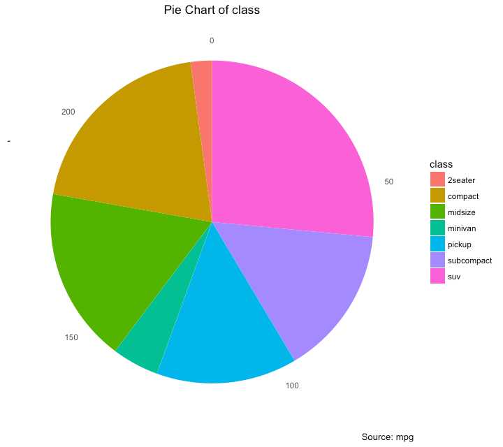
使用 coord_polar().
library(ggplot2)
theme_set(theme_classic())

# Source: Frequency table
df <- as.data.frame(table(mpg$class))
colnames(df) <- c("class", "freq")
pie <- ggplot(df, aes(x = "", y=freq, fill = factor(class))) +
  geom_bar(width = 1, stat = "identity") +
  theme(axis.line = element_blank(),
        plot.title = element_text(hjust=0.5)) +
  labs(fill="class",
       x=NULL,
       y=NULL,
       title="Pie Chart of class",
       caption="Source: mpg")

pie + coord_polar(theta = "y", start=0)

# Source: Categorical variable.
# mpg$class
pie <- ggplot(mpg, aes(x = "", fill = factor(class))) +
  geom_bar(width = 1) +
  theme(axis.line = element_blank(),
        plot.title = element_text(hjust=0.5)) +
  labs(fill="class",
       x=NULL,
       y=NULL,
       title="Pie Chart of class",
       caption="Source: mpg")

pie + coord_polar(theta = "y", start=0)
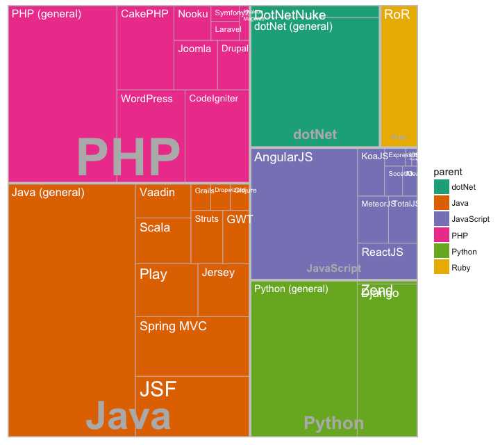
通过内嵌矩形展示分级数据 treemapify 包提供需要的函数把数据转换为想要的格式 (treemapify) 并且画出图形 (ggplotify).
必须使用 treemapify()转换数据格式 数据要求:one variable each that describes the area of the tiles, variable for fill color, variable that has the tile’s label and finally the parent group.
一旦格式转换好 只需要调用 ggplotify() 这个例子有点问题
library(ggplot2)
library(treemapify)
proglangs <- read.csv("https://raw.githubusercontent.com/selva86/datasets/master/proglanguages.csv")

# plot
treeMapCoordinates <- treemapify(proglangs,
                                 area = "value",
                                 fill = "parent",
                                 label = "id",
                                 group = "parent")

treeMapPlot <- ggplotify(treeMapCoordinates) +
                  scale_x_continuous(expand = c(0, 0)) +
                  scale_y_continuous(expand = c(0, 0)) +
                  scale_fill_brewer(palette = "Dark2")

print(treeMapPlot)
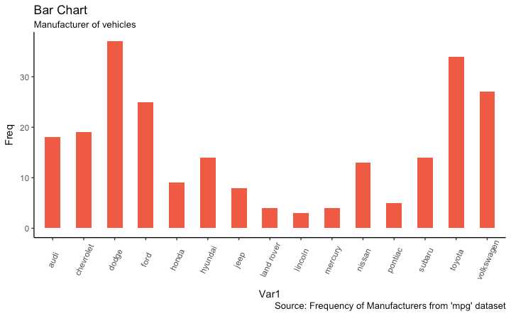
stat=identityx 和 y 在 aes() 中, x是character 或者 factor , y 是数值变量# prep frequency table freqtable <- table(mpg$manufacturer) df <- as.data.frame.table(freqtable) head(df) #> Var1 Freq #> 1 audi 18 #> 2 chevrolet 19 #> 3 dodge 37 #> 4 ford 25 #> 5 honda 9 #> 6 hyundai 14
# 画图
library(ggplot2)
theme_set(theme_classic())

# Plot
g <- ggplot(df, aes(Var1, Freq))
g + geom_bar(stat="identity", width = 0.5, fill="tomato2") +
      labs(title="Bar Chart",
           subtitle="Manufacturer of vehicles",
           caption="Source: Frequency of Manufacturers from ‘mpg‘ dataset") +
      theme(axis.text.x = element_text(angle=65, vjust=0.6))
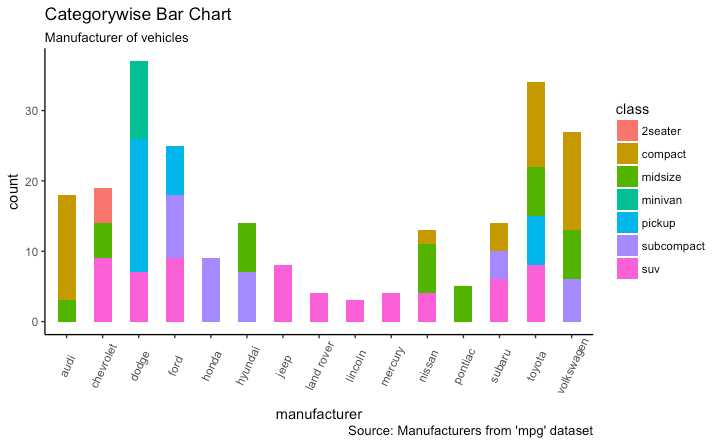
如果只提供 X 并且 stat=identity 没有被设置
# From on a categorical column variable
g <- ggplot(mpg, aes(manufacturer))
g + geom_bar(aes(fill=class), width = 0.5) +
  theme(axis.text.x = element_text(angle=65, vjust=0.6)) +
  labs(title="Categorywise Bar Chart",
       subtitle="Manufacturer of vehicles",
       caption="Source: Manufacturers from ‘mpg‘ dataset")
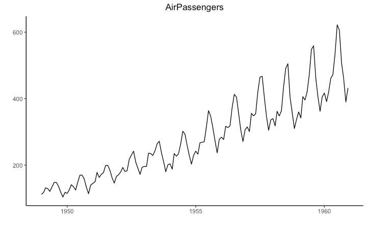
ts) 使用时间序列对象来画时间序列图 ggfortify 可以直接画 (ts).
## AirPassengers是 Timeseries object (ts)
library(ggplot2)
library(ggfortify)
theme_set(theme_classic())

# Plot
autoplot(AirPassengers) +
  labs(title="AirPassengers") +
  theme(plot.title = element_text(hjust=0.5))
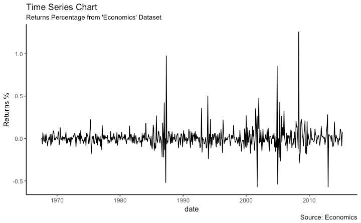
使用geom_line(), data.frame
library(ggplot2)
theme_set(theme_classic())

# Allow Default X Axis Labels
ggplot(economics, aes(x=date)) +
  geom_line(aes(y=returns_perc)) +
  labs(title="Time Series Chart",
       subtitle="Returns Percentage from ‘Economics‘ Dataset",
       caption="Source: Economics",
       y="Returns %")
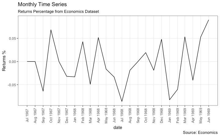
使用 scale_x_date()设置自己想要的时间间隔
library(ggplot2)
library(lubridate)
theme_set(theme_bw())

economics_m <- economics[1:24, ]

# X轴的标签和间断
lbls <- paste0(month.abb[month(economics_m$date)], " ", lubridate::year(economics_m$date))
brks <- economics_m$date

# plot
ggplot(economics_m, aes(x=date)) +
  geom_line(aes(y=returns_perc)) +
  labs(title="Monthly Time Series",
       subtitle="Returns Percentage from Economics Dataset",
       caption="Source: Economics",
       y="Returns %") +  # title and caption
  scale_x_date(labels = lbls,
               breaks = brks) +  # 变为 monthly ticks and labels
  theme(axis.text.x = element_text(angle = 90, vjust=0.5),
        panel.grid.minor = element_blank())  #关闭次级间断
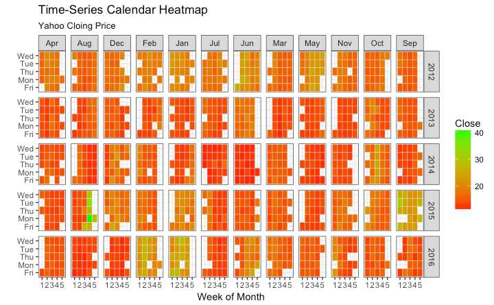
使用 geom_tile 需要更多的数据准备工作
# http://margintale.blogspot.in/2012/04/ggplot2-time-series-heatmaps.html
library(ggplot2)
library(plyr)
library(scales)
library(zoo)

df <- read.csv("https://raw.githubusercontent.com/selva86/datasets/master/yahoo.csv")
df$date <- as.Date(df$date)  # format date
df <- df[df$year >= 2012, ]  # filter reqd years

# Create Month Week
df$yearmonth <- as.yearmon(df$date)
df$yearmonthf <- factor(df$yearmonth)
df <- ddply(df,.(yearmonthf), transform, monthweek=1+week-min(week))  # compute week number of month
df <- df[, c("year", "yearmonthf", "monthf", "week", "monthweek", "weekdayf", "VIX.Close")]
head(df)
#>   year yearmonthf monthf week monthweek weekdayf VIX.Close
#> 1 2012   Jan 2012    Jan    1         1      Tue     22.97
#> 2 2012   Jan 2012    Jan    1         1      Wed     22.22
#> 3 2012   Jan 2012    Jan    1         1      Thu     21.48
#> 4 2012   Jan 2012    Jan    1         1      Fri     20.63
#> 5 2012   Jan 2012    Jan    2         2      Mon     21.07
#> 6 2012   Jan 2012    Jan    2         2      Tue     20.69


# Plot
ggplot(df, aes(monthweek, weekdayf, fill = VIX.Close)) +
  geom_tile(colour = "white") +
  facet_grid(year~monthf) +
  scale_fill_gradient(low="red", high="green") +
  labs(x="Week of Month",
       y="",
       title = "Time-Series Calendar Heatmap",
       subtitle="Yahoo Closing Price",
       fill="Close")
适合仅有几个时间点时
library(dplyr)
theme_set(theme_classic())
source_df <- read.csv("https://raw.githubusercontent.com/jkeirstead/r-slopegraph/master/cancer_survival_rates.csv")

# Define functions. Source: https://github.com/jkeirstead/r-slopegraph
tufte_sort <- function(df, x="year", y="value", group="group", method="tufte", min.space=0.05) {
    ## First rename the columns for consistency
    ids <- match(c(x, y, group), names(df))
    df <- df[,ids]
    names(df) <- c("x", "y", "group")

    ## Expand grid to ensure every combination has a defined value
    tmp <- expand.grid(x=unique(df$x), group=unique(df$group))
    tmp <- merge(df, tmp, all.y=TRUE)
    df <- mutate(tmp, y=ifelse(is.na(y), 0, y))

    ## Cast into a matrix shape and arrange by first column
    require(reshape2)
    tmp <- dcast(df, group ~ x, value.var="y")
    ord <- order(tmp[,2])
    tmp <- tmp[ord,]

    min.space <- min.space*diff(range(tmp[,-1]))
    yshift <- numeric(nrow(tmp))
    ## Start at "bottom" row
    ## Repeat for rest of the rows until you hit the top
    for (i in 2:nrow(tmp)) {
        ## Shift subsequent row up by equal space so gap between
        ## two entries is >= minimum
        mat <- as.matrix(tmp[(i-1):i, -1])
        d.min <- min(diff(mat))
        yshift[i] <- ifelse(d.min < min.space, min.space - d.min, 0)
    }


    tmp <- cbind(tmp, yshift=cumsum(yshift))

    scale <- 1
    tmp <- melt(tmp, id=c("group", "yshift"), variable.name="x", value.name="y")
    ## Store these gaps in a separate variable so that they can be scaled ypos = a*yshift + y

    tmp <- transform(tmp, ypos=y + scale*yshift)
    return(tmp)

}

plot_slopegraph <- function(df) {
    ylabs <- subset(df, x==head(x,1))$group
    yvals <- subset(df, x==head(x,1))$ypos
    fontSize <- 3
    gg <- ggplot(df,aes(x=x,y=ypos)) +
        geom_line(aes(group=group),colour="grey80") +
        geom_point(colour="white",size=8) +
        geom_text(aes(label=y), size=fontSize, family="American Typewriter") +
        scale_y_continuous(name="", breaks=yvals, labels=ylabs)
    return(gg)
}

## Prepare data
df <- tufte_sort(source_df,
                 x="year",
                 y="value",
                 group="group",
                 method="tufte",
                 min.space=0.05)

df <- transform(df,
                x=factor(x, levels=c(5,10,15,20),
                            labels=c("5 years","10 years","15 years","20 years")),
                y=round(y))

## Plot
plot_slopegraph(df) + labs(title="Estimates of % survival rates") +
                      theme(axis.title=element_blank(),
                            axis.ticks = element_blank(),
                            plot.title = element_text(hjust=0.5,
                                                      family = "American Typewriter",
                                                      face="bold"),
                            axis.text = element_text(family = "American Typewriter",
                                                     face="bold"))

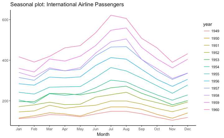
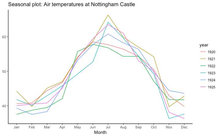
使用 forecast::ggseasonplot
library(ggplot2)
library(forecast)
theme_set(theme_classic())

# Subset data
nottem_small <- window(nottem, start=c(1920, 1), end=c(1925, 12))  # subset a smaller timewindow

# Plot
ggseasonplot(AirPassengers) + labs(title="Seasonal plot: International Airline Passengers")
ggseasonplot(nottem_small) + labs(title="Seasonal plot: Air temperatures at Nottingham Castle")
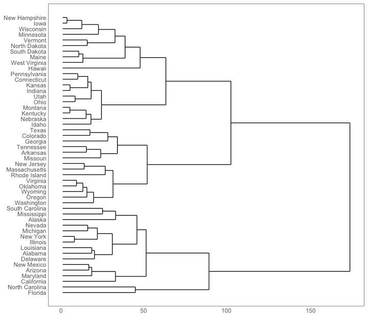
# install.packages("ggdendro")
library(ggplot2)
library(ggdendro)
theme_set(theme_bw())

hc <- hclust(dist(USArrests), "ave")  # hierarchical clustering

# plot
ggdendrogram(hc, rotate = TRUE, size = 2)
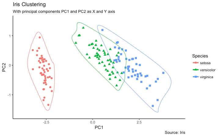
使用 geom_encircle()圈出类 输入变量为一个子数据框
# devtools::install_github("hrbrmstr/ggalt")
library(ggplot2)
library(ggalt)
library(ggfortify)
theme_set(theme_classic())

# Compute data with principal components ------------------
df <- iris[c(1, 2, 3, 4)]
pca_mod <- prcomp(df)  # compute principal components

# Data frame of principal components ----------------------
df_pc <- data.frame(pca_mod$x, Species=iris$Species)  # dataframe of principal components
df_pc_vir <- df_pc[df_pc$Species == "virginica", ]  # df for ‘virginica‘
df_pc_set <- df_pc[df_pc$Species == "setosa", ]  # df for ‘setosa‘
df_pc_ver <- df_pc[df_pc$Species == "versicolor", ]  # df for ‘versicolor‘

# Plot ----------------------------------------------------
ggplot(df_pc, aes(PC1, PC2, col=Species)) +
  geom_point(aes(shape=Species), size=2) +   # draw points
  labs(title="Iris Clustering",
       subtitle="With principal components PC1 and PC2 as X and Y axis",
       caption="Source: Iris") +
  coord_cartesian(xlim = 1.2 * c(min(df_pc$PC1), max(df_pc$PC1)),
                  ylim = 1.2 * c(min(df_pc$PC2), max(df_pc$PC2))) +   # change axis limits
  geom_encircle(data = df_pc_vir, aes(x=PC1, y=PC2)) +   # draw circles
  geom_encircle(data = df_pc_set, aes(x=PC1, y=PC2)) +
  geom_encircle(data = df_pc_ver, aes(x=PC1, y=PC2))
ggmap 包使得可以 和google maps api 进行交互 同时获取想要的地方的坐标位置
使用 geocode()函数获取地点的坐标 使用 qmap() 获取地图
maptype决定地图类型
设定 zoom 来选择缩放尺度大小 默认为10
# 最好下载 dev 版本 ----------
# devtools::install_github("dkahle/ggmap")
# devtools::install_github("hrbrmstr/ggalt")

# load packages
library(ggplot2)
library(ggmap)
library(ggalt)

# Get Chennai‘s Coordinates --------------------------------
chennai <-  geocode("Chennai")  # get longitude and latitude

# Get the Map ----------------------------------------------
# Google Satellite Map
chennai_ggl_sat_map <- qmap("chennai", zoom=12, source = "google", maptype="satellite")

# Google Road Map
chennai_ggl_road_map <- qmap("chennai", zoom=12, source = "google", maptype="roadmap")

# Google Hybrid Map
chennai_ggl_hybrid_map <- qmap("chennai", zoom=12, source = "google", maptype="hybrid")

# Open Street Map
chennai_osm_map <- qmap("chennai", zoom=12, source = "osm")

# Get Coordinates for Chennai‘s Places ---------------------
chennai_places <- c("Kolathur",
                    "Washermanpet",
                    "Royapettah",
                    "Adyar",
                    "Guindy")

places_loc <- geocode(chennai_places)  # get longitudes and latitudes


# Plot Open Street Map -------------------------------------
chennai_osm_map + geom_point(aes(x=lon, y=lat),
                             data = places_loc,
                             alpha = 0.7,
                             size = 7,
                             color = "tomato") +
                  geom_encircle(aes(x=lon, y=lat),
                                data = places_loc, size = 2, color = "blue")

# Plot Google Road Map -------------------------------------
chennai_ggl_road_map + geom_point(aes(x=lon, y=lat),
                                  data = places_loc,
                                  alpha = 0.7,
                                  size = 7,
                                  color = "tomato") +
                       geom_encircle(aes(x=lon, y=lat),
                                     data = places_loc, size = 2, color = "blue")

# Google Hybrid Map ----------------------------------------
chennai_ggl_hybrid_map + geom_point(aes(x=lon, y=lat),
                                     data = places_loc,
                                     alpha = 0.7,
                                     size = 7,
                                     color = "tomato") +
                          geom_encircle(aes(x=lon, y=lat),
                                        data = places_loc, size = 2, color = "blue")
参考:
http://r-statistics.co/Top50-Ggplot2-Visualizations-MasterList-R-Code.html
标签:rap efi treemap mes scale his 适合 manual life
原文地址:https://www.cnblogs.com/icydengyw/p/11495900.html