标签:tps rds bin 学生 enum href nump nec ack
import matplotlib.pyplot as plt
from matplotlib.font_manager import  FontProperties  # 修改字体
font=FontProperties(fname='C:\Windows\Fonts\simfang.ttf')

plt.style.use('ggplot')  # 设置条形图的背景
classes=['3班','4班','5班','6班']
students = [66, 55, 45, 70]
classes_index=range(len(classes))
plt.bar(classes_index,students,color='darkgreen')

plt.xlabel('学生',fontproperties=font,fontsize=15)
plt.ylabel('学生人数',fontproperties=font,fontsize=15)
plt.title('班级-学生人数',fontproperties=font,fontsize=20)
plt.xticks(classes_index,classes,fontproperties=font)
plt.show()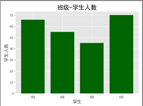
import numpy as np
import matplotlib.pyplot as plt
from matplotlib.font_manager import  FontProperties  # 修改字体
font=FontProperties(fname='C:\Windows\Fonts\simhei.ttf')
plt.style.use('ggplot')
x1=np.random.randn(10000) # 随机生成10000个小数
x2=np.random.randn(10000)

fig = plt.figure() # 生成一张画布
ax1 = fig.add_subplot(1,2,1) # 表示一行两列取第一个
ax2 = fig.add_subplot(1,2,2) # 表示一行两列取第二个

ax1.hist(x1,bins=50,color='green')  # 表示10000个小数分到50个柱子上
ax2.hist(x2,bins=50,color='blue')
ax1.set_title('x1的正太分布',fontproperties=font) # 加子标题
ax2.set_title('x2的正太分布',fontproperties=font) # 加子标题
fig.suptitle('两个正太分布',fontproperties=font,fontsize=20) # 父标题
plt.show()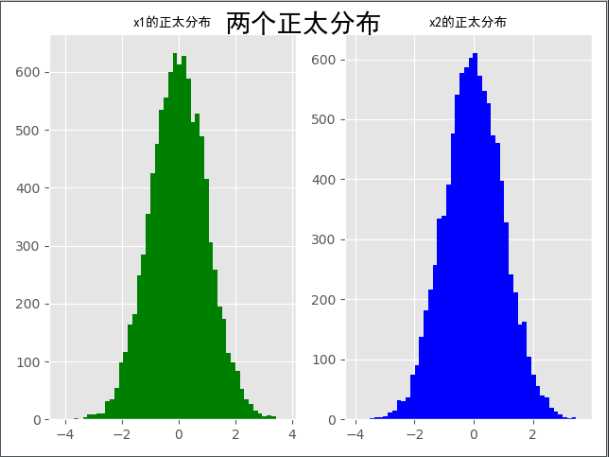
import numpy as np
import matplotlib.pyplot as plt
from matplotlib.font_manager import  FontProperties  # 修改字体
font=FontProperties(fname='C:\Windows\Fonts\simhei.ttf')
plt.style.use('ggplot')

x1=np.random.randn(40).cumsum()  # cumsum是讲生成的随机数一个个累加起来,作为对应位置的新元素
x2=np.random.randn(40).cumsum()
x3=np.random.randn(40).cumsum()
x4=np.random.randn(40).cumsum()

plt.plot(x1,color='r',linestyle='-',marker='o',label='红圆线')
plt.plot(x2,color='b',linestyle='--',marker='*',label='蓝虚线')
plt.plot(x3,color='black',linestyle='-.',marker='s',label='黑方线')
plt.plot(x4,color='y',linestyle=':',marker='s',label='黄方线')
plt.legend(loc='best',prop=font) # 显示label,loc不指定默认在最佳位置显示label,指定right就是将label在右边显示
plt.show()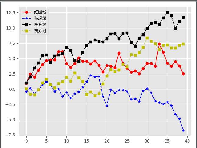
# 生成一个对称轴为x=1的二次函数
import numpy as np
import matplotlib.pyplot as plt
from matplotlib.font_manager import  FontProperties  # 修改字体
font=FontProperties(fname='C:\Windows\Fonts\simhei.ttf')  #
plt.style.use('ggplot')

x=np.arange(-20,21)
# y = np.random.randn(20).cumsum()
y=(x**2)+2*x+1
plt.scatter(x,y)
plt.show()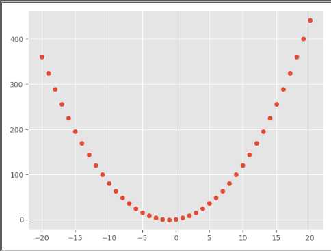
import numpy as np
import matplotlib.pyplot as plt
from matplotlib.font_manager import FontProperties
font=FontProperties(fname='C:\Windows\Fonts\simhei.ttf')


plt.style.use('ggplot')
x=np.arange(1,20,1)
print(x)

# 拟合一条水平散点线
np.random.seed(1)
y_linear=x+10*np.random.randn(19)
print(y_linear)

# 拟合一条x**2 的散点线
y_quad=x**2+10*np.random.randn(19)
print(y_quad)

# s是散点大小
fig = plt.figure()
ax1 = fig.add_subplot(121)
plt.scatter(x,y_linear,s=30,color='r',label='蓝点')
plt.scatter(x,y_quad,s=100,color='b',label='红点')

ax2= fig.add_subplot(122)
plt.plot(x,y_linear,color='r')
plt.plot(x,y_quad,color='b')

# 限制x轴和y轴的范围取值
plt.xlim(min(x) -1,max(x) + 1)
plt.ylim(min(y_quad) - 10,max(y_quad) + 10)
fig.suptitle('散点图+直线图',fontproperties=font,fontsize=20)
ax1.set_title('散点图',fontproperties=font)
ax1.legend(prop=font)  # 最佳位置显示label
ax2.set_title('折线图',fontproperties=font)
plt.show()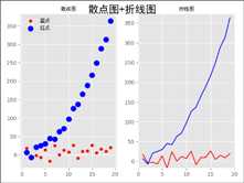
import numpy as np
import  matplotlib.pyplot as plt
from pylab import mpl
from matplotlib.font_manager import FontProperties
font=FontProperties(fname='C:\Windows\Fonts\simhei.ttf')
mpl.rcParams['font.sans-serif'] = ['SimHei']

fig,ax = plt.subplots(subplot_kw=dict(aspect='equal'))

recipe = ['优','良','轻度污染','中度污染','重度污染','严重污染','缺']

data = [2,49,21,9,11,6,2]
colors = ['lime','yellow','darkorange','red','purple','maroon','grey',]
wedges,texts,texts2 = ax.pie(data,
                             wedgeprops=dict(width = 0.5),
                             startangle=40,
                             colors=colors,
                             autopct='%1.0f%%',
                             pctdistance=0.8)
# print(wedges)
'''
[<matplotlib.patches.Wedge object at 0x000000000EE46198>, <matplotlib.patches.Wedge object at 0x000000000EE46860>,
  <matplotlib.patches.Wedge object at 0x000000000EE46F28>, <matplotlib.patches.Wedge object at 0x000000000EE57630>,
  <matplotlib.patches.Wedge object at 0x000000000EE57CF8>, <matplotlib.patches.Wedge object at 0x000000000EE63400>,
  <matplotlib.patches.Wedge object at 0x000000000EE63AC8>]
'''
# print(texts)
# print(texts2)
plt.setp(texts2,size=14,weight='bold')
bbox_props=dict(boxstyle='squre',pad='0.3',fc='w',ec='k',lw=0.72)
kw = dict(xycoords='data',
          textcoords='data',
          arrowprops=dict(arrowstyle='->'),
          bbox=None,
          zorder=0,
          va='center')
for i ,p in enumerate(wedges):
    # print(i,p)
    '''
     0 Wedge(center=(0, 0), r=1, theta1=40, theta2=47.2, width=0.5)
     1 Wedge(center=(0, 0), r=1, theta1=47.2, theta2=223.6, width=0.5)
     2 Wedge(center=(0, 0), r=1, theta1=223.6, theta2=299.2, width=0.5)
     3 Wedge(center=(0, 0), r=1, theta1=299.2, theta2=331.6, width=0.5)
     4 Wedge(center=(0, 0), r=1, theta1=331.6, theta2=371.2, width=0.5)
     5 Wedge(center=(0, 0), r=1, theta1=371.2, theta2=392.8, width=0.5)
     6 Wedge(center=(0, 0), r=1, theta1=392.8, theta2=400, width=0.5)
    '''
    ang=(p.theta2-p.theta1)/2. + p.theta1
    y=np.sin(np.deg2rad(ang))
    x = np.cos(np.deg2rad(ang))
    horizontalalignment = {-1:'right',1:'left'}[int(np.sign(x))]
    connectionstyle='angle,angleA=0,angleB={}'.format(ang)
    kw['arrowprops'].update({'connectionstyle':connectionstyle})
    ax.annotate(recipe[i],
                xy=(x,y),
                xytext=(1.25*np.sign(x),1.3*y),
                size=16,
                horizontalalignment=horizontalalignment,
                fontproperties=font,
                **kw)
ax.set_title('饼图示例',fontproperties=font)
plt.show()
? 线型linestyle(-,-.,--,..)
? 点型marker(v,^,s,*,H,+,x,D,o,....)
? 颜色color(b,g,r,y,k,w....)
? 设置图像标题:plt.title()
? 设置x轴名称:plt.xlabel()
? 设置y轴名称:plt.ylabel()
? 设置X轴范围:plt.Xlim()
? 设置Y轴范围:plt.ylim()
? 设置X轴刻度:plt.xtlcks()
? 设置Y轴刻度:plt.yticks()
? 设置曲线图例:plt.legend()
标签:tps rds bin 学生 enum href nump nec ack
原文地址:https://www.cnblogs.com/zhangchaocoming/p/11624444.html