标签:ack tle column auto oct 高度自适应 pad gif play

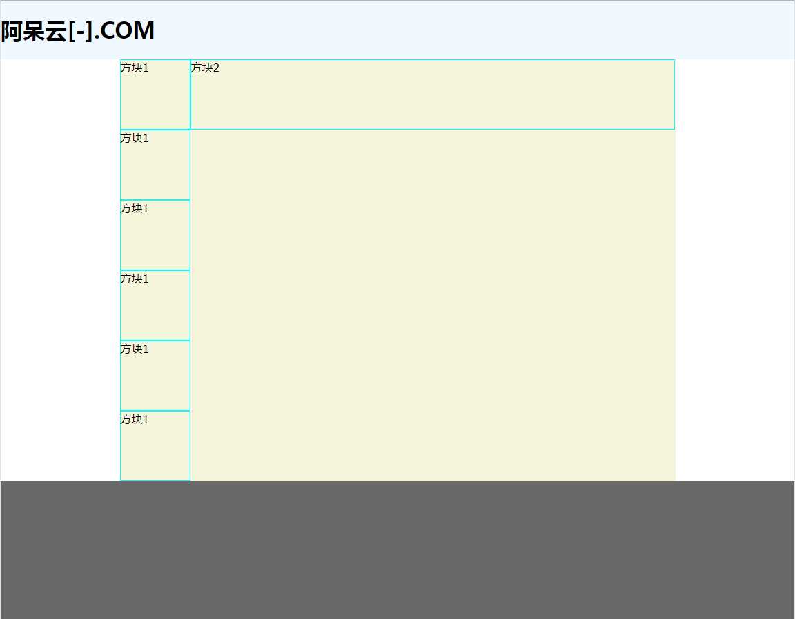
<!DOCTYPE html>
<html>
    <head>
        <meta charset="utf-8">
        <title></title>
        <style type="text/css">
            /* 圣杯布局 */
            body{
                margin: 0;
                padding: 0;
                display: flex;
                flex-direction: column;/* 灵活的项目将垂直显示,正如一个列一样 */
            }
            header{
                flex: 0 0 50px;
                background-color: aliceblue;
                align-items: center;
            }
            footer{
                flex: 0 0 200px;
                background-color: dimgray;
            }
            .content{
                display: flex;
                width: 70%;
                margin: 0 auto;
                background: beige;
                height: auto;

            }
            .square1{
                border: aqua 1px solid;width: 100px; height: 100px;/* 内容效果 */
            }
            .square2{
                border: aqua 1px solid;width: 700px; height: 100px;/* 内容效果 */

            }
            .parcel2{
                display: flex;
                flex-wrap: wrap;
            }
        </style>
    </head>
    <body>
        <!--
            页面从上到下为头部、中部、脚部;头部、脚部定高,不可伸缩;中部高度自适应。
         -->
         <header><h1>阿呆云[-].COM</h1></header>

             <div class="content">
                <div class="parcel">
                    <div class="square1" >方块1</div>
                    <div class="square1" >方块1</div>
                    <div class="square1" >方块1</div>
                    <div class="square1" >方块1</div>
                    <div class="square1" >方块1</div>
                    <div class="square1" >方块1</div>
                </div>
                <div class="parcel2">
                    <div class="square2" >方块2</div>
                </div>
             </div>

         <footer></footer>
    </body>
</html>
效果图:
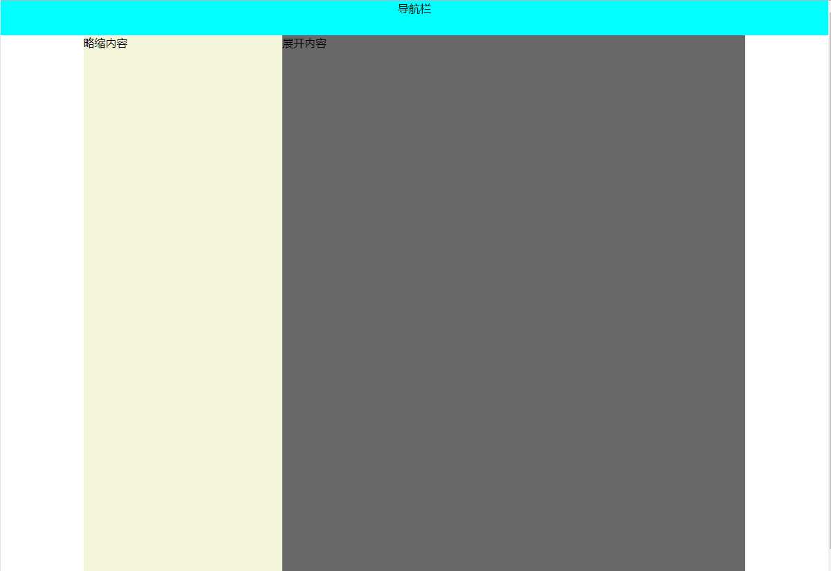
<!DOCTYPE html>
<html>
    <head>
        <meta charset="utf-8">
        <title></title>
        <style type="text/css">
            body{
                display: flex;
                margin: 0;
                padding: 0;
                flex-wrap: wrap;
            }
            .box{
                display: flex;
                margin: 0 auto;
                width: 80%;
                height: 1000px;
                background: #696969;
            }
            .top{
                width: 100%;
                height: 50px;
                background: #00FFFF;
                text-align: center;
            }
            .left{
                width: 30%;
                background: #F5F5DC;
            }
        </style>
    </head>
    <body>
        <div class="top">导航栏</div>
        <div class="box">
            <div class="left">
                略缩内容
            </div>
            <div class="right">
                展开内容
            </div>
        </div>

    </body>
</html>
效果图:
标签:ack tle column auto oct 高度自适应 pad gif play
原文地址:https://www.cnblogs.com/449house/p/11793476.html
