标签:bootstra Fix sheet str jquery inf fixed 适应 nta
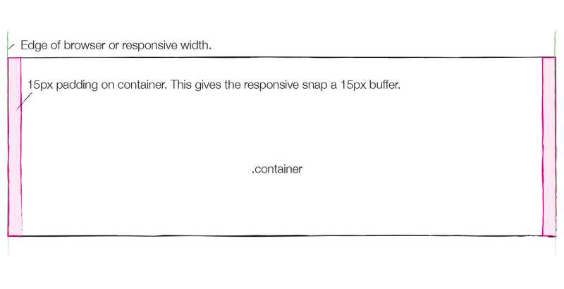
流体布局容器
        容器的width为auto,只是两边加了15px的padding。
流体布局容器
容器的width为auto,只是两边加了15px的padding。
<div class="container-fluid">

<!DOCTYPE html>
<html>
    <head>
        <meta charset="UTF-8">
        <title></title>
        <link rel="stylesheet" href="css/bootstrap.min.css" />
        <style type="text/css">
            .container-fluid{
                border: 1px solid;
                height: 30px;
                background: pink;
            }
        </style>
    </head>
    <body>
        <!--流体容器   自适应-->
        <div class="container-fluid">
            container-fluid
        </div>
    </body>
    <script src="js/jquery.min.js"></script>
    <script src="js/bootstrap.min.js"></script>
</html>
源码刨析
.container {
  .container-fixed();
                sm=平板=800     //768px
  @media (min-width: @screen-sm-min) {
    width: @container-sm;
  }            md=中屏pc=1024   //992px;
  @media (min-width: @screen-md-min) {
    width: @container-md;
  }              lg=大屏pc=1232  //1200px;
  @media (min-width: @screen-lg-min) {
    width: @container-lg;
  }
}
.container-fluid {
  .container-fixed();
}
标签:bootstra Fix sheet str jquery inf fixed 适应 nta
原文地址:https://www.cnblogs.com/hack-ing/p/11811338.html
