标签:switch pre position 表示 otto diff http tick time
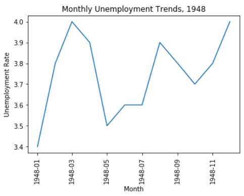
plt_1

import pandas as pd
unrate = pd.read_csv(‘unrate.csv‘)
unrate[‘DATE‘] = pd.to_datetime(unrate[‘DATE‘])
print(unrate.head(12))
‘‘‘
         DATE  VALUE
0  1948-01-01    3.4
1  1948-02-01    3.8
2  1948-03-01    4.0
3  1948-04-01    3.9
4  1948-05-01    3.5
5  1948-06-01    3.6
6  1948-07-01    3.6
7  1948-08-01    3.9
8  1948-09-01    3.8
9  1948-10-01    3.7
10 1948-11-01    3.8
11 1948-12-01    4.0
‘‘‘

import matplotlib.pyplot as plt
#%matplotlib inline
#Using the different pyplot functions, we can create, customize, and display a plot. For example, we can use 2 functions to :
plt.plot()
plt.show()
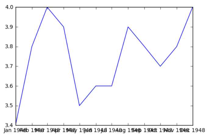
first_twelve = unrate[0:12]
plt.plot(first_twelve[‘DATE‘], first_twelve[‘VALUE‘])
plt.show()
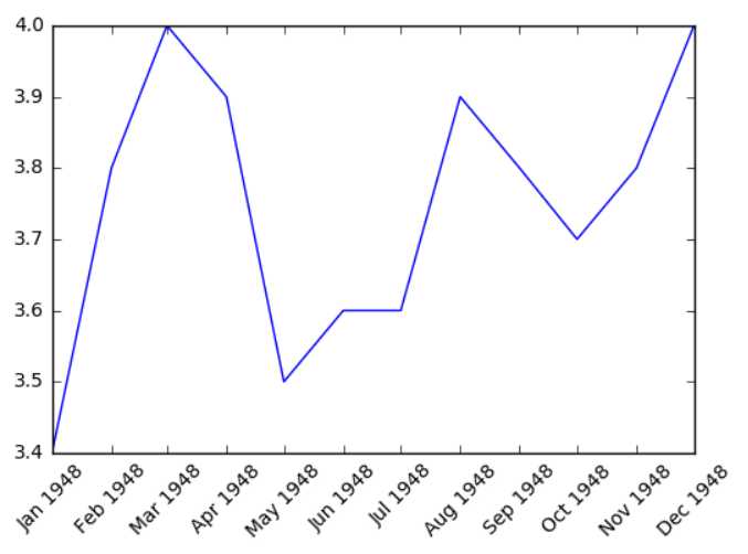
#While the y-axis looks fine, the x-axis tick labels are too close together and are unreadable
#We can rotate the x-axis tick labels by 90 degrees so they don‘t overlap
#We can specify degrees of rotation using a float or integer value.
plt.plot(first_twelve[‘DATE‘], first_twelve[‘VALUE‘])
plt.xticks(rotation=45)
#print help(plt.xticks)
plt.show()
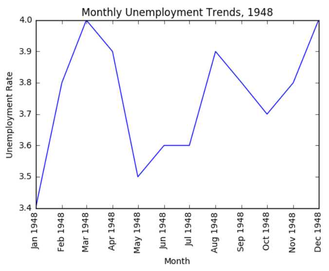
#xlabel(): accepts a string value, which gets set as the x-axis label.
#ylabel(): accepts a string value, which is set as the y-axis label.
#title(): accepts a string value, which is set as the plot title.

plt.plot(first_twelve[‘DATE‘], first_twelve[‘VALUE‘])
plt.xticks(rotation=90)
plt.xlabel(‘Month‘)
plt.ylabel(‘Unemployment Rate‘)
plt.title(‘Monthly Unemployment Trends, 1948‘)
plt.show()
plt_2

import pandas as pd
import matplotlib.pyplot as plt

unrate = pd.read_csv(‘unrate.csv‘)
unrate[‘DATE‘] = pd.to_datetime(unrate[‘DATE‘])
first_twelve = unrate[0:12]
plt.plot(first_twelve[‘DATE‘], first_twelve[‘VALUE‘])
plt.xticks(rotation=90)
plt.xlabel(‘Month‘)
plt.ylabel(‘Unemployment Rate‘)
plt.title(‘Monthly Unemployment Trends, 1948‘)
plt.show()
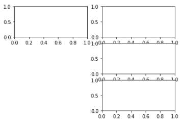
unrate.head()
‘‘‘
             DATE        VALUE
0    1948-01-01    3.4
1    1948-02-01    3.8
2    1948-03-01    4.0
3    1948-04-01    3.9
4    1948-05-01    3.5
‘‘‘

#add_subplot(first,second,index) first means number of Row,second means number of Column.

import matplotlib.pyplot as plt
fig = plt.figure()
ax1 = fig.add_subplot(3,2,1)
ax2 = fig.add_subplot(3,2,2)
ax2 = fig.add_subplot(3,2,4)
ax2 = fig.add_subplot(3,2,6)
plt.show()
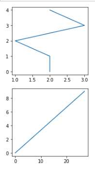
import numpy as np
# fig = plt.figure()
fig = plt.figure(figsize=(3, 6)) # 指定画图区域大小
ax1 = fig.add_subplot(2,1,1)
ax2 = fig.add_subplot(2,1,2)

ax1.plot(np.random.randint(1,5,5), np.arange(5))
ax2.plot(np.arange(10)*3, np.arange(10))
plt.show()
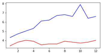
unrate[‘MONTH‘] = unrate[‘DATE‘].dt.month
unrate[‘MONTH‘] = unrate[‘DATE‘].dt.month
fig = plt.figure(figsize=(6,3))

plt.plot(unrate[0:12][‘MONTH‘], unrate[0:12][‘VALUE‘], c=‘red‘) # c 指定折线图颜色
plt.plot(unrate[12:24][‘MONTH‘], unrate[12:24][‘VALUE‘], c=‘blue‘)

plt.show()
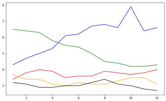
fig = plt.figure(figsize=(10,6))
colors = [‘red‘, ‘blue‘, ‘green‘, ‘orange‘, ‘black‘]
for i in range(5):
    start_index = i*12
    end_index = (i+1)*12
    subset = unrate[start_index:end_index]
    plt.plot(subset[‘MONTH‘], subset[‘VALUE‘], c=colors[i])

plt.show()
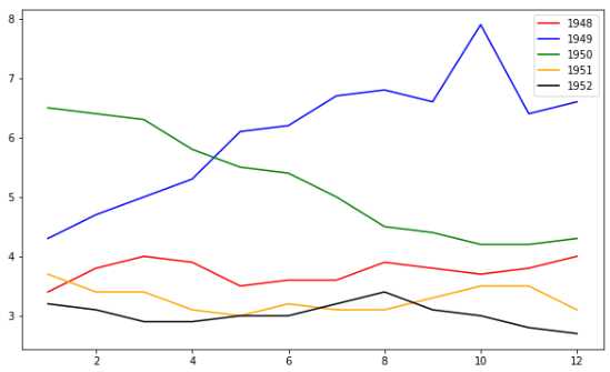
fig = plt.figure(figsize=(10,6))
colors = [‘red‘, ‘blue‘, ‘green‘, ‘orange‘, ‘black‘]
for i in range(5):
    start_index = i*12
    end_index = (i+1)*12
    subset = unrate[start_index:end_index]

    label = str(1948 + i) # 标签的值
    plt.plot(subset[‘MONTH‘], subset[‘VALUE‘], c=colors[i], label=label) # label 指定标签

plt.legend(loc=‘best‘) # 设置 label 的位置
# print(help(plt.legend))
‘‘‘
            ===============   =============
            Location String   Location Code
            ===============   =============
            ‘best‘            0
            ‘upper right‘     1
            ‘upper left‘      2
            ‘lower left‘      3
            ‘lower right‘     4
            ‘right‘           5
            ‘center left‘     6
            ‘center right‘    7
            ‘lower center‘    8
            ‘upper center‘    9
            ‘center‘          10
            ===============   =============
‘‘‘
plt.show()
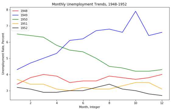
fig = plt.figure(figsize=(10,6))
colors = [‘red‘, ‘blue‘, ‘green‘, ‘orange‘, ‘black‘]
for i in range(5):
    start_index = i*12
    end_index = (i+1)*12
    subset = unrate[start_index:end_index]
    label = str(1948 + i)
    plt.plot(subset[‘MONTH‘], subset[‘VALUE‘], c=colors[i], label=label)
plt.legend(loc=‘upper left‘)
plt.xlabel(‘Month, Integer‘)
plt.ylabel(‘Unemployment Rate, Percent‘)
plt.title(‘Monthly Unemployment Trends, 1948-1952‘)

plt.show()
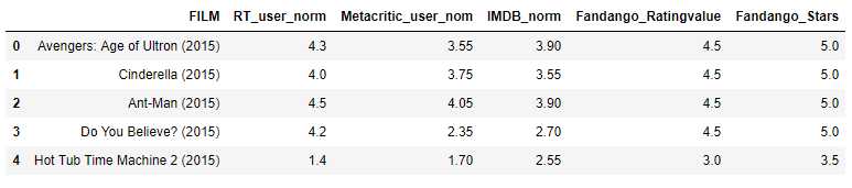
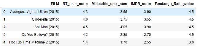
plt_3

import pandas as pd
reviews = pd.read_csv(‘fandango_scores.csv‘)
cols = [‘FILM‘, ‘RT_user_norm‘, ‘Metacritic_user_nom‘, ‘IMDB_norm‘, ‘Fandango_Ratingvalue‘, ‘Fandango_Stars‘]
norm_reviews = reviews[cols]
# print(norm_reviews[:1])
norm_reviews.head()
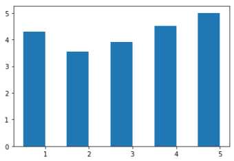
import matplotlib.pyplot as plt
from numpy import arange
#The Axes.bar() method has 2 required parameters, left and height.
#We use the left parameter to specify the x coordinates of the left sides of the bar.
#We use the height parameter to specify the height of each bar
num_cols = [‘RT_user_norm‘, ‘Metacritic_user_nom‘, ‘IMDB_norm‘, ‘Fandango_Ratingvalue‘, ‘Fandango_Stars‘]

bar_heights = norm_reviews.loc[0, num_cols].values
#print bar_heights
bar_positions = arange(5) + 0.75
#print bar_positions
fig, ax = plt.subplots()
ax.bar(bar_positions, bar_heights, 0.5) # 0.5 表示柱形的宽度
plt.show()
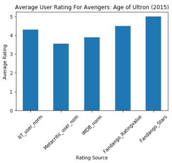
arange(5)
‘‘‘
array([0, 1, 2, 3, 4])
‘‘‘

#By default, matplotlib sets the x-axis tick labels to the integer values the bars
#spanned on the x-axis (from 0 to 6). We only need tick labels on the x-axis where the bars are positioned.
#We can use Axes.set_xticks() to change the positions of the ticks to [1, 2, 3, 4, 5]:

num_cols = [‘RT_user_norm‘, ‘Metacritic_user_nom‘, ‘IMDB_norm‘, ‘Fandango_Ratingvalue‘, ‘Fandango_Stars‘]
bar_heights = norm_reviews.loc[0, num_cols].values
bar_positions = arange(5)
tick_positions = range(0,5)
fig, ax = plt.subplots()

ax.bar(bar_positions, bar_heights, 0.5)
ax.set_xticks(tick_positions)
ax.set_xticklabels(num_cols, rotation=45)

ax.set_xlabel(‘Rating Source‘)
ax.set_ylabel(‘Average Rating‘)
ax.set_title(‘Average User Rating For Avengers: Age of Ultron (2015)‘)
plt.show()
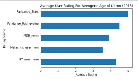
import matplotlib.pyplot as plt
from numpy import arange
num_cols = [‘RT_user_norm‘, ‘Metacritic_user_nom‘, ‘IMDB_norm‘, ‘Fandango_Ratingvalue‘, ‘Fandango_Stars‘]

bar_widths = norm_reviews.loc[0, num_cols].values
bar_positions = arange(5) + 0.75
tick_positions = range(1,6)
fig, ax = plt.subplots()
ax.barh(bar_positions, bar_widths, 0.5) # barh 横着画图

ax.set_yticks(tick_positions)
ax.set_yticklabels(num_cols)
ax.set_ylabel(‘Rating Source‘)
ax.set_xlabel(‘Average Rating‘)
ax.set_title(‘Average User Rating For Avengers: Age of Ultron (2015)‘)
plt.show()
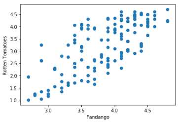
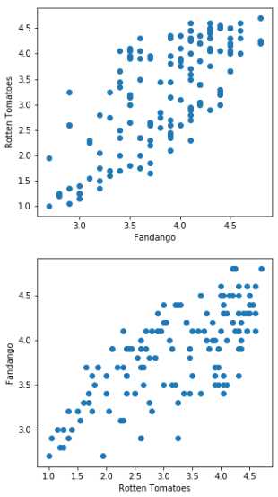
#Let‘s look at a plot that can help us visualize many points.
fig, ax = plt.subplots()
ax.scatter(norm_reviews[‘Fandango_Ratingvalue‘], norm_reviews[‘RT_user_norm‘])
ax.set_xlabel(‘Fandango‘)
ax.set_ylabel(‘Rotten Tomatoes‘)
plt.show()
#Switching Axes
fig = plt.figure(figsize=(5,10))
ax1 = fig.add_subplot(2,1,1)
ax2 = fig.add_subplot(2,1,2)
ax1.scatter(norm_reviews[‘Fandango_Ratingvalue‘], norm_reviews[‘RT_user_norm‘])
ax1.set_xlabel(‘Fandango‘)
ax1.set_ylabel(‘Rotten Tomatoes‘)
ax2.scatter(norm_reviews[‘RT_user_norm‘], norm_reviews[‘Fandango_Ratingvalue‘])
ax2.set_xlabel(‘Rotten Tomatoes‘)
ax2.set_ylabel(‘Fandango‘)
plt.show()
plt_4

import pandas as pd
import matplotlib.pyplot as plt
reviews = pd.read_csv(‘fandango_scores.csv‘)
cols = [‘FILM‘, ‘RT_user_norm‘, ‘Metacritic_user_nom‘, ‘IMDB_norm‘, ‘Fandango_Ratingvalue‘]
norm_reviews = reviews[cols]
norm_reviews.head()
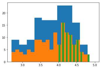
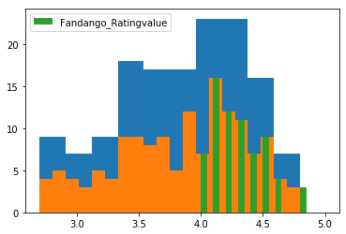
fandango_distribution = norm_reviews[‘Fandango_Ratingvalue‘].value_counts()
fandango_distribution = fandango_distribution.sort_index()

imdb_distribution = norm_reviews[‘IMDB_norm‘].value_counts()
imdb_distribution = imdb_distribution.sort_index()

print(fandango_distribution.head())
print(imdb_distribution.head())
‘‘‘
2.7    2
2.8    2
2.9    5
3.0    4
3.1    3
Name: Fandango_Ratingvalue, dtype: int64
2.00    1
2.10    1
2.15    1
2.20    1
2.30    2
Name: IMDB_norm, dtype: int64
‘‘‘

fig, ax = plt.subplots()
ax.hist(norm_reviews[‘Fandango_Ratingvalue‘]) # hist 值在范围 的数量
ax.hist(norm_reviews[‘Fandango_Ratingvalue‘],bins=20) # bins 表示范围的个数
ax.hist(norm_reviews[‘Fandango_Ratingvalue‘], range=(4, 5),bins=20) # range=(4, 5)给定范围
plt.show()
fig, ax = plt.subplots()
ax.hist(norm_reviews[‘Fandango_Ratingvalue‘]) # hist 值在范围 的数量
ax.hist(norm_reviews[‘Fandango_Ratingvalue‘],bins=20) # bins 表示范围的个数
label = ‘Fandango_Ratingvalue‘
ax.hist(norm_reviews[‘Fandango_Ratingvalue‘], range=(4, 5),bins=20, label=label) # range=(4, 5)给定范围
plt.legend(loc=‘upper left‘)
plt.show()
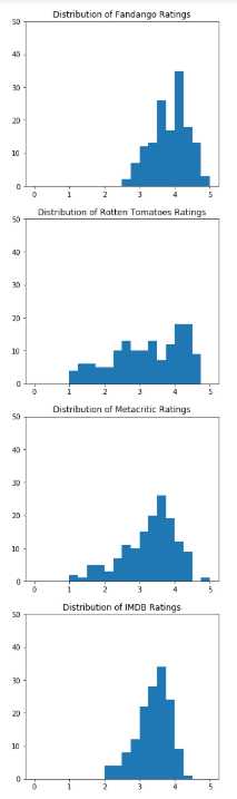
fig = plt.figure(figsize=(5,20))
ax1 = fig.add_subplot(4,1,1)
ax2 = fig.add_subplot(4,1,2)
ax3 = fig.add_subplot(4,1,3)
ax4 = fig.add_subplot(4,1,4)
ax1.hist(norm_reviews[‘Fandango_Ratingvalue‘], bins=20, range=(0, 5))
ax1.set_title(‘Distribution of Fandango Ratings‘)
ax1.set_ylim(0, 50) # 设置 y 轴的范围

ax2.hist(norm_reviews[‘RT_user_norm‘], 20, range=(0, 5))
ax2.set_title(‘Distribution of Rotten Tomatoes Ratings‘)
ax2.set_ylim(0, 50)
ax3.hist(norm_reviews[‘Metacritic_user_nom‘], 20, range=(0, 5))
ax3.set_title(‘Distribution of Metacritic Ratings‘)
ax3.set_ylim(0, 50)

ax4.hist(norm_reviews[‘IMDB_norm‘], 20, range=(0, 5))
ax4.set_title(‘Distribution of IMDB Ratings‘)
ax4.set_ylim(0, 50)

plt.show()
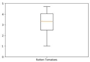
fig, ax = plt.subplots()
ax.boxplot(norm_reviews[‘RT_user_norm‘]) # 盒图
ax.set_xticklabels([‘Rotten Tomatoes‘])
ax.set_ylim(0, 5)
plt.show()
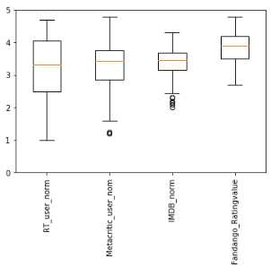
num_cols = [‘RT_user_norm‘, ‘Metacritic_user_nom‘, ‘IMDB_norm‘, ‘Fandango_Ratingvalue‘]
fig, ax = plt.subplots()
ax.boxplot(norm_reviews[num_cols].values)
ax.set_xticklabels(num_cols, rotation=90)
ax.set_ylim(0,5)
plt.show()
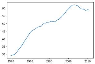
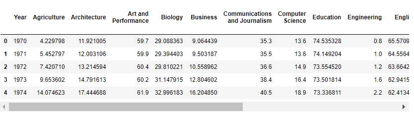
plt_5

import pandas as pd
import matplotlib.pyplot as plt

women_degrees = pd.read_csv(‘percent-bachelors-degrees-women-usa.csv‘)
plt.plot(women_degrees[‘Year‘], women_degrees[‘Biology‘])
plt.show()
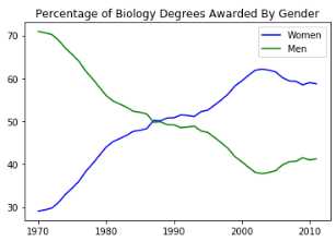
women_degrees.head()

#100-women_degrees means men
plt.plot(women_degrees[‘Year‘], women_degrees[‘Biology‘], c=‘blue‘, label=‘Women‘)
plt.plot(women_degrees[‘Year‘], 100-women_degrees[‘Biology‘], c=‘green‘, label=‘Men‘)
plt.legend(loc=‘upper right‘)
plt.title(‘Percentage of Biology Degrees Awarded By Gender‘)
plt.show()
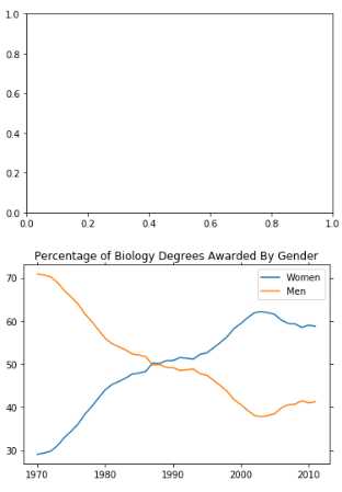
fig, ax = plt.subplots()
# Add your code here.
fig, ax = plt.subplots()
ax.plot(women_degrees[‘Year‘], women_degrees[‘Biology‘], label=‘Women‘)
ax.plot(women_degrees[‘Year‘], 100-women_degrees[‘Biology‘], label=‘Men‘)

ax.tick_params(bottom="off", top="off", left="off", right="off")
ax.set_title(‘Percentage of Biology Degrees Awarded By Gender‘)
ax.legend(loc="upper right")

plt.show()
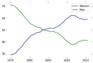
fig, ax = plt.subplots()
ax.plot(women_degrees[‘Year‘], women_degrees[‘Biology‘], c=‘blue‘, label=‘Women‘)
ax.plot(women_degrees[‘Year‘], 100-women_degrees[‘Biology‘], c=‘green‘, label=‘Men‘)
ax.tick_params(bottom="off", top="off", left="off", right="off")

for key,spine in ax.spines.items():
    spine.set_visible(False)
# End solution code.
ax.legend(loc=‘upper right‘)
plt.show()
major_cats = [‘Biology‘, ‘Computer Science‘, ‘Engineering‘, ‘Math and Statistics‘]
fig = plt.figure(figsize=(12, 12))

for sp in range(0,4):
    ax = fig.add_subplot(2,2,sp+1)
    ax.plot(women_degrees[‘Year‘], women_degrees[major_cats[sp]], c=‘blue‘, label=‘Women‘)
    ax.plot(women_degrees[‘Year‘], 100-women_degrees[major_cats[sp]], c=‘green‘, label=‘Men‘)
    # Add your code here.

# Calling pyplot.legend() here will add the legend to the last subplot that was created.
plt.legend(loc=‘upper right‘)
plt.show()
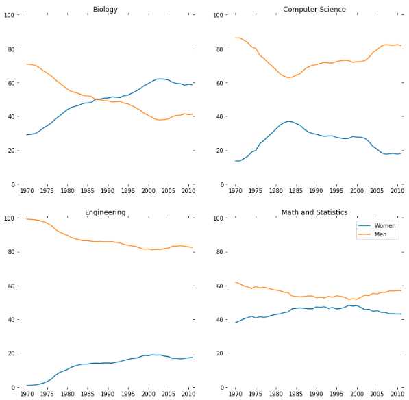
major_cats = [‘Biology‘, ‘Computer Science‘, ‘Engineering‘, ‘Math and Statistics‘]
fig = plt.figure(figsize=(12, 12))

for sp in range(0,4):
    ax = fig.add_subplot(2,2,sp+1)
    ax.plot(women_degrees[‘Year‘], women_degrees[major_cats[sp]], c=‘blue‘, label=‘Women‘)
    ax.plot(women_degrees[‘Year‘], 100-women_degrees[major_cats[sp]], c=‘green‘, label=‘Men‘)
    for key,spine in ax.spines.items():
        spine.set_visible(False)
    ax.set_xlim(1968, 2011)
    ax.set_ylim(0,100)
    ax.set_title(major_cats[sp])
    ax.tick_params(bottom="off", top="off", left="off", right="off")

# Calling pyplot.legend() here will add the legend to the last subplot that was created.
plt.legend(loc=‘upper right‘)
plt.show()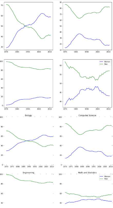
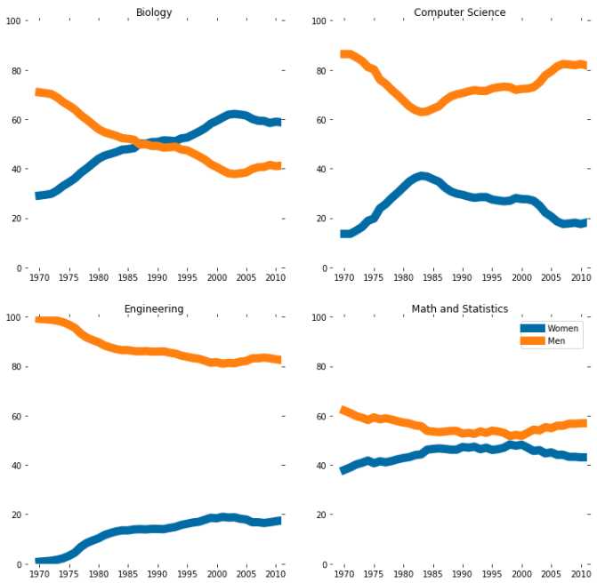
plt_6

#Color
import pandas as pd
import matplotlib.pyplot as plt

women_degrees = pd.read_csv(‘percent-bachelors-degrees-women-usa.csv‘)
major_cats = [‘Biology‘, ‘Computer Science‘, ‘Engineering‘, ‘Math and Statistics‘]


cb_dark_blue = (0/255, 107/255, 164/255)
cb_orange = (255/255, 128/255, 14/255)

fig = plt.figure(figsize=(12, 12))

for sp in range(0,4):
    ax = fig.add_subplot(2,2,sp+1)
    # The color for each line is assigned here.
    ax.plot(women_degrees[‘Year‘], women_degrees[major_cats[sp]], c=cb_dark_blue, label=‘Women‘)
    ax.plot(women_degrees[‘Year‘], 100-women_degrees[major_cats[sp]], c=cb_orange, label=‘Men‘)
    for key,spine in ax.spines.items():
        spine.set_visible(False)
    ax.set_xlim(1968, 2011)
    ax.set_ylim(0,100)
    ax.set_title(major_cats[sp])
    ax.tick_params(bottom="off", top="off", left="off", right="off")

plt.legend(loc=‘upper right‘)
plt.show()
#Setting Line Width
cb_dark_blue = (0/255, 107/255, 164/255)
cb_orange = (255/255, 128/255, 14/255)

fig = plt.figure(figsize=(12, 12))

for sp in range(0,4):
    ax = fig.add_subplot(2,2,sp+1)
    # Set the line width when specifying how each line should look.
    ax.plot(women_degrees[‘Year‘], women_degrees[major_cats[sp]], c=cb_dark_blue, label=‘Women‘, linewidth=10)
    ax.plot(women_degrees[‘Year‘], 100-women_degrees[major_cats[sp]], c=cb_orange, label=‘Men‘, linewidth=10)
    for key,spine in ax.spines.items():
        spine.set_visible(False)
    ax.set_xlim(1968, 2011)
    ax.set_ylim(0,100)
    ax.set_title(major_cats[sp])
    ax.tick_params(bottom="off", top="off", left="off", right="off")

plt.legend(loc=‘upper right‘)
plt.show()
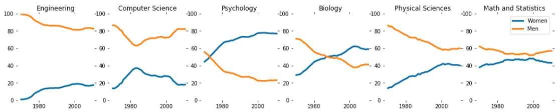
stem_cats = [‘Engineering‘, ‘Computer Science‘, ‘Psychology‘, ‘Biology‘, ‘Physical Sciences‘, ‘Math and Statistics‘]
fig = plt.figure(figsize=(18, 3))

for sp in range(0,6):
    ax = fig.add_subplot(1,6,sp+1)
    ax.plot(women_degrees[‘Year‘], women_degrees[stem_cats[sp]], c=cb_dark_blue, label=‘Women‘, linewidth=3)
    ax.plot(women_degrees[‘Year‘], 100-women_degrees[stem_cats[sp]], c=cb_orange, label=‘Men‘, linewidth=3)
    for key,spine in ax.spines.items():
        spine.set_visible(False)
    ax.set_xlim(1968, 2011)
    ax.set_ylim(0,100)
    ax.set_title(stem_cats[sp])
    ax.tick_params(bottom="off", top="off", left="off", right="off")

plt.legend(loc=‘upper right‘)
plt.show()
fig = plt.figure(figsize=(18, 3))

for sp in range(0,6):
    ax = fig.add_subplot(1,6,sp+1)
    ax.plot(women_degrees[‘Year‘], women_degrees[stem_cats[sp]], c=cb_dark_blue, label=‘Women‘, linewidth=3)
    ax.plot(women_degrees[‘Year‘], 100-women_degrees[stem_cats[sp]], c=cb_orange, label=‘Men‘, linewidth=3)
    for key,spine in ax.spines.items():
        spine.set_visible(False)
    ax.set_xlim(1968, 2011)
    ax.set_ylim(0,100)
    ax.set_title(stem_cats[sp])
    ax.tick_params(bottom="off", top="off", left="off", right="off")

    if sp == 0:
        ax.text(2005, 87, ‘Men‘) # 指定文本在图标坐标位置
        ax.text(2002, 8, ‘Women‘)
    elif sp == 5:
        ax.text(2005, 62, ‘Men‘)
        ax.text(2001, 35, ‘Women‘)
plt.show()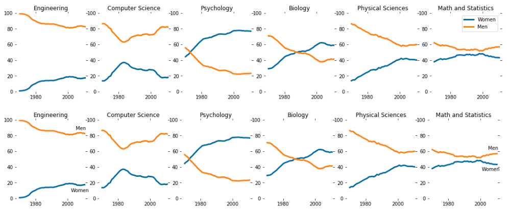
标签:switch pre position 表示 otto diff http tick time
原文地址:https://www.cnblogs.com/LXL616/p/12040478.html