标签:标签 control des not top href 颜色 ica packages
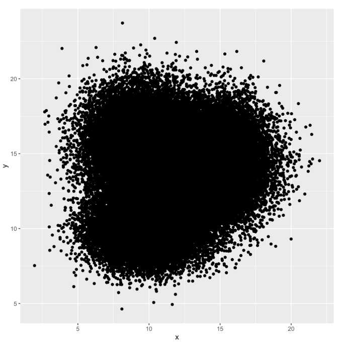
有时候看见很多论文中有那种散点密度图,还有拟合线,感觉瞬间一张图里面信息很丰富,特别是针对数据很多的时候,散点图上的点就会存在很多重叠,这时候比较难以看出其分布特征,所以叠加点密度的可视化效果还是很有必要的。
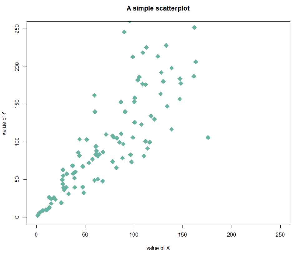
基本的R语言:使用plot()函数即可
# Create data
data = data.frame(
  x=seq(1:100) + 0.1*seq(1:100)*sample(c(1:10) , 100 , replace=T),
  y=seq(1:100) + 0.2*seq(1:100)*sample(c(1:10) , 100 , replace=T)
)

# Basic scatterplot
plot(x=data$x, y=data$y)
自定义:
cex: circle sizexlim and ylim: limits of the X and Y axispch: shape of markers. See all here.xlab and ylab: X and Y axis labelscol: marker colormain: chart title# Basic scatterplot
plot(data$x, data$y,
xlim=c(0,250) , ylim=c(0,250),
pch=18,
cex=2,
col="#69b3a2",
xlab="value of X", ylab="value of Y",
main="A simple scatterplot"
)
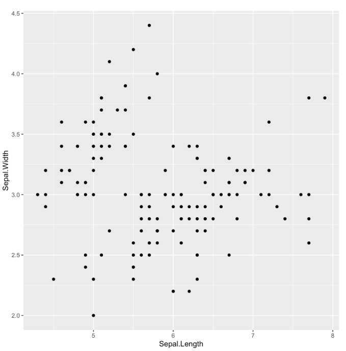
geom_point() to show points. 显示点# library library(ggplot2) # The iris dataset is provided natively by R # basic scatterplot ggplot(iris, aes(x=Sepal.Length, y=Sepal.Width)) + geom_point()
针对存在的问题:
# Library
library(tidyverse)

# Data
a <- data.frame( x=rnorm(20000, 10, 1.9), y=rnorm(20000, 10, 1.2) )
b <- data.frame( x=rnorm(20000, 14.5, 1.9), y=rnorm(20000, 14.5, 1.9) )
c <- data.frame( x=rnorm(20000, 9.5, 1.9), y=rnorm(20000, 15.5, 1.9) )
data <- rbind(a,b,c) #创建数据集


# Basic scatterplot
ggplot(data, aes(x=x,y=y))+geo_point()
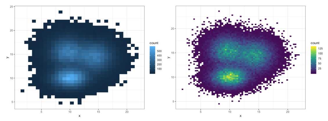
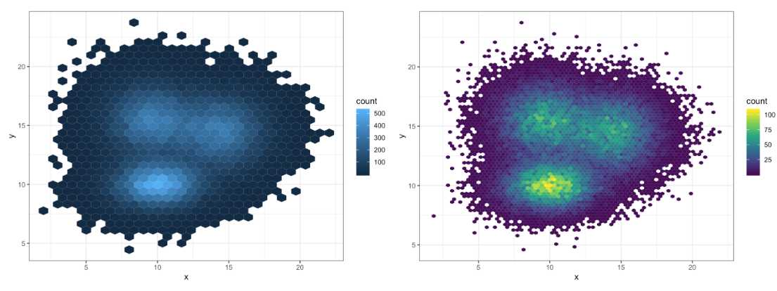
运用2D直方图的概念来显示,原理是把整张图像分为很多个小方块,分别计算落在每个方块中的点的数量,再以2D直方图的原理显示出来,以颜色的深浅来代表点的密集程度
这种的缺点可能是不够平滑
# 2d histogram with default option
ggplot(data, aes(x=x, y=y) ) + geom_bin2d() + theme_bw()

# Bin size control + color palette
ggplot(data, aes(x=x, y=y) ) + geom_bin2d(bins = 70) +
  scale_fill_continuous(type = "viridis") + theme_bw()#通过bins控制划分方块的大小,即粒度大小,同时可以设置颜色条的色彩模式
同理,如果划分为六边形的话:
# Hexbin chart with default option
ggplot(data, aes(x=x, y=y) ) +
  geom_hex() +
  theme_bw()

# Bin size control + color palette
ggplot(data, aes(x=x, y=y) ) +
  geom_hex(bins = 70) +
  scale_fill_continuous(type = "viridis") +
  theme_bw()
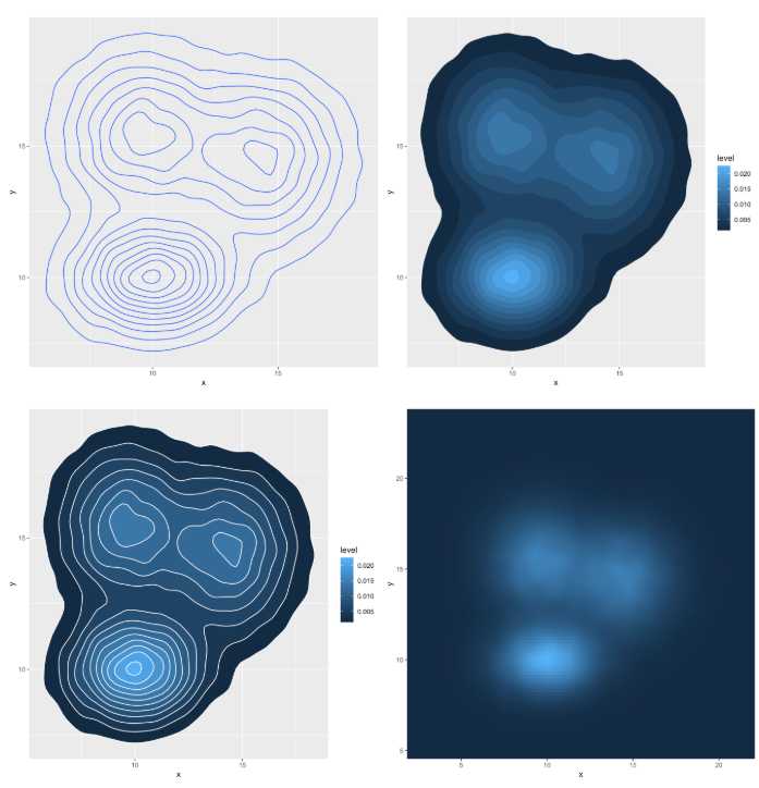
使用密度图来代替2D直方图显示
# Show the contour only 只显示等高线
ggplot(data, aes(x=x, y=y) ) +
  geom_density_2d()

# Show the area only 只显示着色的分级区域
ggplot(data, aes(x=x, y=y) ) +
  stat_density_2d(aes(fill = ..level..), geom = "polygon")

# Area + contour 叠加
ggplot(data, aes(x=x, y=y) ) +
  stat_density_2d(aes(fill = ..level..), geom = "polygon", colour="white")

# Using raster 栅格
ggplot(data, aes(x=x, y=y) ) +
  stat_density_2d(aes(fill = ..density..), geom = "raster", contour = FALSE) +
  scale_x_continuous(expand = c(0, 0)) +
  scale_y_continuous(expand = c(0, 0)) +
  theme(
    legend.position=‘none‘
  )
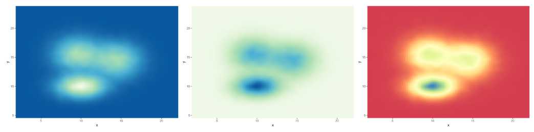
自定义色彩风格:
使用scale_fill_distiller()函数
# Call the palette with a number
ggplot(data, aes(x=x, y=y) ) +
  stat_density_2d(aes(fill = ..density..), geom = "raster", contour = FALSE) +
  scale_fill_distiller(palette=4, direction=-1) + #direction表示是否改变色度方向 palette代表不同风格
  scale_x_continuous(expand = c(0, 0)) +
  scale_y_continuous(expand = c(0, 0)) +
  theme(
    legend.position=‘none‘
  )
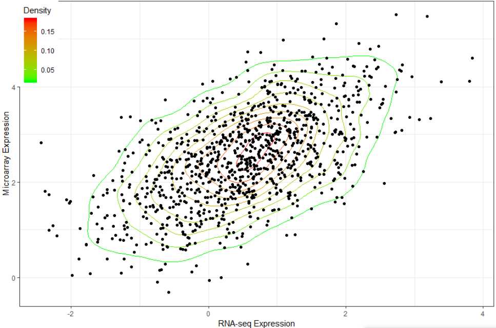
案例:
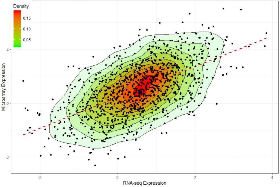
library(MASS)
library(ggplot2)

n <- 1000
x <- mvrnorm(n, mu=c(.5,2.5), Sigma=matrix(c(1,.6,.6,1), ncol=2))
df = data.frame(x); colnames(df) = c("x","y")

commonTheme = list(labs(color="Density",fill="Density",
                        x="RNA-seq Expression",
                        y="Microarray Expression"),
                   theme_bw(),
                   theme(legend.position=c(0,1),
                         legend.justification=c(0,1)))

ggplot(data=df,aes(x,y)) +
  geom_density2d(aes(colour=..level..)) +
  scale_colour_gradient(low="green",high="red") +
  geom_point() + commonTheme
添加拟合线与平滑 填补颜色
ggplot(data=df,aes(x,y)) +
  stat_density2d(aes(fill=..level..,alpha=..level..),geom=‘polygon‘,colour=‘black‘) +
  scale_fill_continuous(low="green",high="red") +
  geom_smooth(method=lm,linetype=2,colour="red",se=F) + #线性拟合
  guides(alpha="none") +
  geom_point() + commonTheme
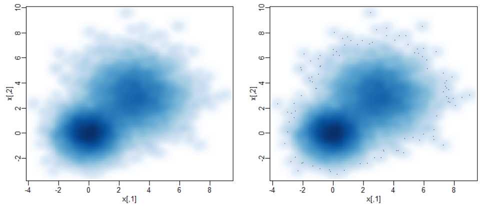
smoothScatter函数smoothScatter 产生散点图平滑的点密度分布,通过核密度进行估算
smoothScatter(x, y = NULL, nbin = 128, bandwidth,
              colramp = colorRampPalette(c("white", blues9)),
              nrpoints = 100, ret.selection = FALSE,
              pch = ".", cex = 1, col = "black",
              transformation = function(x) x^.25,
              postPlotHook = box,
              xlab = NULL, ylab = NULL, xlim, ylim,
              xaxs = par("xaxs"), yaxs = par("yaxs"), ...)
具体参数作用参考:https://stat.ethz.ch/R-manual/R-devel/library/graphics/html/smoothScatter.html
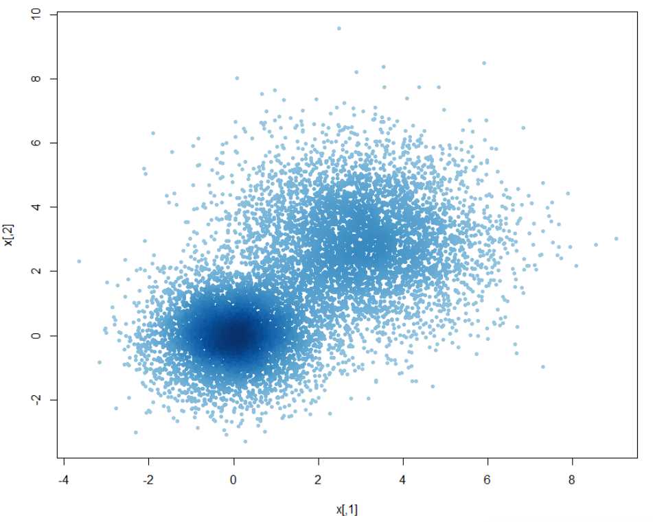
## A largish data set
n <- 10000
x1  <- matrix(rnorm(n), ncol = 2)
x2  <- matrix(rnorm(n, mean = 3, sd = 1.5), ncol = 2)
x   <- rbind(x1, x2)

oldpar <- par(mfrow = c(2, 2), mar=.1+c(3,3,1,1), mgp = c(1.5, 0.5, 0))
smoothScatter(x, nrpoints = 0) #不显示边界的相对比较异常的点 如果要显示所有的点 nrpoints = Inf
smoothScatter(x)
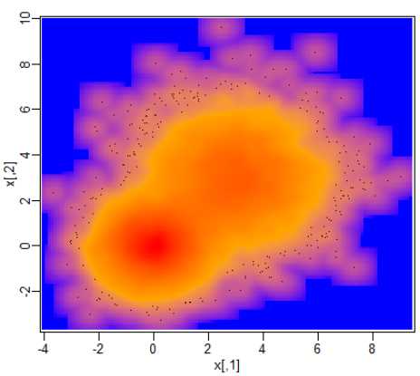
换一种颜色方案
## a different color scheme:
Lab.palette <- colorRampPalette(c("blue", "orange", "red"), space = "Lab")
i.s <- smoothScatter(x, colramp = Lab.palette,
                     ## pch=NA: do not draw them
                     nrpoints = 250, ret.selection=TRUE)
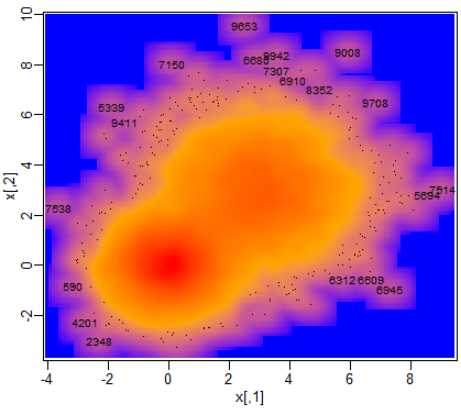
显示异常点的标签
## label the 20 very lowest-density points,the "outliers" (with obs.number):
i.20 <- i.s[1:20]
text(x[i.20,], labels = i.20, cex= 0.75)
没有那么“聚集”
## somewhat similar, using identical smoothing computations,
## but considerably *less* efficient for really large data:
plot(x, col = densCols(x), pch = 20)
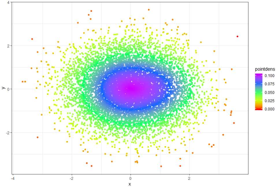
# generare random data, swap this for yours :-)!
n <- 10000
x <- rnorm(n)
y <- rnorm(n)
DF <- data.frame(x,y)

# Calculate 2d density over a grid
library(MASS)
dens <- kde2d(x,y)

# create a new data frame of that 2d density grid
# (needs checking that I haven‘t stuffed up the order here of z?)
gr <- data.frame(with(dens, expand.grid(x,y)), as.vector(dens$z))
names(gr) <- c("xgr", "ygr", "zgr")

# Fit a model
mod <- loess(zgr~xgr*ygr, data=gr)

# Apply the model to the original data to estimate density at that point
DF$pointdens <- predict(mod, newdata=data.frame(xgr=x, ygr=y))

# Draw plot
library(ggplot2)
ggplot(DF, aes(x=x,y=y, color=pointdens)) + geom_point() + scale_colour_gradientn(colours = rainbow(5)) + theme_bw()
install.packages("LSD") #先下载LSD包
n <- 10000
x <- rnorm(n)
y <- rnorm(n)
DF <- data.frame(x,y)
library(LSD)
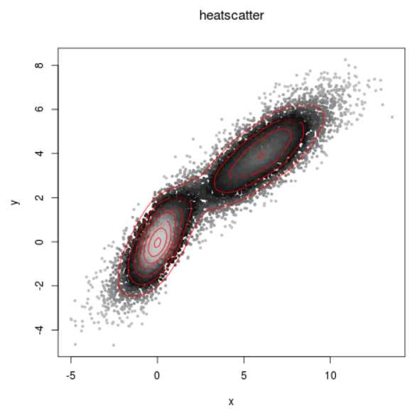
heatscatter(DF[,1],DF[,2])
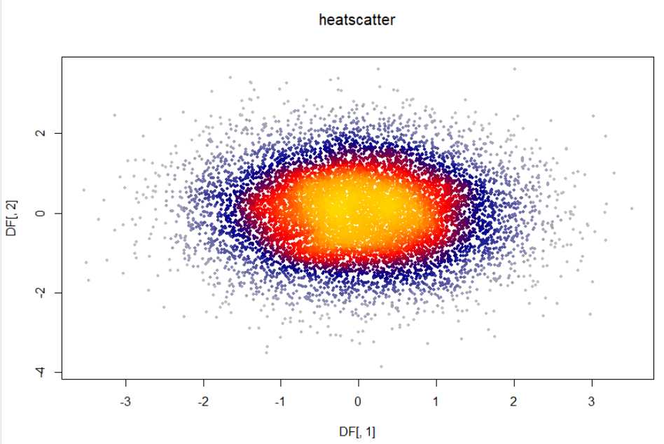
详细用法参考:https://www.imsbio.co.jp/RGM/R_rdfile?f=LSD/man/heatscatter.Rd&d=R_CC
heatscatter(x, y, pch = 19, cexplot = 0.5, nrcol = 30, grid = 100,
  colpal = "heat", simulate = FALSE, daltonize = FALSE, cvd = "p",
  alpha = NULL, rev = FALSE, xlim = NULL, ylim = NULL, xlab = NULL,
  ylab = NULL, main = "heatscatter", cor = FALSE, method = "spearman",
  only = "none", add.contour = FALSE, nlevels = 10,
  color.contour = "black", greyscale = FALSE, log = "", ...)
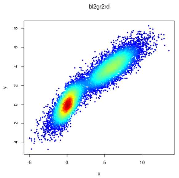
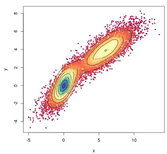
points = 10^4
x = c(rnorm(points/2),rnorm(points/2)+4)
y = x + rnorm(points,sd=0.8)
x = sign(x)*abs(x)^1.3

heatscatter(x,y,colpal="bl2gr2rd",main="bl2gr2rd",cor=FALSE)

heatscatter(x,y,cor=FALSE,add.contour=TRUE,color.contour="red",greyscale=TRUE)

heatscatter(x,y,colpal="spectral",cor=FALSE,add.contour=TRUE)
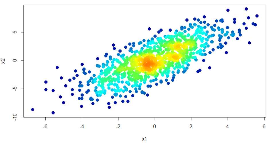
# adopted from https://stackoverflow.com/questions/17093935/r-scatter-plot-symbol-color-represents-number-of-overlapping-points
## Data in a data.frame
x1 <- rnorm(n=1E3, sd=2)
x2 <- x1*1.2 + rnorm(n=1E3, sd=2)
df <- data.frame(x1,x2)

## Use densCols() output to get density at each point 得到点密度
x <- densCols(x1,x2, colramp=colorRampPalette(c("black", "white")))
df$dens <- col2rgb(x)[1,] + 1L

## Map densities to colors 将点密度与不同颜色关联
cols <-  colorRampPalette(c("#000099", "#00FEFF", "#45FE4F",
                            "#FCFF00", "#FF9400", "#FF3100"))(300)
df$col <- cols[df$dens]

par(family =‘Times New Roman‘)
## Plot it, reordering rows so that densest points are plotted on top
plot(x2~x1, data=df[order(df$dens),], pch=20, col=col, cex=2)


# Function to plot color bar for legend
color.bar <- function(lut, max, min=0 , nticks=11, ticks=seq(min, max, len=nticks), title=‘‘) {
  scale = (length(lut)-1)/(max-min)

  dev.new(width=1.75, height=5)
  plot(c(0,10), c(min,max), type=‘n‘, bty=‘n‘, xaxt=‘n‘, xlab=‘‘, yaxt=‘n‘, ylab=‘‘, main=title)
  axis(2, ticks, las=1)
  for (i in 1:(length(lut)-1)) {
    y = (i-1)/scale + min
    rect(0,y,10,y+1/scale, col=lut[i], border=NA)
  }
}

cols <-  colorRampPalette(c("#000099", "#00FEFF", "#45FE4F",
                            "#FCFF00", "#FF9400", "#FF3100"))(300)

color.bar(cols, 300)
参考:
https://www.plob.org/article/15849.html
http://wap.sciencenet.cn/blog-526092-1205095.html?mobile=1
https://www.r-graph-gallery.com/2d-density-plot-with-ggplot2.html
标签:标签 control des not top href 颜色 ica packages
原文地址:https://www.cnblogs.com/icydengyw/p/12309455.html