标签:容器 info code margin 决定 init pat type ack
| 值 | 描述 |
|---|---|
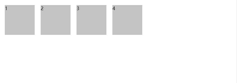
| row | 默认值。主轴为水平?方向,起点在左边。 |
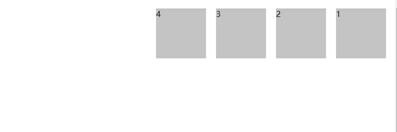
| row-reverse | 主轴为水平?方向,起点在右边。 |
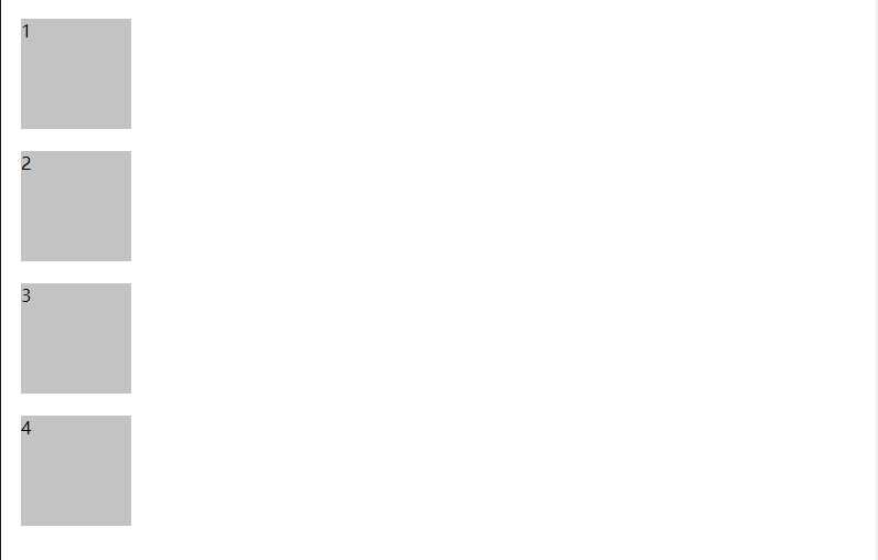
| column | 主轴为垂直方向,起点在上面。 |
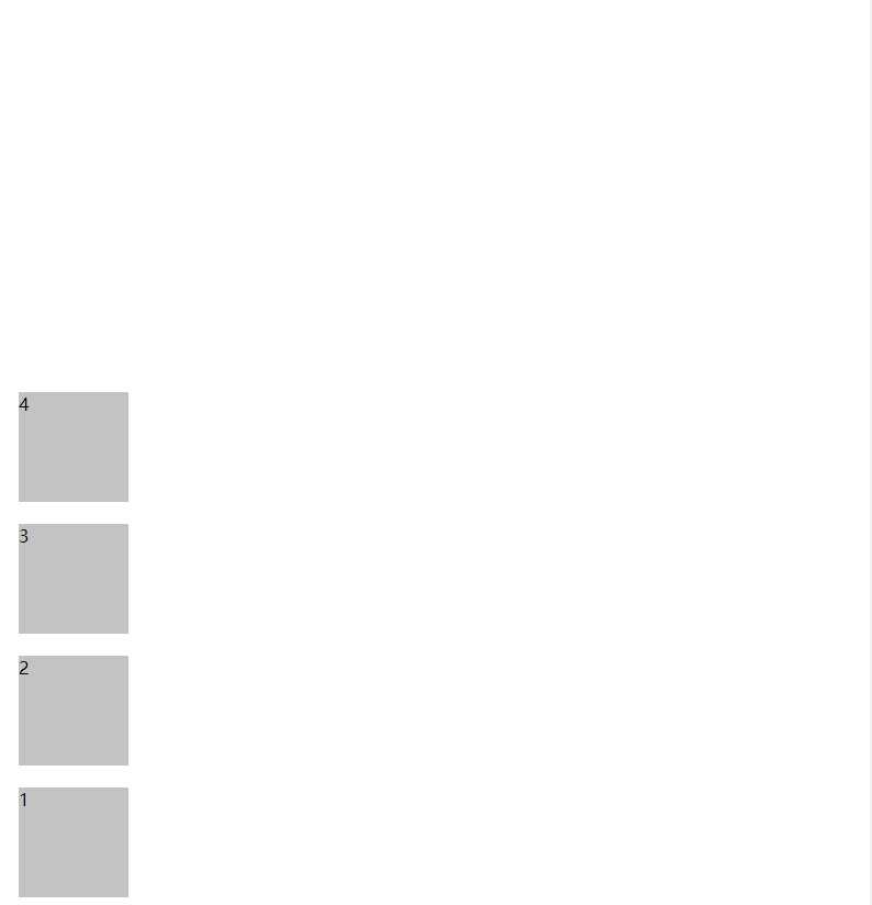
| column-reverse | 主轴为垂直方向,起点在下面。 |
<!DOCTYPE html>
<html lang="en">
<head>
  <meta charset="UTF-8">
  <meta name="viewport" content="width=device-width, initial-scale=1.0">
  <meta http-equiv="X-UA-Compatible" content="ie=edge">
  <title>Document</title>
  <style>
    .flexTest {
      display: flex;
      flex-direction: row;
      height: 1000px;
    }
    .item {
      width: 100px;
      height: 100px;
      margin: 10px;
      background: #c3c3c3;
    }
  </style>
</head>
<body>
  <div class="flexTest">
    <div class="item">1</div>
    <div class="item">2</div>
    <div class="item">3</div>
    <div class="item">4</div>
  </div>
</body>
</html>
第2节 讲解flex布局容器?六?属性之flex-direction
标签:容器 info code margin 决定 init pat type ack
原文地址:https://www.cnblogs.com/xl4ng/p/12636188.html