标签:position row justify enter 使用 复杂 隐藏 20px 属性
对比一下常用的三种布局:
1.传统布局方式:利用position属性+display属性+float属性,兼容性最好,但是效率低,麻烦
2.flex布局:效率高,学习成本低,兼容性强
3.grid:翻译网格,grid布局相对于flex布局稍微复杂那么一点点,但grid布局比flex布局更强大。
有一说一,grid没有flex兼容性好。
flex布局是轴线布局,只能指定"项目"针对轴线的位置,可以看作是一维布局。
Grid 布局则是将容器划分成"行"和"列",产生单元格,然后指定"项目所在"的单元格,可以看作是二维布局。
grid基本概念
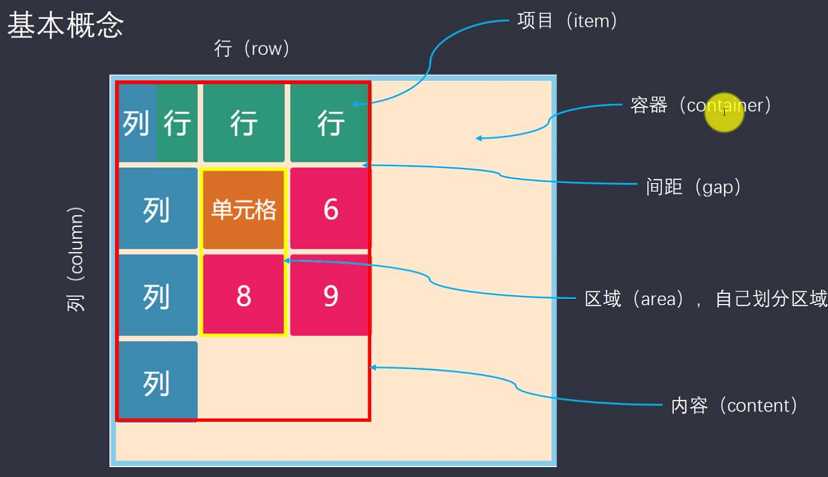
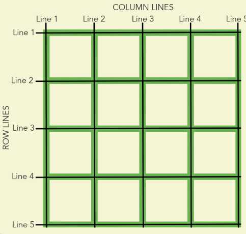
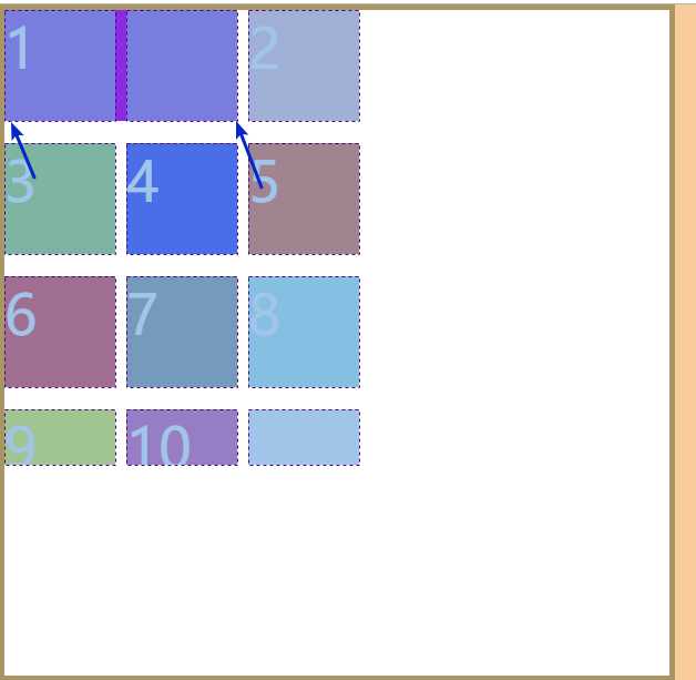
每个grid布局,有隐藏的网格线,用来帮助定位(4*4的网格有5*5条网格线)
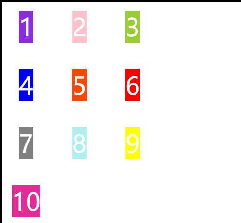
采用网格布局的区域,称为"容器"(container)。容器内部采用网格定位的子元素,称为"项目"(item)。
布局:
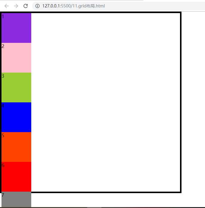
<div class="wrap">
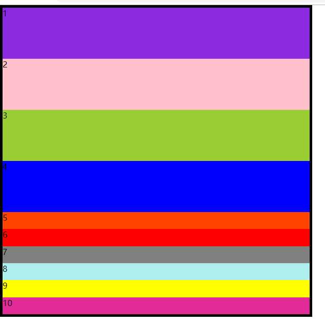
<div class="item item1">1</div>
<div class="item item2">2</div>
<div class="item item3">3</div>
<div class="item item4">4</div>
<div class="item item5">5</div>
<div class="item item6">6</div>
<div class="item item7">7</div>
<div class="item item8">8</div>
<div class="item item9">9</div>
<div class="item item10">10</div>
</div>
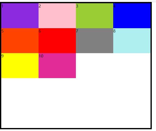
基本样式:
*{
margin:0;
padding: 0;
}
.wrap{
width: 600px;
height: 600px;
border: 5px solid black;
}
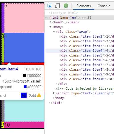
.item{
width:100px;
height:100px;
}
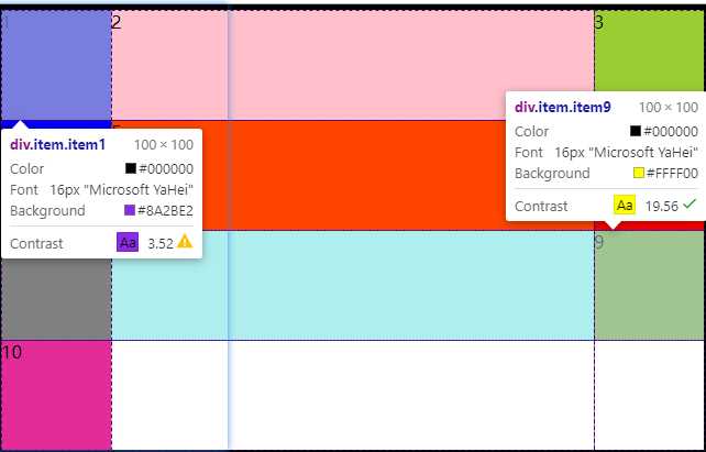
.item1{
background-color: blueviolet;
}
.item2{
background-color: pink;
}
.item3{
background-color: yellowgreen;
}
.item4{
background-color: blue;
}
.item5{
background-color: orangered;
}
.item6{
background-color: red;
}
.item7{
background-color: gray;
}
.item8{
background-color: paleturquoise;
}
.item9{
background-color: yellow;
}
.item10{
background-color: rgb(226, 43, 150);
}
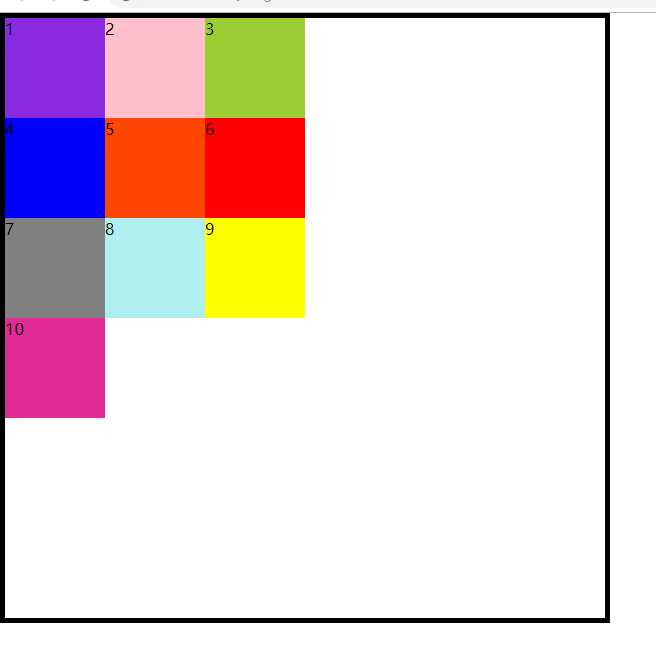
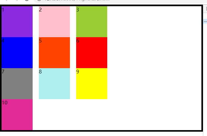
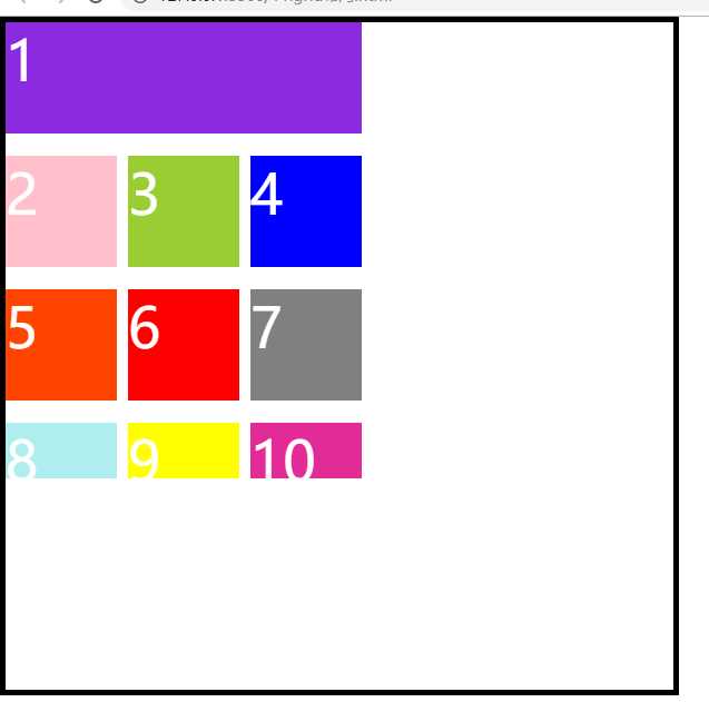
页面效果:
下面就看一下容器属性有哪些?
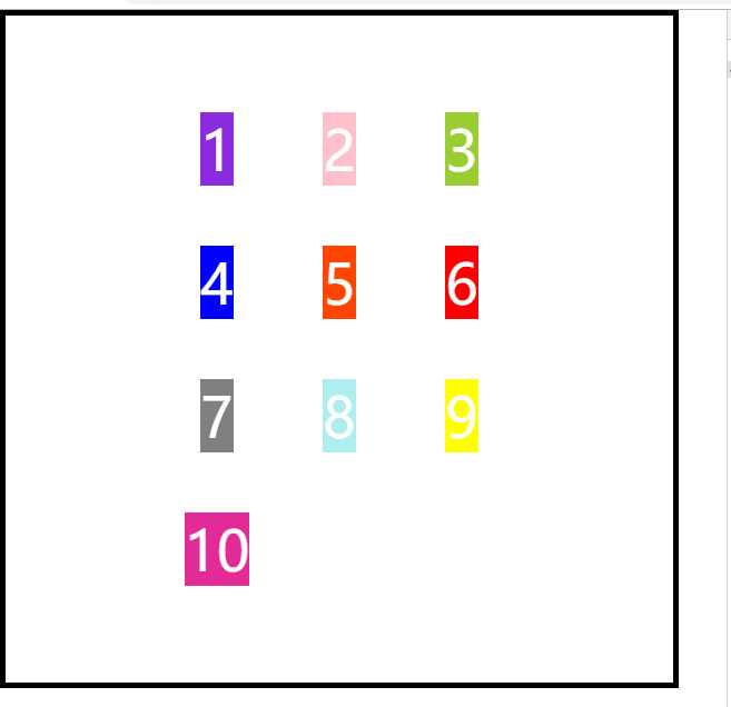
display:grid 指定一个容器采用网格布局
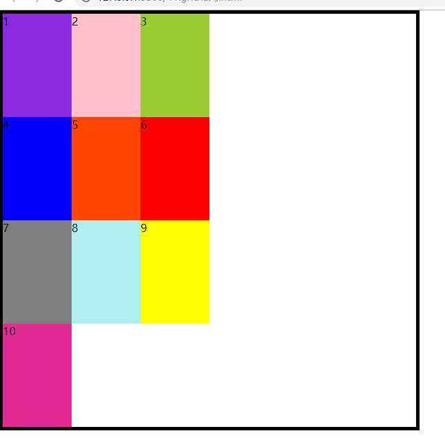
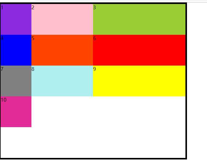
1.grid-template-columns:想要有多少列,就填写相应属性值的个数,不填写自动分配
(如果只定义了列没有定义行,那这些元素会平分盒子高度)
    .wrap{
      width: 600px;
      height: 600px;
      border: 5px solid black;
      display: grid;
      grid-template-columns:100px 100px 100px;
    }
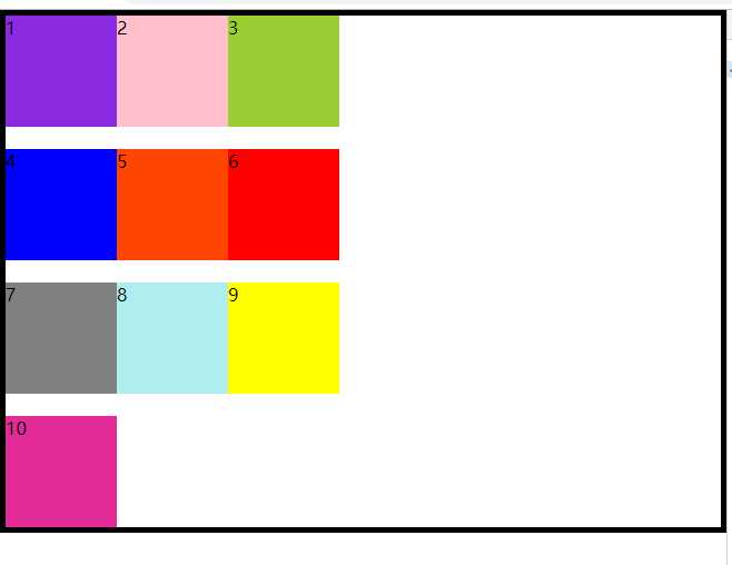
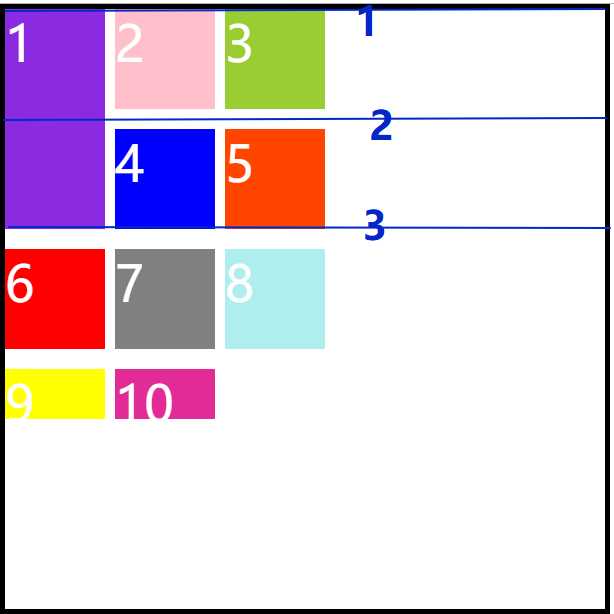
2.grid-template-rows:想要有多少行,就填写相应属性值的个数,不填写自动分配
(如果只定义行不定义列)
哈哈哈,很好玩是不是?搞错了重来!
 .wrap{
      width: 600px;
      height: 600px;
      border: 5px solid black;
      display: grid;
      grid-template-columns:100px 100px 100px;
      grid-template-rows:100px 100px 100px 100px;
    }
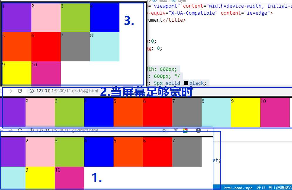
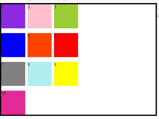
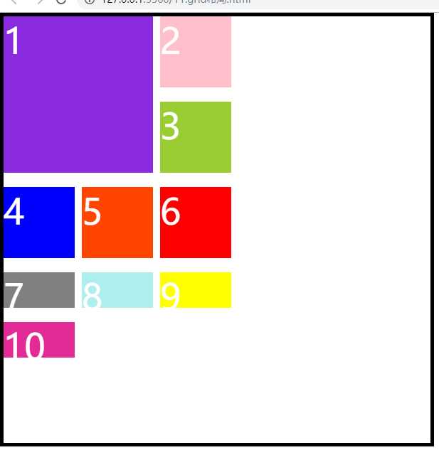
这是定义了行和列的
grid-template的相关函数
repeat(次数,重复的值)
(1)grid-template-columns:100px 100px 100px; 等价于 grid-template-columns:repeat(3,100px);
(2)auto-fill(有时单元格的大小是固定的,但是容器的大小不确定,这个属性就会自动填充)
    .wrap{
      /* width: 600px;
      height: 600px; */
      border: 5px solid black;
      display: grid;
      /* grid-template-columns:100px 100px 100px; */
      /* grid-template-columns:repeat(3,100px); */
      grid-template-columns:repeat(auto-fill,100px);
      grid-template-rows:100px 100px 100px 100px;
    }
里面的项目会随着容器的宽度而变化
(3)fr:为了方便表示比例关系。网格布局提供了fr关键字(fraction的缩写,意为片段)
grid-template-columns:repeat(4,1fr);//宽度平均分成4份
grid-template-columns:1fr 2fr 3fr;
(4)minmax(最小值,最大值):函数产生一个长度范围,表示长度就在这个范围之内,它接收两个参数:分别为最小值和最大值
grid-template-columns:1fr minmax(150px,1fr);:共两列,第一列占一份,第二列的宽度最小为150px,最大占1份
(5)auto:表示由浏览器自己决定长度
grid-template-columns:100px auto 100px;共三列,第一列、第三列的宽度为100px,中间那一列由浏览器撑开
(6)网格线:可以用方括号定义网格线名称,方便以后的引用(视觉上没什么区别)
grid-template-columns:[c1] 100px [c2] 100px [c3] 100px [c4]; [c1]第一条线 100px [c2]第二条线(两条网格线之间的宽度为100px)
3.grid-row-gap:item(项目)行之间的距离,据最新标准,grid-前缀已经删除变为row-gap
row-gap: 20px;
4.grid-column-gap:item(项目)列之间的距离,据最新标准,grid-前缀已经删除变为column-gap
column-gap: 20px;
5.grid-gap(3和4的简写):item(项目)相互之间的距离,grid-前缀已经删除变为gap
gap:20px 10px;行之间的距离为20px,列之间的距离为10px
6.grid-template-areas:一个区域由多个单元格组成;区域的命名会影响到网格线,每个区域的起始网格线会自动命名为区域名-start,终止网格线自动命名为区域名-end
grid-template-areas: ‘a b c‘
‘d e f‘
‘g h i‘; :一个item单独属于一个区域
grid-template-areas: ‘a a a‘
‘d d d‘
‘g h i‘; :同一个区域名属于同一个区域( 1 、2、3属于同一区域)
grid-template-areas: ‘a . c‘
‘d . f‘
‘g h i‘; :不需要划分区域的使用点“.”表示
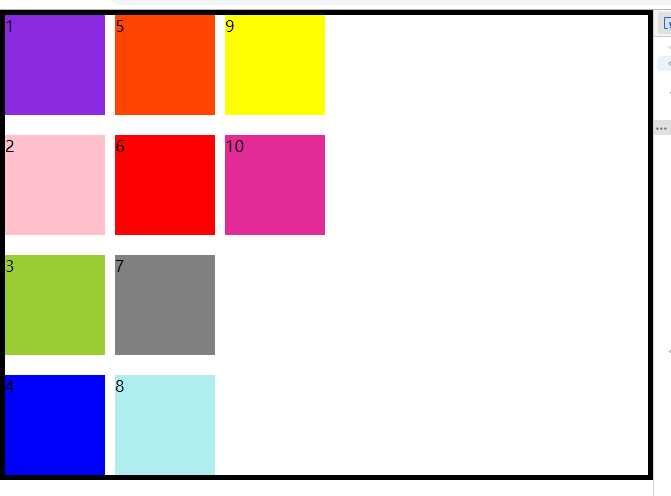
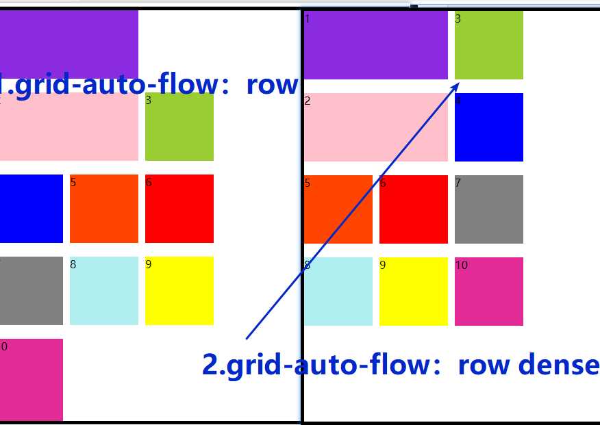
7.grid-auto-flow:划分网格以后,容器的子元素会按照顺序,自动放置在每一个网格,默认的放置顺序是:“先行后列”,即先填满第一行,再开始放入第二行(就是子元素的排放顺序)
grid-auto-flow: column;
dense:提高空间利用率
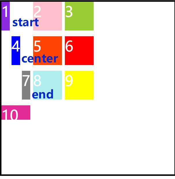
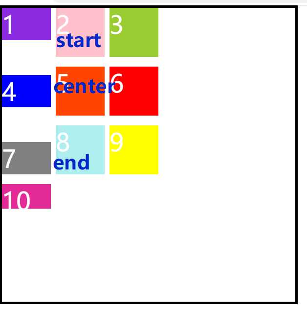
8.justify-items:水平方向上的对齐方式,start | end | center | stretch(设置单元格内容的对齐方式)
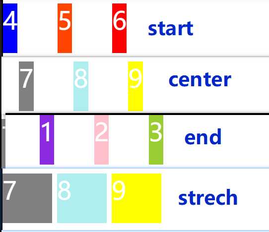
9.align-items:垂直方向上的对齐方式,start | end | center | stretch(设置单元格内容的对齐方式)
忽略图片中的错误英文单词stretch,(我已经罚写100遍了??)
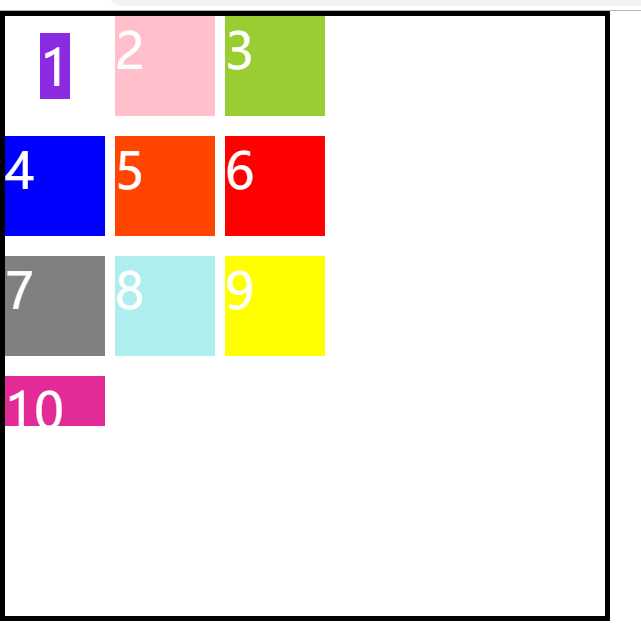
10.plce-items(8和9的简写)
place-items:<align-items> <justify-items>
place-items: center center;
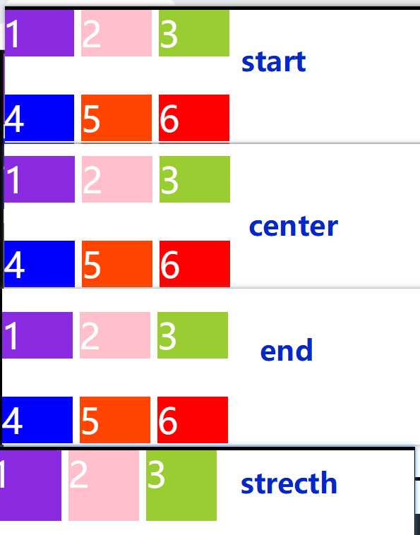
11.justify-content:设置整个内容(容器中的所有项目总和)的水平方向的对齐方式
start | end | center | strentch | space-around | space-between | space-evenly
12.align-content: 设置整个内容(容器中的所有项目总和)的垂直方向的对齐方式
start | end | center | strentch | space-around | space-between | space-evenly
13.place-content:(11,12的简写)
place-content: center ;
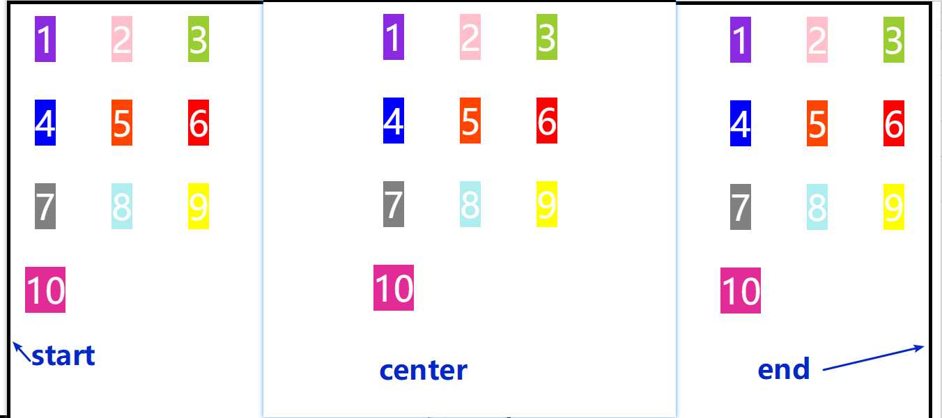
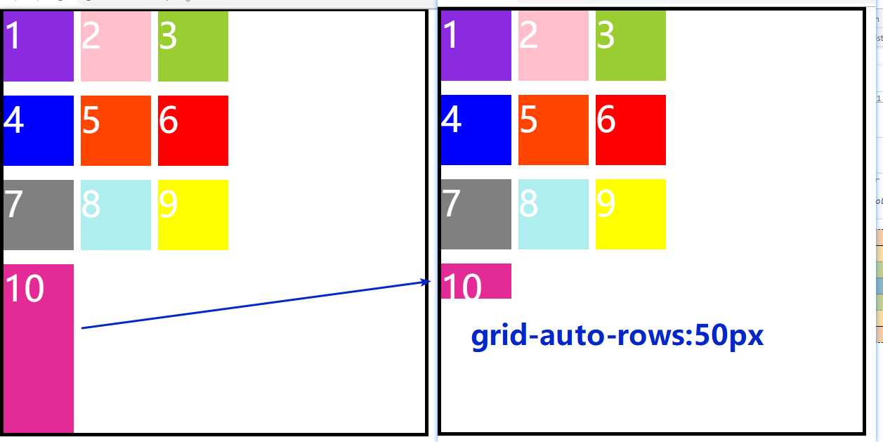
14.grid-auto-columns:用来设置多出来的项目的宽
应用场景:假如你只设置了3*3的行和列,但是有10个item
15.grid-auto-rows:用来设置多出来的项目的高
grid-auto-rows: 50px;
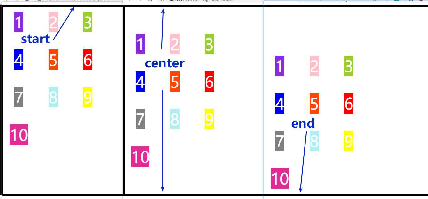
接下来看项目属性:
1.grid-column-start:用来指定item的具体位置。开始的列网格线位置
2.grid-column-end:用来指定item的具体位置。结束的列网格线位置
3.grid-column(1和2 的简写形式)
grid-column-start: 1; grid-column-end: 3; 等价于 grid-column: 1 / 3; 表示项目的列起始位置分别在第一根、第三根网格线(也就是占据两列)
另一种写法:grid-column-start:span 2;往右跨越两个
grid-column-end:span 2;往左跨越两个
4.grid-row-start:用来指定item的具体位置。开始的行网格线位置
5.grid-row-end:用来指定item的具体位置。结束的行网格线位置
6.grid-row(4和5 的简写形式)
grid-row-start: 1; grid-row-end: 3; 等价于 grid-row: 1 / 3;
7.grid-area:指定项目放在哪一个区域
grid-template-areas: ‘a a a‘
‘d e f‘
‘g h i‘;
grid-area: a;
grid-area属性还可作用grid-row-start、grid-column-start、grid-row-end、grid-column-end的合并
简写形式,直接指定项目的位置:
grid-area:<row-start><column-start><row-end><column-end>
8.justify-self:设置单元格内的水平位置,只作用于单个项目的水平方向
start | end | center | stretch
9.align-self:设置单元格内的垂直位置,只作用于单个项目的垂直方向
start | end | center |stretch
10.place-self(8和9的简写形式)
place-self:center center
grid布局
标签:position row justify enter 使用 复杂 隐藏 20px 属性
原文地址:https://www.cnblogs.com/yaya-003/p/12819298.html