标签:toast ams png image dde hidden 接收 des 完整
学习Vue的道路上,封装一些自定义的组件不可避免,今天就来封装一个Toast消息提示。后面还有dialog对话框,原理差不多。
现在才知道用qq录制gif图是真方便。(非广告,后面会多用gif图)
Toast.vue 看看效果.<template>
<div class="Toast"
v-if="showToast">
{{ message }}
</div>
</template>
<script>
export default {
name: "Toast",
props: {
showToast: {
// 激活
type: Boolean,
default: false
},
message: {
type: String,
required: true
},
delay: {
type: Number,
default: 3000
}
},
data() {
return {
}
},
methods: {
// Toast消失
disappear() {
if (this.showToast) {
setTimeout(() => {
this.$emit("disappear");
}, this.delay)
}
},
},
watch: {
showToast() {
this.disappear()
},
},
}
</script>
<style scoped>
.Toast {
position: fixed;
left: 50%;
top: 50%;
background: rgb(233, 233, 235);
padding: 10px;
border-radius: 5px;
transform: translate(-50%, -50%);
animation: show-toast .2s;
color: #909399;
overflow: hidden;
display: flex;
align-items: center;
}
@keyframes show-toast {
from {
opacity: 0;
}
to {
opacity: 1;
}
}
</style>
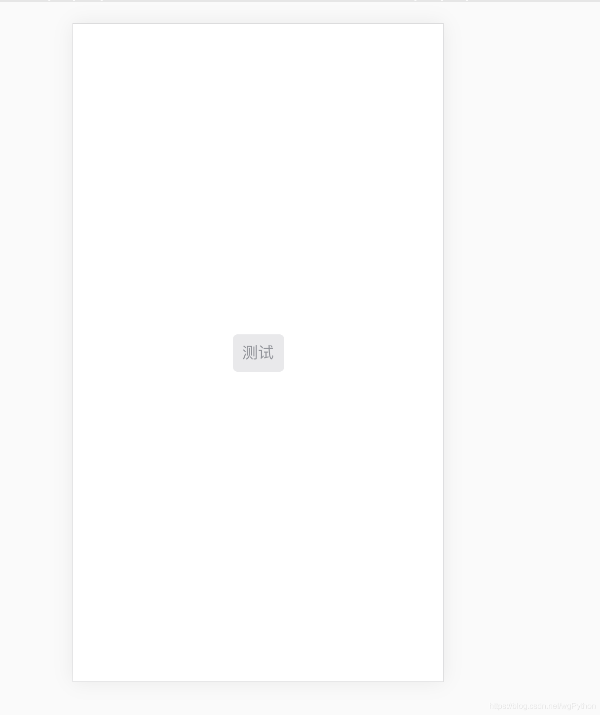
<template>
    <div>
        <toast
                :showToast="true"
                message="测试"
        />
    </div>

</template>

<script>
    import Toast from ‘@/components/common/toast/Toast‘

    export default {
        name: ‘Profile‘,
        data() {
            return {
            }
        },
        methods:{

        },
        components: {
            Toast,

        }
    }
</script>

<style scoped>


</style>
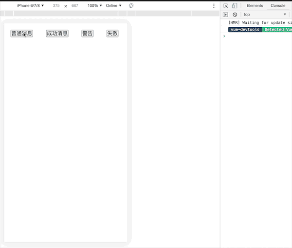
然后就能看到这样的效果,但是样式不够好看。
我颜色搭配也没什么经验,就参考的ElementUI。
添加了type样式, 还有提示的小图标,共四种,需要自行去阿里矢量图下载。
<template>
    <div class="Toast"
         :class="type"
         v-if="showToast">
        <span class="icon">
            <!--<img :src="iconSrc"/>-->
        </span>
        {{ message }}
    </div>
</template>

<script>
    /**
     * 自己封装的Toast v0.1
     * params: showToast Boolean 是否激活toast 默认 false
     * params: type String       toast提示类型 共normal success,fail,warning 四个选项 默认normal
     * params: message String    toast消息
     * params: delay Number      toast显示时间 默认 3000ms
     * */
    export default {
        name: "Toast",
        props: {
            showToast: {
                // 激活
                type: Boolean,
                default: false
            },
            type: {
                // 三种弹窗提示类型
                type: String,
                default: "normal"
            },
            message: {
                type: String,
                required: true
            },
            delay: {
                type: Number,
                default: 3000
            }
        },
        data() {
            return {
            }
        },
        methods: {
            // Toast消失
            disappear() {
                if (this.showToast) {
                    setTimeout(() => {
                        this.$emit("disappear");
                    }, this.delay)
                }
            },
        },
        watch: {
            showToast() {
                this.disappear()
            },
        },
        computed: {
            iconSrc() {
                // 这里使用的阿里矢量图
                let tipType = ["normal", "success", "warning", "fail"];
                if (tipType.includes(this.type)) {
                    return require(`@/assets/img/common/${this.type}.svg`)
                } else {
                    throw "Toast type数据只允许为 normal, success, warning, fail 四种其中的一种,默认为normal"
                }
            }
        },


    }
</script>

<style scoped>
    .Toast {
        position: fixed;
        left: 50%;
        top: 50%;
        background: rgb(233, 233, 235);
        padding: 10px;
        border-radius: 5px;
        transform: translate(-50%, -50%);
        animation: show-toast .2s;
        color: #909399;
        overflow: hidden;
        display: flex;
        align-items: center;
    }

    @keyframes show-toast {
        from {
            opacity: 0;
        }
        to {
            opacity: 1;

        }
    }

    .success {
        color: #67C23A;
        background: rgb(225, 243, 216);
    }

    .warning {
        color: #E6A23C;
        background: rgb(250, 236, 216);
    }

    .fail {
        color: #F56C6C;
        background: rgb(253, 226, 226);
    }

    .icon img {
        width: 20px;
        height: 20px;
        margin-top: 3px;
        margin-right: 4px;
    }
</style>

对应完整代码Github地址 https://github.com/CoderCharm/Mall/blob/master/src/components/common/toast/Toast.vue
调用非常不方便,使用需要导入,传入参数,回调之类的,不符合使用习惯,像ElementUI那种,使用起来就特别方便。
下一步就是超那个方向封装。
CustToast.vue组件,里面就不怎么写逻辑.<template>
<div class="CustToast"
:class="type"
v-if="showToast">
<span class="icon">
<img :src="iconSrc"/>
</span>
{{ message }}
</div>
</template>
<script>
export default {
/**
* 自己封装的Toast v0.2
* params: showToast Boolean 是否激活toast 默认 false
* params: type String toast提示类型 共normal success,fail,warning 四个选项 默认normal
* params: message String toast消息
* params: duration Number toast显示时间 默认 3000ms
* */
name: "CustToast",
data() {
return {
showToast: true,
type: "normal",
message: "消息提示",
duration: 3000
}
},
computed: {
iconSrc() {
window.console.log("当前类型", this.type);
let tipType = ["normal", "success", "warning", "fail"];
if (tipType.includes(this.type)) {
return require(`@/assets/img/common/${this.type}.svg`)
} else {
throw "Toast type数据只允许为 normal, success, warning, fail 四种其中的一种,默认为normal"
}
}
},
}
</script>
<style scoped>
.CustToast {
position: fixed;
left: 50%;
top: 50%;
background: rgb(233, 233, 235);
padding: 10px;
border-radius: 5px;
transform: translate(-50%, -50%);
animation: show-toast .2s;
color: #909399;
overflow: hidden;
display: flex;
align-items: center;
}
@keyframes show-toast {
from {
opacity: 0;
}
to {
opacity: 1;
}
}
.success {
color: #67C23A;
background: rgb(225, 243, 216);
}
.warning {
color: #E6A23C;
background: rgb(250, 236, 216);
}
.fail {
color: #F56C6C;
background: rgb(253, 226, 226);
}
.icon img {
width: 20px;
height: 20px;
margin-top: 3px;
margin-right: 4px;
}
</style>
index.js文件组册,给Vue添加原型$toast//
import vue from ‘vue‘
// 导入自定义到Toast组件
import CustToast from ‘./CustToast.vue‘
// 生成一个扩展实例构造器
const ToastConstructor = vue.extend(CustToast);
// 定义弹出组件的函数 接收三个参数 消息 toast类型 显示时间
function showToast(message, type="normal", duration = 2000) {
// 实例化一个 CustToast.vue
const _toast = new ToastConstructor({
data() {
return {
showToast: true,
type: type,
message: message,
duration: duration
}
}
});
// 把实例化的 CustToast.vue 添加到 body 里
let element = _toast.$mount().$el;
document.body.appendChild(element);
// duration时间到了后隐藏
setTimeout(() => {_toast.showToast = false} ,duration)
}
// 需要在main.js 里面使用 Vue.use(showToast);
showToast.install = (Vue) => {
// 将组件注册到 vue 的 原型链里去,
// 这样就可以在所有 vue 的实例里面使用 this.$toast()
Vue.prototype.$toast = showToast
};
// 导出
export default showToast
main.js文件注册import showToast from ‘@/你的路径/toast/index‘
Vue.use(showToast);
// 封装的时候, 定义了三个参数,message必须要传
// message, type="normal", duration = 2000
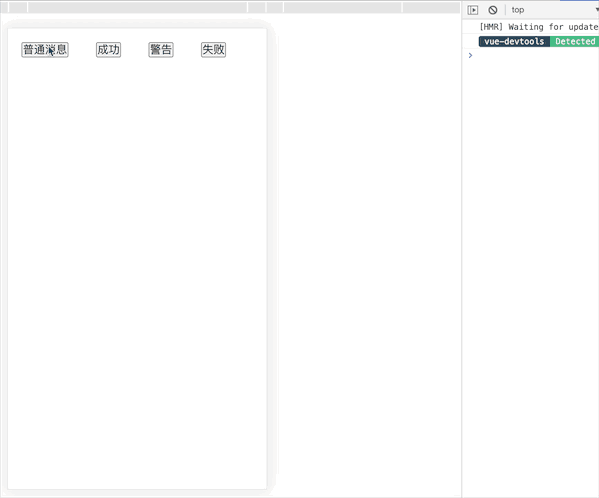
this.$toast("测试普通")
this.$toast("测试成功", "success", 5000)
this.$toast("测试警告", "warning")
this.$toast("测试失败", "fail")
就可以看到开头,我那个演示的gif了。
当然呢,消息提示显示的位置,我没自定义统一显示在中间,同样是按照type一样的思路,给个class样式就可以了。
还有就消失的动画没处理,多个消息弹出的时候直接折叠了。
第二个封装样式Github地址: https://github.com/CoderCharm/Mall/blob/master/src/components/common/toast/CustToast.vue
我是第一次封装自己的全局对象,Vue原型挂载, vue.extend的用法。官网Vue.extend说明https://cn.vuejs.org/v2/api/index.html#Vue-extend
感觉还行的话,就去我那个项目点个star吧??
标签:toast ams png image dde hidden 接收 des 完整
原文地址:https://www.cnblogs.com/CharmCode/p/13223933.html