标签:style blog http io ar color sp strong 数据
最近有不少朋友在追问这样一个问题:我单序列的柱状图,我想让每一个根柱子的颜色都不一样,应该如何做?
针对这个问题,其实我只想说你压根没有认真看完或者查找ECharts官方的示例,官方能够找到的示例有:
1、http://echarts.baidu.com/doc/example/bar14.html
2、http://echarts.baidu.com/doc/example/bar15.html
那么你看完过后是否能够明白其中的道理呢?数据点的属性首先是通过itemStyle节点进行控制的,我们要控制数据点的颜色,自然我们就需要设置color,另外根据ECharts的API介绍,color是支持Function函数的。
我们首先来看看这样一个例子:
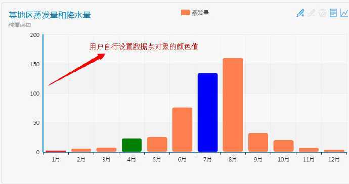
示例一:根据数据点所在序号从一个颜色数组内拿拿取对应颜色值
我们首先设置一个颜色数组,最好比序列内的数据点个数要大或者相等,结合itemStyle内color的函数根据当前数据点在当前序列内所处的顺序序号去颜色数组内自动匹配颜色。
代码如下所示:
option = {
    title : {
        text: ‘某地区蒸发量和降水量‘,
        subtext: ‘纯属虚构‘
    },
    tooltip : {
        trigger: ‘axis‘
    },
    legend: {
        data:[‘蒸发量‘]
    },
    toolbox: {
        show : true,
        feature : {
            mark : {show: true},
            dataView : {show: true, readOnly: false},
            magicType : {show: true, type: [‘line‘, ‘bar‘]},
            restore : {show: true},
            saveAsImage : {show: true}
        }
    },
    calculable : true,
    xAxis : [
        {
            type : ‘category‘,
            data : [‘1月‘,‘2月‘,‘3月‘,‘4月‘,‘5月‘,‘6月‘,‘7月‘,‘8月‘,‘9月‘,‘10月‘,‘11月‘,‘12月‘]
        }
    ],
    yAxis : [
        {
            type : ‘value‘
        }
    ],
    series : [
        {
            name:‘蒸发量‘,
            type:‘bar‘,
            data:[2.0, 4.9, 7.0, 23.2, 25.6, 76.7, 135.6, 162.2, 32.6, 20.0, 6.4, 3.3],
           itemStyle: {
                normal: {
                    color: function(params) {
                        // build a color map as your need.
                        var colorList = [
                          ‘#C1232B‘,‘#B5C334‘,‘#FCCE10‘,‘#E87C25‘,‘#27727B‘,
                           ‘#FE8463‘,‘#9BCA63‘,‘#FAD860‘,‘#F3A43B‘,‘#60C0DD‘,
                           ‘#D7504B‘,‘#C6E579‘,‘#F4E001‘,‘#F0805A‘,‘#26C0C0‘
                        ];
                        return colorList[params.dataIndex]
                    }
                }
            }
        }
    ]
};
效果是不是很炫?!
示例二:通过配置数据点的颜色扩展属性来达到控制不同数据点的颜色
我们最想实现的应该是我们自己能够设置每一个数据点的颜色值,而非通过设置颜色数组的形式,那么我们应该如何做呢?
1、我们需要改写series的data格式,之前是一个一维数据类型的数组,先走我们需要将至变成一个对象类型的一维数组,如下所示;
data:[{
              value:2.0,
              color:"red"
            }, 4.9, 7.0, {
              value:23.2,
              color:"green"
            }, 25.6, 76.7, 135.6, 162.2, 32.6, 20.0, 6.4, 3.3]
某些数据点我设置了其color属性,也就是我要用所配置的颜色来渲染柱子。
2、为了没有配置颜色属性的数据点的颜色显示有所归属(因为我们通过params找不到当前序列的颜色,所以我们最好自己给其series设置一个颜色属性。如下所示:
{
            name:‘蒸发量‘,
            type:‘bar‘,
            color:"#ff7f50",
            data:[{
              value:2.0,
              color:"red"
            }, 4.9, 7.0, {
              value:23.2,
              color:"green"
            }, 25.6, 76.7, 135.6, 162.2, 32.6, 20.0, 6.4, 3.3],
            itemStyle: {
                normal: {
                  color: function(params) {
                    if(params.series.data[params.dataIndex] != null && params.series.data[params.dataIndex].color != undefined)
                    {
                       return params.series.data[params.dataIndex].color;
                    }else
                    {
                      return params.series.color;
                    }
                  }
                }
            }
        }
最后我们就可以通过改写itemStyle内color的function函数规则来返回数据点对象所配置的颜色以及序列所配置的颜色。
当数据点对象尚未配置颜色color属性时,我们就返回当前序列所配置的color即可。
示例代码的option配置如下所示:
option = {
    title : {
        text: ‘某地区蒸发量和降水量‘,
        subtext: ‘纯属虚构‘
    },
    tooltip : {
        trigger: ‘axis‘
    },
    legend: {
        data:[‘蒸发量‘]
    },
    toolbox: {
        show : true,
        feature : {
            mark : {show: true},
            dataView : {show: true, readOnly: false},
            magicType : {show: true, type: [‘line‘, ‘bar‘]},
            restore : {show: true},
            saveAsImage : {show: true}
        }
    },
    calculable : true,
    xAxis : [
        {
            type : ‘category‘,
            data : [‘1月‘,‘2月‘,‘3月‘,‘4月‘,‘5月‘,‘6月‘,‘7月‘,‘8月‘,‘9月‘,‘10月‘,‘11月‘,‘12月‘]
        }
    ],
    yAxis : [
        {
            type : ‘value‘
        }
    ],
    series : [
        {
            name:‘蒸发量‘,
            type:‘bar‘,
            color:"#ff7f50",
            data:[{
              value:2.0,
              color:"red"
            }, 4.9, 7.0, {
              value:23.2,
              color:"green"
            }, 25.6, 76.7, 135.6, 162.2, 32.6, 20.0, 6.4, 3.3],
            itemStyle: {
                normal: {
                  color: function(params) {
                    if(params.series.data[params.dataIndex] != null && params.series.data[params.dataIndex].color != undefined)
                    {
                       return params.series.data[params.dataIndex].color;
                    }else
                    {
                      return params.series.color;
                    }
                  }
                }
            }
        }
    ]
};
ECharts图表实战经验1:如何设置图表同序列不同数据点的独立颜色值
标签:style blog http io ar color sp strong 数据
原文地址:http://www.cnblogs.com/spring_wang/p/4112691.html