表单主要功能是用来与用户做交流的一个网页控件,良好的表单设计能够让网页与用户更好的沟通。表单中常见的元素主要包括:文本输入框 、下拉选择框、单选按钮、复选按钮 、文本域 和按钮 等。其中每个控件所起的作用都各不相同,而且不同的浏览器对表单控件渲染的风格都各有不同。
同样,表单也是Bootstrap框架中的核心内容,下面向大家介绍Bootstrap框架中表单的制作。
表单源码查询
Bootstrap框架的表单,其源码占据了大量的代码,同样的,根据不同的Bootstrap版本,你可以轻松获取相应的源码:
? forms.less
? _forms.scss
编译后的Bootstrap版本,可以查阅bootstrap.css文件第1630行~第1991行
不过在样式表中,还对表单做了一些初始化,详细代码可以查阅bootstrap.css文件第110行~第178行。
对于基础表单,Bootstrap并未对其做太多的定制性效果设计,仅仅对表单内的fieldset 、legend 、label 标签进行了定制。如:
/*源码请查阅bootstrap.css文件第1631行~第1652行*/
fieldset {
min-width: 0;
padding: 0;
margin: 0;
border: 0;
}
legend {
display: block;
width: 100%;
padding: 0;
margin-bottom: 20px;
font-size: 21px;
line-height: inherit;
color: #333;
border: 0;
border-bottom: 1px solid #e5e5e5;
}

label {
display: inline-block;
margin-bottom: 5px;
font-weight: bold;
}
主要将这些元素的margin 、padding 和border 等进行了细化设置。
当然表单除了这几个元素之外,还有input 、select 、textarea 等元素,在Bootstrap框架中,通过定制了一个类名`form-control `,也就是说,如果这几个元素使用了类名“form-control”,将会实现一些设计上的定制效果。
1、宽度变成了100%
2、设置了一个浅灰色(#ccc)的边框
3、具有4px的圆角
4、设置阴影效果,并且元素得到焦点之时,阴影和边框效果会有所变化
5、设置了placeholder的颜色为#999
详细请查阅bootstrap.css文件第1690行~第1732行。
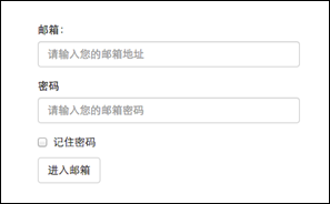
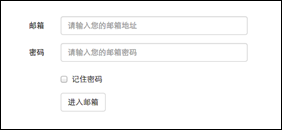
运行效果如下或查看右侧结果窗口:
<form role="form">
  <div class="form-group">
    <label for="exampleInputEmail1">邮箱:</label>
    <input type="email" class="form-control" id="exampleInputEmail1" placeholder="请输入您的邮箱地址">
  </div>
  <div class="form-group">
    <label for="exampleInputPassword1">密码</label>
    <input type="password" class="form-control" id="exampleInputPassword1" placeholder="请输入您的邮箱密码">
  </div>
  <div class="checkbox">
    <label>
      <input type="checkbox"> 记住密码
    </label>
  </div>
  <button type="submit" class="btn btn-default">进入邮箱</button>
</form>
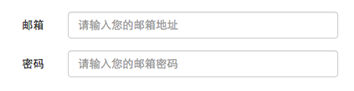
水平表单
Bootstrap框架默认的表单是垂直显示风格 ,但很多时候我们需要的水平表单风格 (标签居左,表单控件居右 )见下图。
在Bootstrap框架中要实现水平表单效果,必须满足以下两个条件:1、在<form>元素是使用类名“form-horizontal”。
在<form> 元素上使用类名“form-horizontal ”主要有以下几个作用:1、设置表单控件padding和margin值。
/*源码请查阅bootstrap.css文件第1963行~第1991行*/
.form-horizontal .control-label,
.form-horizontal .radio,
.form-horizontal .checkbox,
.form-horizontal .radio-inline,
.form-horizontal .checkbox-inline {
padding-top: 7px;
margin-top: 0;
margin-bottom: 0;
}
.form-horizontal .radio,
.form-horizontal .checkbox {
min-height: 27px;
}
.form-horizontal .form-group {
margin-right: -15px;
margin-left: -15px;
}
.form-horizontal .form-control-static {
padding-top: 7px;
}
@media (min-width: 768px) {
.form-horizontal .control-label {
text-align: right;
  }
}
.form-horizontal .has-feedback .form-control-feedback {
top: 0;
right: 15px;
}
来看一个简单的示例:
<form class="form-horizontal " role="form">
<div class="form-group">
<label for="inputEmail3" class="col-sm-2 control-label">邮箱</label>
<div class="col-sm-10 ">
<input type="email" class="form-control" id="inputEmail3" placeholder="请输入您的邮箱地址">
</div>
</div>
<div class="form-group">
<label for="inputPassword3" class="col-sm-2 control-label">密码</label>
<div class="col-sm-10 ">
<input type="password" class="form-control" id="inputPassword3" placeholder="请输入您的邮箱密码">
</div>
</div>
<div class="form-group">
<div class="col-sm-offset-2 col-sm-10 ">
<div class="checkbox">
<label>
<input type="checkbox">记住密码
</label>
</div>
</div>
</div>
<div class="form-group">
<div class="col-sm-offset-2 col-sm-10 ">
<button type="submit" class="btnbtn-default">进入邮箱</button>
</div>
</div>
</form>
(注意:要想看到此效果,需要把鼠标移到结果窗口,单击出现的“全屏”按钮)
<form class="form-horizontal" role="form">
  <div class="form-group">
    <label for="inputEmail3" class="col-sm-2 control-label">邮箱</label>
    <div class="col-sm-10">
      <input type="email" class="form-control" id="inputEmail3" placeholder="请输入您的邮箱地址">
    </div>
  </div>
  <div class="form-group">
    <label for="inputPassword3" class="col-sm-2 control-label">密码</label>
    <div class="col-sm-10">
      <input type="password" class="form-control" id="inputPassword3" placeholder="请输入您的邮箱密码">
    </div>
  </div>
  <div class="form-group">
    <div class="col-sm-offset-2 col-sm-10">
      <div class="checkbox">
        <label>
          <input type="checkbox"> 记住密码
        </label>
      </div>
    </div>
  </div>
  <div class="form-group">
    <div class="col-sm-offset-2 col-sm-10">
      <button type="submit" class="btn btn-default">进入邮箱</button>
    </div>
  </div>
</form>
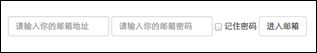
内联表单
有时候我们需要将表单的控件都在一行内显示,类似这样的:
在Bootstrap框架中实现这样的表单效果是轻而易举的,你只需要在<form>元素中添加类名“form-inline ”即可。
如果你要在input前面添加一个label标签时,会导致input换行显示。如果你必须添加这样的一个label标签,并且不想让input换行,你需要将label标签也放在容器“form-group”中,如:
<div class="form-group" >
<label class="sr-only" for="exampleInputEmail2">Email address</label>
</div>
<div class="form-group" >
<inputtype="email" class="form-control" id="exampleInputEmail2" placeholder="Enter email">
</div>
<form class="form-inline" role="form">
<div class="form-group" >
<label class="sr-only" for="exampleInputEmail2">邮箱</label>
<input type="email" class="form-control" id="exampleInputEmail2" placeholder="请输入你的邮箱地址">
</div>
<div class="form-group" >
<label class="sr-only" for="exampleInputPassword2">密码</label>
<input type="password" class="form-control" id="exampleInputPassword2" placeholder="请输入你的邮箱密码">
</div>
<div class="checkbox">
<label>
<input type="checkbox">记住密码
</label>
</div>
<button type="submit" class="btnbtn-default">进入邮箱</button>
</form>
运行效果如下或查看右侧结果窗口:(查看效果需要把结果窗口设置为全屏 )
回过头来看示例,你或许会问,为什么添加了label标签,而且没有放置在”form-group”这样的容器中,input也不会换行;还有label标签怎么没显示出来。如果你仔细看,在label标签运用了一个类名“sr-only ”,标签没显示就是这个样式将标签隐藏了。
.sr-only {
position: absolute;
width: 1px;
height: 1px;
padding: 0;
margin: -1px;
overflow: hidden;
clip: rect(0, 0, 0, 0);
border: 0;
}
注意: 那么Bootstrap为什么要这么做呢?这样不是多此一举吗?其实不是的,如果没有为输入控件设置label标签,屏幕阅读器 将无法正确识别。这也是Bootstrap框架另一个优点之处,为残障人员进行了一定的考虑。
<form class="form-inline" role="form">
  <div class="form-group">
    <label class="sr-only" for="exampleInputEmail2">邮箱</label>
    <input type="email" class="form-control" id="exampleInputEmail2" placeholder="请输入你的邮箱地址">
  </div>
  <div class="form-group">
    <label class="sr-only" for="exampleInputPassword2">密码</label>
    <input type="password" class="form-control" id="exampleInputPassword2" placeholder="请输入你的邮箱密码">
  </div>
  <div class="checkbox">
    <label>
      <input type="checkbox"> 记住密码
    </label>
  </div>
  <button type="submit" class="btn btn-default">进入邮箱</button>
</form>
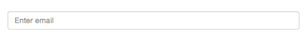
表单控件(输入框input)
每一个表单都是由表单控件组成。离开了控件,表单就失去了意义。接下来的我们简单的来了解Bootstrap框架中表单控件的相关知识。
单行输入框 ,常见的文本输入框,也就是input 的type 属性值为text 。在Bootstrap中使用input时也必须添加type类型,如果没有指定type类型,将无法得到正确的样式,因为Bootstrap框架都是通过input[type=“?”] (其中?号代表type类型,比如说text类型,对应的是input[type=“text”] )的形式来定义样式的。
为了让控件在各种表单风格中样式不出错,需要添加类名“form-control
<form role="form">
<div class="form-group">
<input type="email" form-control
运行效果如下或查看右侧结果窗口:
<form role="form">
<div class="form-group">
<input type="email" class="form-control" placeholder="Enter email">
</div>
</form>
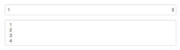
表单控件(下拉选择框select)
Bootstrap框架中的下拉选择框使用和原始的一致,多行选择设置multiple 属性的值为multiple 。Bootstrap框架会为这些元素提供统一的样式风格。如:
<form role="form">
<div class="form-group">
<select class="form-control ">
<option>1</option>
<option>2</option>
<option>3</option>
<option>4</option>
<option>5</option>
</select>
</div>
<div class="form-group">
<select multiple class="form-control ">
<option>1</option>
<option>2</option>
<option>3</option>
<option>4</option>
<option>5</option>
</select>
</div>
</form>
运行效果如下或查看右侧结果窗口:
<form role="form">
  <div class="form-group">
    <select class="form-control">
      <option>1</option>
      <option>2</option>
      <option>3</option>
      <option>4</option>
      <option>5</option>
      </select>
  </div>
  <div class="form-group">
      <select multiple class="form-control">
        <option>1</option>
        <option>2</option>
        <option>3</option>
        <option>4</option>
        <option>5</option>
      </select>
  </div>
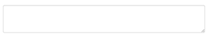
表单控件(文本域textarea)
文本域和原始使用方法一样,设置rows 可定义其高度,设置cols 可以设置其宽度。但如果textarea 元素中添加了类名“form-control ”类名,则无需设置cols属性。因为Bootstrap框架中的“form-control”样式的表单控件宽度为100% 或auto 。
<form role="form">
  <div class="form-group">
    <textarea class="form-control" rows="3"></textarea>
  </div>
</form>
运行效果如下或查看右侧结果窗口:
<form role="form">
  <div class="form-group">
    <textarea class="form-control" rows="3"></textarea>
  </div>
</form>
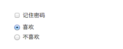
表单控件(复选框checkbox和单选择按钮radio)
Bootstrap框架中checkbox和radio有点特殊,Bootstrap针对他们做了一些特殊化处理,主要是checkbox和radio与label标签配合使用会出现一些小问题(最头痛的是对齐问题)。使用Bootstrap框架,开发人员无需考虑太多,只需要按照下面的方法使用即可。
<form role="form">
<div class="checkbox">
<label>
<input type="checkbox" value="">
记住密码
</label>
</div>
<div class="radio">
<label>
<input type="radio" name="optionsRadios" id="optionsRadios1" value="love" checked>
喜欢
</label>
</div>
<div class="radio">
<label>
<input type="radio" name="optionsRadios" id="optionsRadios2" value="hate">
不喜欢
</label>
</div>
</form>
运行效果如下或查看右侧结果窗口(案例1):
从上面的示例,我们可以得知:.checkbox ”的容器内.radio ”的容器内.checkbox ”和“.radio ”样式,来处理复选框、单选按钮与标签的对齐方式。源码请查看bootstrap.css文件第1742行~第1762行:
.radio,
.checkbox {
display: block;
min-height: 20px;
padding-left: 20px;
margin-top: 10px;
margin-bottom: 10px;
}
.radio label,
.checkbox label {
display: inline;
font-weight: normal;
cursor: pointer;
}
.radio input[type="radio"],
.radio-inline input[type="radio"],
.checkbox input[type="checkbox"],
.checkbox-inline input[type="checkbox"] {
float: left;
margin-left: -20px;
}
.radio + .radio,
.checkbox + .checkbox {
margin-top: -5px;
}
<form role="form">
  <h3>案例1</h3>
  <div class="checkbox">
    <label>
      <input type="checkbox" value="">
      记住密码
    </label>
  </div>
  <div class="radio">
    <label>
      <input type="radio" name="optionsRadios" id="optionsRadios1" value="love" checked>
      喜欢
    </label>
  </div>
    <div class="radio">
    <label>
      <input type="radio" name="optionsRadios" id="optionsRadios2" value="hate">
      不喜欢
    </label>
  </div>
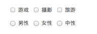
表单控件(复选框和单选按钮水平排列)
有时候,为了布局的需要,将复选框和单选按钮需要水平排列。Bootstrap框架也做了这方面的考虑:1、如果checkbox需要水平排列,只需要在label标签上添加类名“checkbox-inline”
<form role="form">
<div class="form-group">
<label class="checkbox-inline ">
<input type="checkbox" value="option1">游戏
</label>
<label class="checkbox-inline ">
<input type="checkbox" value="option2">摄影
</label>
<label class="checkbox-inline ">
<input type="checkbox" value="option3">旅游
</label>
</div>
<div class="form-group">
<label class="radio-inline ">
<input type="radio" value="option1" name="sex">男性
</label>
<label class="radio-inline ">
<input type="radio" value="option2" name="sex">女性
</label>
<label class="radio-inline ">
<input type="radio" value="option3" name="sex">中性
</label>
</div>
</form>
运行效果如下或查看右侧结果窗口:
实现源码请查看bootstrap.css文件第1767行~第1780行:
.radio-inline,
.checkbox-inline {
display: inline-block;
padding-left: 20px;
margin-bottom: 0;
font-weight: normal;
vertical-align: middle;
cursor: pointer;
}
.radio-inline + .radio-inline,
.checkbox-inline + .checkbox-inline {
margin-top: 0;
margin-left: 10px;
}
表单控件(按钮)
按钮也是表单重要控件之一,制作按钮通常使用下面代码来实现:
input[type= “ submit”]
input[type=“button”]
input[type= “ reset”]
<button>
在Bootstrap框架中的按钮都是采用<button> 来实现。
有关于Bootstrap中按钮如何制作,在这里不做过多阐述,因为按钮也是Bootstrap框架中核心部分之一,后面我们专门有一节内容来介绍Bootstrap的按钮。
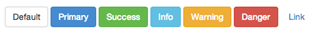
这里先让大家看看Bootstrap的按钮长成什么样:
<table class="table table-bordered table-striped">
    <thead>
      <tr>
        <th>Button</th>
        <th>class=""</th>
        <th>Description</th>
      </tr>
    </thead>
    <tbody>
      <tr>
        <td><button class="btn" href="#">Default</button></td>
        <td><code>btn</code></td>
        <td>Standard gray button with gradient</td>
      </tr>
      <tr>
        <td><button class="btn btn-primary" href="#">Primary</button></td>
        <td><code>btn btn-primary</code></td>
        <td>Provides extra visual weight and identifies the primary action in a set of buttons</td>
      </tr>
      <tr>
        <td><button class="btn btn-info" href="#">Info</button></td>
        <td><code>btn btn-info</code></td>
        <td>Used as an alternative to the default styles</td>
      </tr>
      <tr>
        <td><button class="btn btn-success" href="#">Success</button></td>
        <td><code>btn btn-success</code></td>
        <td>Indicates a successful or positive action</td>
      </tr>
      <tr>
        <td><button class="btn btn-warning" href="#">Warning</button></td>
        <td><code>btn btn-warning</code></td>
        <td>Indicates caution should be taken with this action</td>
      </tr>
      <tr>
        <td><button class="btn btn-danger" href="#">Danger</button></td>
        <td><code>btn btn-danger</code></td>
        <td>Indicates a dangerous or potentially negative action</td>
      </tr>
      <tr>
        <td><button class="btn btn-inverse" href="#">Inverse</button></td>
        <td><code>btn btn-inverse</code></td>
        <td>Alternate dark gray button, not tied to a semantic action or use</td>
      </tr>
    </tbody>
  </table>
Button
class=""
Description
Default
btn
Standard gray button with gradient
Primary
btn btn-primary
Provides extra visual weight and identifies the primary action in a set of buttons
Info
btn btn-info
Used as an alternative to the default styles
Success
btn btn-success
Indicates a successful or positive action
Warning
btn btn-warning
Indicates caution should be taken with this action
Danger
btn btn-danger
Indicates a dangerous or potentially negative action
Inverse
btn btn-inverse
Alternate dark gray button, not tied to a semantic action or use
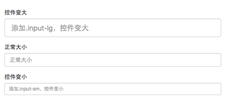
表单控件大小
前面看到的表单控件都正常的大小。可以通过设置控件的height,line-height,padding 和font-size 等属性来实现控件的高度设置。不过Bootstrap框架还提供了两个不同的类名,用来控制表单控件的高度。这两个类名是:1、input-sm:让控件比正常大小更小
这两个类适用于表单中的input ,textarea 和select 控件,具体使用如下:
<input class="form-control input-lg " type="text" placeholder="添加.input-lg,控件变大">
<input class="form-control" type="text" placeholder="正常大小">
<input class="form-control input-sm " type="text" placeholder="添加.input-sm,控件变小">
运行效果如下或查看右侧结果窗口:
源码请查阅bootstrap.css文件第1795~第1824行:
.input-sm {
height: 30px;
padding: 5px 10px;
font-size: 12px;
line-height: 1.5;
border-radius: 3px;
}
select.input-sm {
height: 30px;
line-height: 30px;
}
textarea.input-sm,
select[multiple].input-sm {
height: auto;
}
.input-lg {
height: 46px;
padding: 10px 16px;
font-size: 18px;
line-height: 1.33;
border-radius: 6px;
}
select.input-lg {
height: 46px;
line-height: 46px;
}
textarea.input-lg,
select[multiple].input-lg {
height: auto;
}
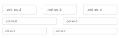
网格系统 。所以你要控制表单宽度,可以像下面这样使用:
<form role="form" class="form-horizontal">
<div class="form-group">
<div class="col-xs-4 ">
<input class="form-control input-lg" type="text" placeholder=".col-xs-4">
</div>
<div class="col-xs-4 ">
<input class="form-control input-lg" type="text" placeholder=".col-xs-4">
</div>
<div class="col-xs-4 ">
<input class="form-control input-lg" type="text" placeholder=".col-xs-4">
</div>
</div>
…
</form>
注:网格布局在后面章节中会进行详细讲解。
运行效果如下或查看右侧结果窗口:
前面介绍水平表单时说过,如果表单使用了类名“form-horizontal”,其中“form-group”就相当于网格系统中的“row”。换句话说,如果没有这样做,要通过网格系统来控制表单控件宽度,就需要这样使用:
<div class="row">
<div class="col-xs-4">
<input class="form-control input-lg" type="text" placeholder=".col-xs-4">
</div>
<div class="col-xs-4">
<input class="form-control input-lg" type="text" placeholder=".col-xs-4">
</div>
<div class="col-xs-4">
<input class="form-control input-lg" type="text" placeholder=".col-xs-4">
</div>
</div>
<h1>案例1</h1>
<form role="form">
  <div class="form-group">
    <label class="control-label">控件变大</label>
    <input class="form-control input-lg" type="text" placeholder="添加.input-lg,控件变大">
  </div>
  <div class="form-group">
    <label class="control-label">正常大小</label>
    <input class="form-control" type="text" placeholder="正常大小">
  </div>
  <div class="form-group">
    <label class="control-label">控件变小</label>
    <input class="form-control input-sm" type="text" placeholder="添加.input-sm,控件变小">
  </div>
</form>
  <br>
  <br>
  <br>
 <h1>案例2</h1>
<form role="form" class="form-horizontal">
  <div class="form-group">
    <div class="col-xs-4">
      <input class="form-control input-lg" type="text" placeholder=".col-xs-4">
    </div>
    <div class="col-xs-4">
      <input class="form-control input-lg" type="text" placeholder=".col-xs-4">
    </div>
    <div class="col-xs-4">
      <input class="form-control input-lg" type="text" placeholder=".col-xs-4">
    </div>
  </div>
  <div class="form-group">
    <div class="col-xs-6"><input class="form-control" type="text" placeholder=".col-xs-6"></div>
    <div class="col-xs-6"><input class="form-control" type="text" placeholder=".col-xs-6"></div>

  </div>
  <div class="form-group">
    <div class="col-xs-5">
      <input class="form-control input-sm" type="text" placeholder=".col-xs-5">
    </div>
    <div class="col-xs-7">
      <input class="form-control input-sm" type="text" placeholder=".col-xs-7">
    </div>
  </div>
</form>
案例1
案例2
表单控件状态(焦点状态)
表单主要用来与用户沟通,好的表单就能更好的与用户进行沟通,而好的表单一定离不开表单的控件状态。
表单状态的作用:
每一种状态都能给用户传递不同的信息,比如表单有焦点的状态可以告诉用户可以输入或选择东西,禁用状态可以告诉用户不可以输入或选择东西,还有就是表单控件验证状态,可以告诉用户的操作是否正确等。那么在Bootstrap框架中的表单控件也具备这些状态。
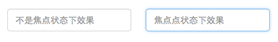
焦点状态是通过伪类“:focus ”来实现。Bootstrap框架中表单控件的焦点状态删除了outline 的默认样式,重新添加阴影效果。
源码请查阅bootstrap.css文件第1707行~第1712行:
.form-control:focus {
border-color: #66afe9;
outline: 0;
  -webkit-box-shadow: inset 0 1px 1pxrgba(0,0,0,.075), 0 0 8px rgba(102, 175, 233, .6);
box-shadow: inset 0 1px 1pxrgba(0,0,0,.075), 0 0 8px rgba(102, 175, 233, .6);
}
从源码中我们可以看出,要让控件在焦点状态下有上面样式效果,需要给控件添加类名“form-control ”:
<form role="form" class="form-horizontal">
<div class="form-group">
<div class="col-xs-6">
<input class="form-control form-control
运行效果如下或查看右侧结果窗口:
(鼠标单击输入框,使其获得焦点就可以看到加入蓝色边框效果 )
在Bootstrap框架中,file 、radio 和checkbox 控件在焦点状态下的效果也与普通的input控件不太一样,主要是因为Bootstrap对他们做了一些特殊处理:
input[type="file"]:focus ,
input[type="radio"]:focus ,
input[type="checkbox"]:focus {
outline: thin dotted;
outline: 5px auto -webkit-focus-ring-color;
outline-offset: -2px;
}
<form role="form" class="form-horizontal">
  <div class="form-group">
    <div class="col-xs-6">
      <input class="form-control input-lg" type="text" placeholder="不是焦点状态下效果">
    </div>
    <div class="col-xs-6">
      <input class="form-control input-lg" type="text" placeholder="焦点点状态下效果">
    </div>
  </div>
</form>
表单控件状态(禁用状态)
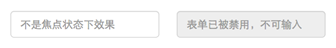
Bootstrap框架的表单控件的禁用状态和普通的表单禁用状态实现方法是一样的,在相应的表单控件上添加属性“disabled ”。和其他表单的禁用状态不同的是,Bootstrap框架做了一些样式风格的处理:
.form-control[disabled] ,
.form-control[readonly],
fieldset[disabled] .form-control {
cursor: not-allowed;
background-color: #eee;
opacity: 1;
}
使用方法为:只需要在需要禁用的表单控件上加上“disabled ”即可:
<input class="form-control" type="text" placeholder="表单已禁用,不能输入" disabled >
运行效果如下或查看右侧结果窗口:
在使用了“form-control”的表单控件中,样式设置了禁用表单背景色为灰色,而且手型变成了不准输入的形状。如果控件中不使用类名“form-control”,禁用的控件只会有一个不准输入的手型出来。
input[type="radio"][disabled],
input[type="checkbox"][disabled],
.radio[disabled],
.radio-inline[disabled],
.checkbox[disabled],
.checkbox-inline[disabled],
fieldset[disabled] input[type="radio"],
fieldset[disabled] input[type="checkbox"],
fieldset[disabled] .radio,
fieldset[disabled] .radio-inline,
fieldset[disabled] .checkbox,
fieldset[disabled] .checkbox-inline {
cursor: not-allowed;
}
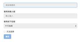
在Bootstrap框架中,如果fieldset 设置了disabled 属性,整个域都将处于被禁用状态。
<form role="form">
<fieldset disabled >
<div class="form-group">
<label for="disabledTextInput">禁用的输入框</label>
<input type="text" id="disabledTextInput" class="form-control" placeholder="禁止输入">
</div>
<div class="form-group">
<label for="disabledSelect">禁用的下拉框</label>
<select id="disabledSelect" class="form-control">
<option>不可选择</option>
</select>
</div>
<div class="checkbox">
<label>
<input type="checkbox">无法选择
</label>
</div>
<button type="submit" class="btnbtn-primary">提交</button>
</fieldset>
</form>
运行效果如下或查看右侧结果窗口:
据说对于整个禁用的域中,如果legend中有输入框 的话,这个输入框是无法被禁用 的。我们一起来验证一下:
<form role="form">
<fieldset disabled >
<legend><input type="text" class="form-control" placeholder="显然我颜色变灰了,但是我没被禁用,不信?单击试一下" /> </legend>
…
</fieldset>
</form>
运行效果如下或查看右侧结果窗口:
<form role="form" class="form-horizontal">
  <div class="form-group">
    <div class="col-xs-6">
      <input class="form-control input-lg" type="text" placeholder="不是焦点状态下效果">
    </div>
    <div class="col-xs-6">
      <input class="form-control input-lg" id="disabledInput" type="text" placeholder="表单已被禁用,不可输入" disabled>
    </div>
  </div>
</form>
<br>
<br>
<br>
<h3>示例2</h3>
<form role="form">
  <fieldset disabled>
    <div class="form-group">
      <label for="disabledTextInput">禁用的输入框</label>
      <input type="text" id="disabledTextInput" class="form-control" placeholder="禁止输入">
    </div>
    <div class="form-group">
      <label for="disabledSelect">禁用的下拉框</label>
      <select id="disabledSelect" class="form-control">
        <option>不可选择</option>
      </select>
    </div>
    <div class="checkbox">
      <label>
        <input type="checkbox"> 无法选择
      </label>
    </div>
    <button type="submit" class="btn btn-primary">提交</button>
  </fieldset>
</form>
表单控件状态(验证状态)
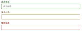
在制作表单时,不免要做表单验证。同样也需要提供验证状态样式,在Bootstrap框架中同样提供这几种效果。
<form role="form">
<div class="form-group has-success ">
<label class="control-label" for="inputSuccess1">成功状态</label>
<input type="text" class="form-control" id="inputSuccess1" placeholder="成功状态" >
</div>
<div class="form-group has-warning ">
<label class="control-label" for="inputWarning1">警告状态</label>
<input type="text" class="form-control" id="inputWarning1" placeholder="警告状态">
</div>
<div class="form-group has-error ">
<label class="control-label" for="inputError1">错误状态</label>
<input type="text" class="form-control" id="inputError1" placeholder="错误状态">
</div>
</form>
运行效果如下或查看右侧结果窗口:
从效果可以看出,三种状态下效果都是一样的,只是颜色不一样而以。
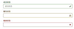
其他两种状态省略源码不在此展示。has-feedback ”。请注意,此类名要与“has-error ”、“has-warning ”和“has-success ”在一起:
<form role="form">
<div class="form-group has-success has-feedback ">
<label class="control-label" for="inputSuccess1">成功状态</label>
<input type="text" class="form-control" id="inputSuccess1" placeholder="成功状态" >
<span class="glyphiconglyphicon-ok form-control-feedback"></span>
</div>
<div class="form-group has-warning has-feedback ">
......
</div>
<div class="form-group has-error has-feedback ">
......
</div>
</form>
运行效果如下或查看右侧结果窗口:
从效果图中可以看出,图标都居右。在 Bootstrap 的小图标都是使用@font-face 来制作(后面的内容中将会着重用一节内容来介绍)。而且必须在表单中添加了一个 span 元素:
<span class="glyphiconglyphicon-warning-sign form-control-feedback"></span>
<h3>示例1</h3>
<form role="form">
<div class="form-group has-success">
  <label class="control-label" for="inputSuccess1">成功状态</label>
  <input type="text" class="form-control" id="inputSuccess1" placeholder="成功状态" >
</div>
<div class="form-group has-warning">
  <label class="control-label" for="inputWarning1">警告状态</label>
  <input type="text" class="form-control" id="inputWarning1" placeholder="警告状态">
</div>
<div class="form-group has-error">
  <label class="control-label" for="inputError1">错误状态</label>
  <input type="text" class="form-control" id="inputError1" placeholder="错误状态">
</div>
</form>
<br>
<br>
<br>
<h3>示例2</h3>
<form role="form">
<div class="form-group has-success has-feedback">
<label class="control-label" for="inputSuccess1">成功状态</label>
<input type="text" class="form-control" id="inputSuccess1" placeholder="成功状态" >
<span class="glyphicon glyphicon-ok form-control-feedback"></span>
</div>
<div class="form-group has-warning has-feedback">
<label class="control-label" for="inputWarning1">警告状态</label>
<input type="text" class="form-control" id="inputWarning1" placeholder="警告状态">
<span class="glyphicon glyphicon-warning-sign form-control-feedback"></span>
</div>
<div class="form-group has-error has-feedback">
<label class="control-label" for="inputError1">错误状态</label>
<input type="text" class="form-control" id="inputError1" placeholder="错误状态">
<span class="glyphicon glyphicon-remove form-control-feedback"></span>
</div>
</form>
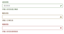
表单提示信息
平常在制作表单验证时,要提供不同的提示信息。在Bootstrap框架中也提供了这样的效果。使用了一个"help-block "样式,将提示信息以块状显示,并且显示在控件底部。
<form role="form">
<div class="form-group has-success has-feedback">
<label class="control-label" for="inputSuccess1">成功状态</label>
<input type="text" class="form-control" id="inputSuccess1" placeholder="成功状态" >
<span class="help-block ">你输入的信息是正确的</span>
<span class="glyphiconglyphicon-ok form-control-feedback"></span>
</div>
…
</form>
运行效果如下或查看右侧结果窗口:
具体样式代码请查看bootstrap.css文件第1922行~第1927行:
.help-block {
display: block;
margin-top: 5px;
margin-bottom: 10px;
color: #737373;
}
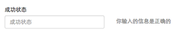
在Bootstrap V2.x版本中还提供了一个行内提示信息,其使用了类名“help-inline ”。一般让提示信息显示在控件的后面,也就是同一水平显示。如果你想在BootstrapV3.x版本也有这样的效果,你可以添加这段代码:
.help-inline{
  display:inline-block;
  padding-left:5px;
  color: #737373;
}
如果你不想为bootstrap.css增加自己的代码,而且设计又有这种样的需求,那么只能借助于Bootstrap的网格系统。(网格系统在后面的章节中会详细讲解)
<form role="form">
<div class="form-group">
<label class="control-label" for="inputSuccess1">成功状态</label>
<div class="row">
<div class="col-xs-6">
<input type="text" class="form-control" id="inputSuccess1" placeholder="成功状态" >
</div>
<span class="col-xs-6 help-block">你输入的信息是正确的</span>
</div>
</div>
</form>
运行效果如下或查看右侧结果窗口:
结束语:有关于Bootstrap框架中表单的运用除了按钮部分,到此就算是介绍完了。如果你觉得这样的表单效果并不是你需要的,你完全可以通过forms.less 或者_forms.scss 文件进行定制,然后重新编译就可以得到你需要的表单效果。在接下来的一节中,我们Bootstrap框架中另一个核心内容——按钮 。
<h3>示例1</h3>
<form role="form">
  <div class="form-group has-success has-feedback">
    <label class="control-label" for="inputSuccess1">成功状态</label>
    <input type="text" class="form-control" id="inputSuccess1" placeholder="成功状态" >
    <span class="help-block">你输入的信息是正确的</span>
    <span class="glyphicon glyphicon-ok form-control-feedback"></span>
  </div>
  <div class="form-group has-warning has-feedback">
    <label class="control-label" for="inputWarning1">警告状态</label>
    <input type="text" class="form-control" id="inputWarning1" placeholder="警告状态">
    <span class="help-block">请输入正确信息</span>
    <span class="glyphicon glyphicon-warning-sign form-control-feedback"></span>
  </div>
  <div class="form-group has-error has-feedback">
    <label class="control-label" for="inputError1">错误状态</label>
    <input type="text" class="form-control" id="inputError1" placeholder="错误状态">

    <span class="glyphicon glyphicon-remove form-control-feedback"></span>
  </div>
</form>
<br>
<br>
<br>
<h3>示例2</h3>
<form role="form">
  <div class="form-group">
    <label class="control-label" for="inputSuccess1">成功状态</label>
    <div class="row">
      <div class="col-xs-6">
        <input type="text" class="form-control" id="inputSuccess1" placeholder="成功状态" >
      </div>
       <span class="col-xs-6 help-block">你输入的信息是正确的</span>
    </div>
  </div>
</form>

