标签:
伪类
VS 伪元素
这两个概念很容易混淆,即使你Google或者查W3C的资料都不一定搞得清。答案其实很简单,如下:
伪类:作用对象是整个元素
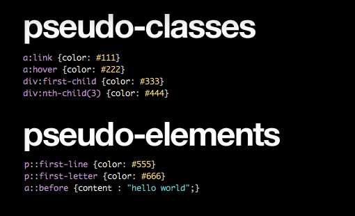
首先,来看几个伪类
a:link
{color:#111}a:hover
{color:#222}div:first-child
{color:#333}div:nth-child(3)
{color:#444} |
如你所见,尽管这些条件不是基于DOM的,但结果每一个都是作用于一个完整的元素,比如整个链接,段落,div等等。
伪元素:作用于元素的一部分
还是来看几个例子:
p::first-line
{color:#555}p::first-letter
{color:#666}a::before
{content : "hello
world";} |
如你所见,伪元素作用于元素的一部分:一个段落的第一行 或者 第一个字母。
更加神奇的是可以作用于并未加入HTML的对象,这就是:before 和 :after,也就是本文要说的内容。
:before VS ::before
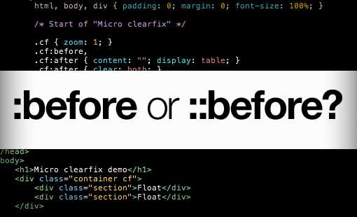
为什么有两种写法呢?它们的效果一样么?
答案是一样的,来看一个例子:
/*CSS2*/.example:before
{}.example:after
{}.example:first-child
{} /*CSS3*/.example::before
{}.example::after
{}.example:first-child
{} |
在CSS2中,我们使用一个冒号表示伪类和伪元素。然而,为了区别已有的这两个,CSS3专门为伪元素设计了两个冒号。
IE再次毁了一切
所有现代浏览器都支持 :: 语法,但是悲剧的IE8不支持,大多数开发者为了兼容IE,使用CSS2的 :。为了保持简单一致,本文后面的部分都是用CSS2格式。
什么是 :before 和 :after
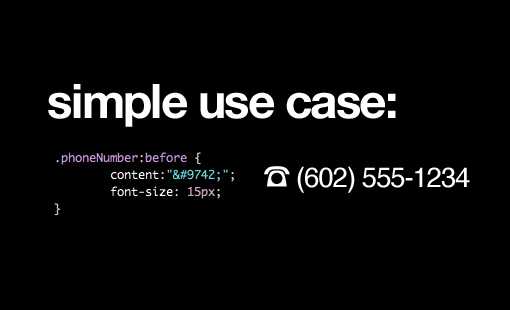
:before 和 :after 使你可以通过CSS加入一些内容,从而避免了HTML的凌乱。特别是一些装饰性的元素,从语义化考虑本就不该出现在HTML中。
举个例子,你的网站有一些电话号码,你希望在它们前面加一个icon ?。你可以用 :before 伪元素实现这个效果:
.phoneNumber:before
{ content:"☎"; font-size:15px;} |
这段代码使得.phoneNumber的所有元素的前面插入了一个icon。:after 作用一样,你可以猜到会出现什么效果了
.phoneNumber:after
{ content:"$#9742"; font-size:15px;} |
--------------------------------------------------------------------------------
一个简洁的例子

最近,:before 和 :after 变得非常流行的一个原因是它们可以增加纯CSS设计的复杂度。不需要多余的标签,我们可以使用伪元素添加额外的可样式化的元素或层级。
来看一个例子,这是一个简单的按钮,圆形并有红色的渐变。
.button
{ height:100px; width:100px; position:relative; margin:50px; color:white; text-align:center; line-height:100px; /*Rounded
Corners and Shadows*/ -webkit-border-radius:100px; -moz-border-radius:100px; border-radius:100px; -webkit-box-shadow:2px 2px 4px rgba(0,0,0,0.4); -moz-box-shadow:2px 2px 4px rgba(0,0,0,0.4); box-shadow:2px 2px 4px rgba(0,0,0,0.4); /*Ridiculous
Gradient Syntax*/ background:#e51d16;/*
Old browsers */ background:
-moz-linear-gradient(top, #e51d16 0%,#b21203 100%);/*
FF3.6+ */ background:
-webkit-gradient(linear, left top,left bottom,
color-stop(0%,#e51d16),
color-stop(100%,#b21203));/*
Chrome,Safari4+ */ background:
-webkit-linear-gradient(top, #e51d16 0%,#b21203 100%);/*
Chrome10+,Safari5.1+ */ background:
-o-linear-gradient(top, #e51d16 0%,#b21203 100%);/*
Opera 11.10+ */ background:
-ms-linear-gradient(top, #e51d16 0%,#b21203 100%);/*
IE10+ */ background:
linear-gradient(top, #e51d16 0%,#b21203 100%);/*
W3C */ filter:
progid:DXImageTransform.Microsoft.gradient( startColorstr=‘#e51d16‘,
endColorstr=‘#b21203‘,GradientType=0 );/*
IE6-9 */} |
效果如下:

现在,我们需要在按钮的外围添加一层稍暗的区域,并且给它一个内阴影效果,看起来就像是嵌入的一样。这次,我们不用添加额外的标签,只需要用一个空的伪元素。
.button:before
{ content:"";} |
现在我们开始实现想要的效果。
.button:before
{ content:""; width:100%; height:100%; display:block; z-index:-1; position:relative; padding:15px; background:#ddd; left:-15px; top:-15px; -webkit-border-radius:100px; -moz-border-radius:100px; border-radius:100px; -webkit-box-shadow:inset 2px 2px 4px rgba(0,0,0,0.4); -moz-box-shadow:inset 2px 2px 4px rgba(0,0,0,0.4); box-shadow:inset 2px 2px 4px rgba(0,0,0,0.4);} |
现在按钮看起来更立体了。 :before 实现了外围的圆环。我们把z-index设置为-1,使它位于按钮的下方,并且使用相对定位校正位置。
接下来,我们又想加一层同样的效果。这一次,我们使用 :after
.button:after
{ content:""; width:100%; height:100%; display:block; z-index:-2; position:relative; padding:25px; background:#eee; position:absolute; left:-25px; top:-25px; -webkit-border-radius:100px; -moz-border-radius:100px; border-radius:100px; -webkit-box-shadow:inset 2px 2px 4px rgba(0,0,0,0.4); -moz-box-shadow:inset 2px 2px 4px rgba(0,0,0,0.4); box-shadow:inset 2px 2px 4px rgba(0,0,0,0.4);} |
效果如下:

通过
:before 和 :after 你还能做什么?
使用很广泛,下面给出几个比较流行的例子
清除浮动
CSS的浮动很让人头痛,世界各地的开发者都在寻找更好的解决方法。
Nicolas Gallagher 提出的方法也许是当今最受欢迎的一个,即利用 :before 和 :after 清除浮动。
/*
For modern browsers */.cf:before,.cf:after
{ content:""; display:table;} .cf:after
{ clear:both;} /*
For IE 6/7 (trigger hasLayout) */.cf
{ zoom:1;} |
这里 :before 阻止了 top-margin 合并, :after则用于清除浮动,这种方法做的极为干净漂亮。
你也许会说还有 overflow: hidden; 方式呢!当然这也是一种可选方案,当你发现overflow不合适的时候,可以选择这里提到的方式。
CSS图形
使用纯CSS实现某些复杂的图形是不是很有趣?通过巧妙的操作 border 和 一些伪元素就可以实现这些图形。
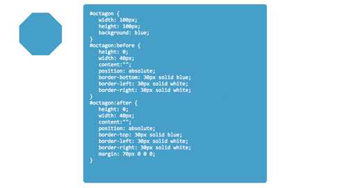
CSS3Shapes.com 有很多例子,这里就举一个八边形的例子。
#octagon
{ width:100px; height:100px; background:blue;} #octagon:before
{ height:0; width:40px; content:""; position:absolute; border-bottom:30px solid blue; border-left:30px solid white; border-right:30px solid white;} #octagon:after
{ height:0; width:40px; content:""; position:absolute; border-top:30px solid blue; border-left:30px solid white; border-right:30px solid white; margin:70px 0 0 0;} |
可以看到,通过定位、设置border,我们就能把一些简单的形状组合成复杂的图形,相当的酷!
标签:
原文地址:http://www.cnblogs.com/ding1006/p/4585442.html