标签:
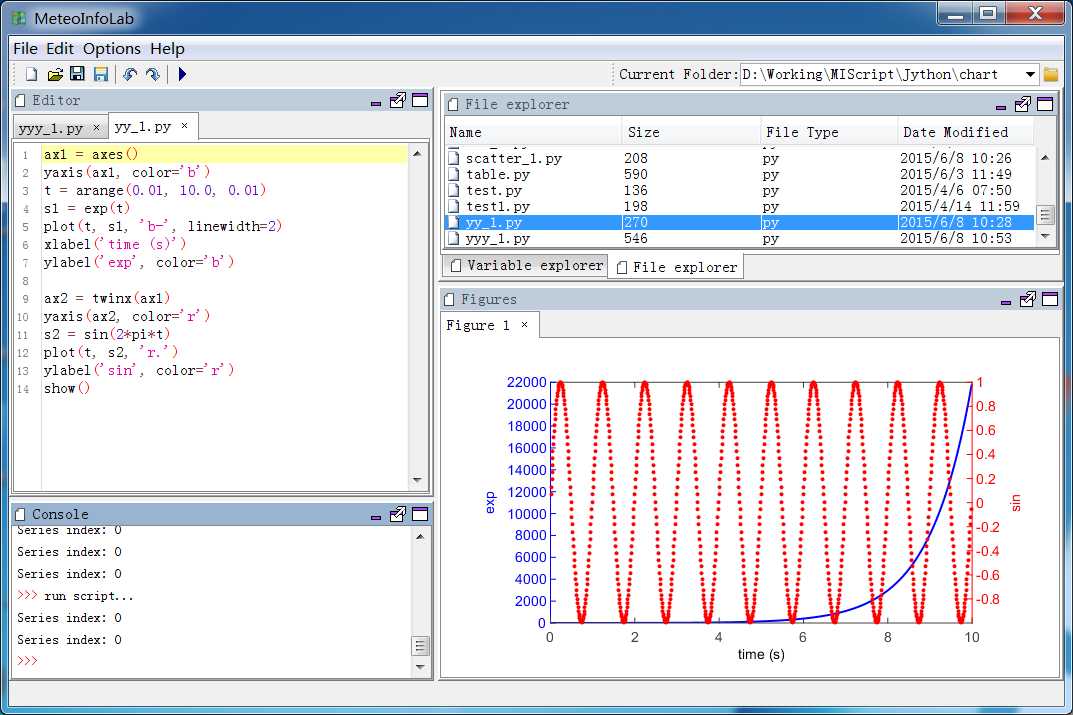
数据范围相差比较大的数据序列进行对比的时候多Y轴图就很重要了。MeteoInfoLab中提供了一个twinx函数来根据已有的坐标系(Axes)生成一个新的Axes,这个命令会使得已有的Axes不绘制右边的Y轴,而新生成的Axes只绘制右边的Y轴。yaxis函数可以对某个Axes的Y轴进行相应的设置,第一个参数是某个Axes的对象,可以设置Y轴的颜色(color)和偏移(shift),对于超过2个Y轴的图形来说第3个Y轴就必须设置偏移以避免压盖。
双Y轴图:
多Y轴图:

脚本程序:
ax1 = axes()
yaxis(ax1, color=‘b‘)
t = arange(0.01, 10.0, 0.01)
s1 = exp(t)
plot(t, s1, ‘b-‘, linewidth=2)
xlabel(‘time (s)‘)
ylabel(‘exp‘, color=‘b‘)

ax2 = twinx(ax1)
yaxis(ax2, color=‘r‘)
s2 = sin(2*pi*t)
plot(t, s2, ‘r.‘)
ylabel(‘sin‘, color=‘r‘)
show()
ax1 = axes(position=[0.113,0.15,0.7,0.8])
yaxis(ax1, color=‘b‘)
line1 = plot([0, 1, 2], [0, 1, 2], ‘b-‘, label="Density")
xlabel(‘Distance‘)
ylabel(‘Density‘, color=‘b‘)
title(‘Mutiple Y Axis Sample‘)

ax2 = twinx(ax1)
yaxis(ax2, color=‘r‘)
line2 = plot([0, 1, 2], [0, 3, 2], ‘r-‘, label="Temperature")
ylabel(‘Temperature‘, color=‘r‘)

ax3 = twinx(ax1)
yaxis(ax3, shift=60, color=‘g‘)
line3 = plot([0, 1, 2], [50, 30, 15], ‘g-‘, label="Velocity")
ylabel(‘Velocity‘, color=‘g‘)
lines = [line1, line2, line3]
legend(lines)
show()
标签:
原文地址:http://www.cnblogs.com/yaqiang/p/4587673.html